While working on Tails.com’s main customer-facing product, I was asked to help with growing issues around their internal CRM (“Frontyard”), used daily by customer support teams. What should have been a quick way to understand a customer had become slow, cluttered, and difficult to navigate, making everyday support tasks harder than they needed to be.
The problem
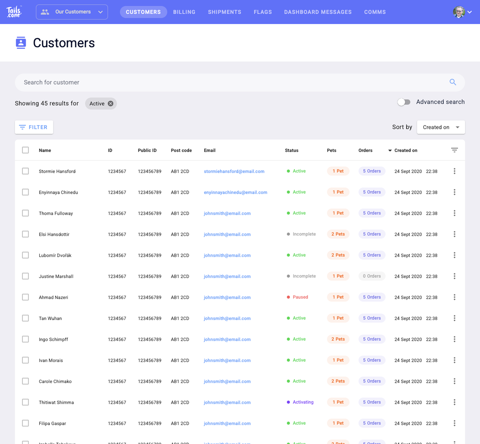
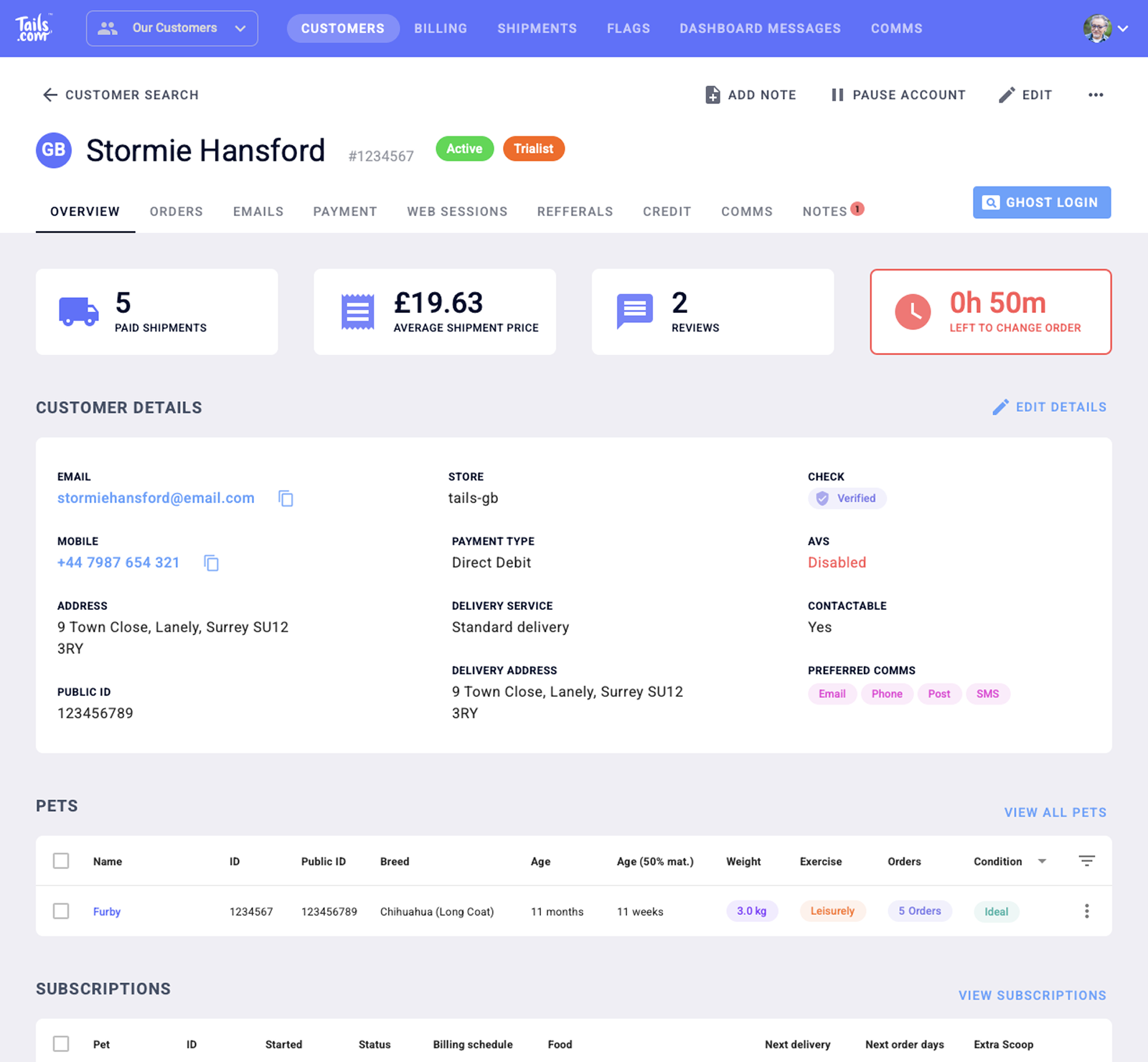
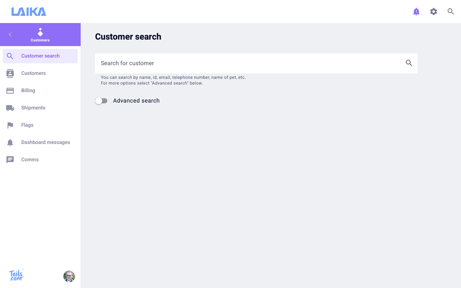
What they had to work with
To understand the issues, I spent time sitting with customer support staff during live calls, observing first-hand where the system was slowing them down. I also spoke with team members to understand their frustrations, alongside engineers to uncover the constraints behind the existing setup.
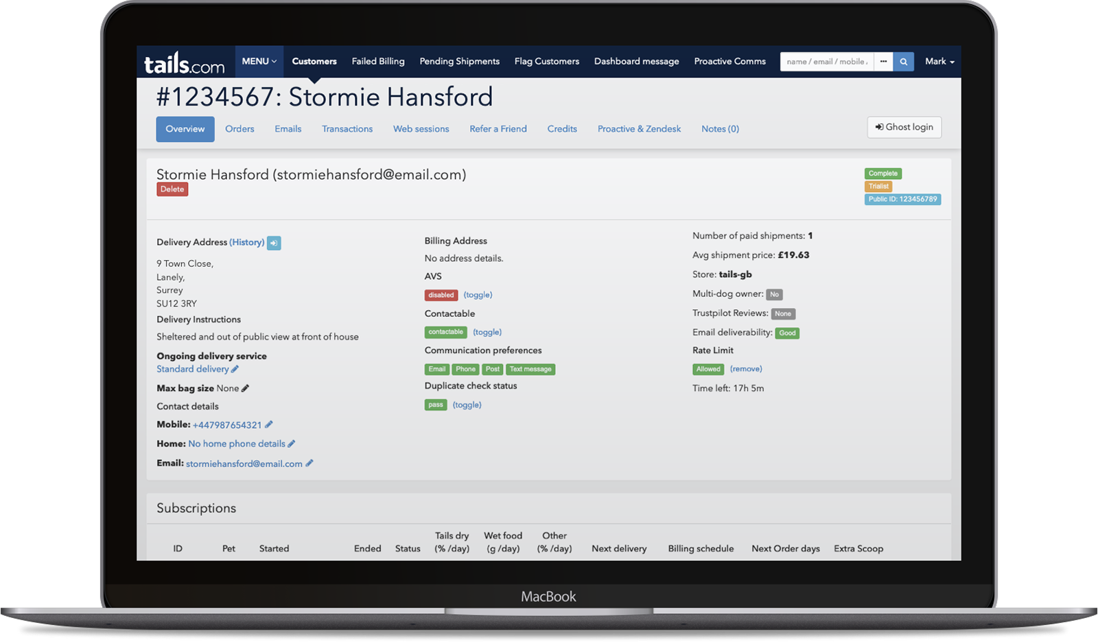
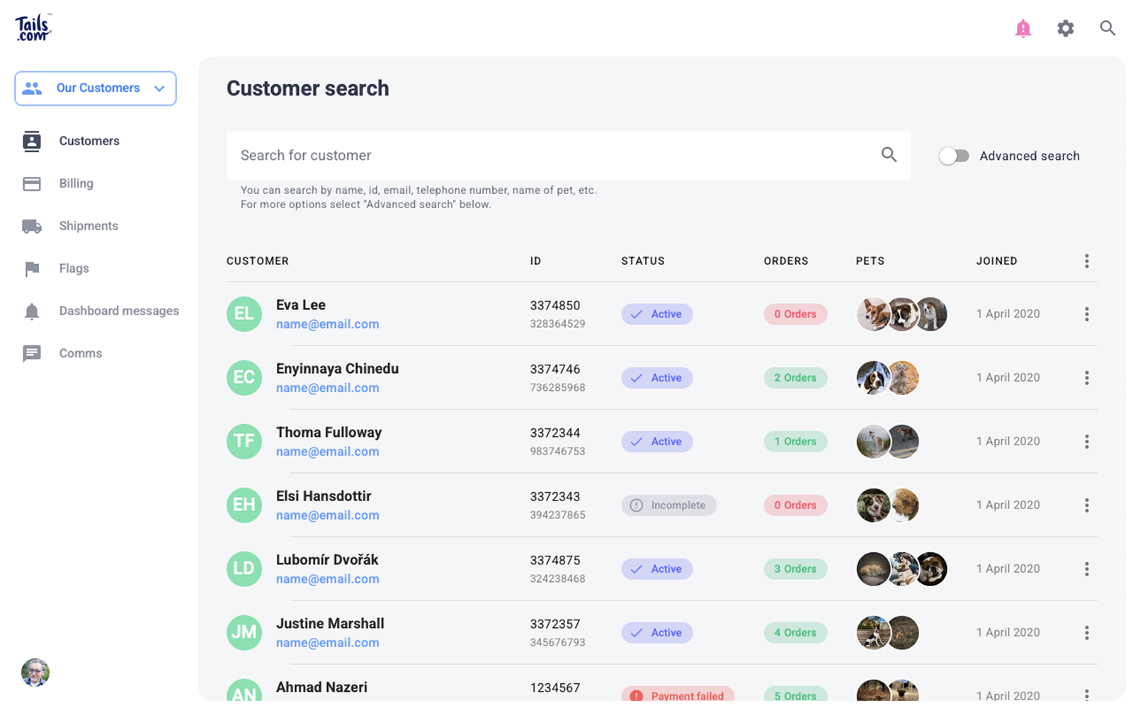
The interface prioritised completeness over clarity. Important customer information was spread across multiple sections, visual hierarchy was weak, and patterns were inconsistent, making it harder for agents to quickly understand a customer’s situation or take action.
This was especially problematic in a support context, where speed and accuracy are critical. While there were clear opportunities to improve the experience, the system was tightly coupled and difficult to change structurally, limiting what could be done without significant engineering effort.
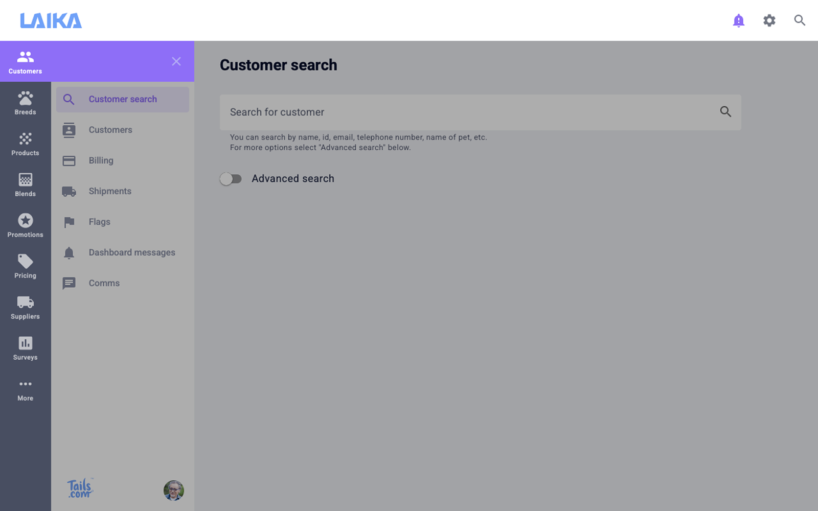
After observing these issues first-hand, I mapped the underlying structure of the system, including its hierarchy and key navigation paths, to understand how information was organised. What initially appeared manageable revealed a deeply nested and fragmented setup, making it difficult to navigate and understand relationships between data.
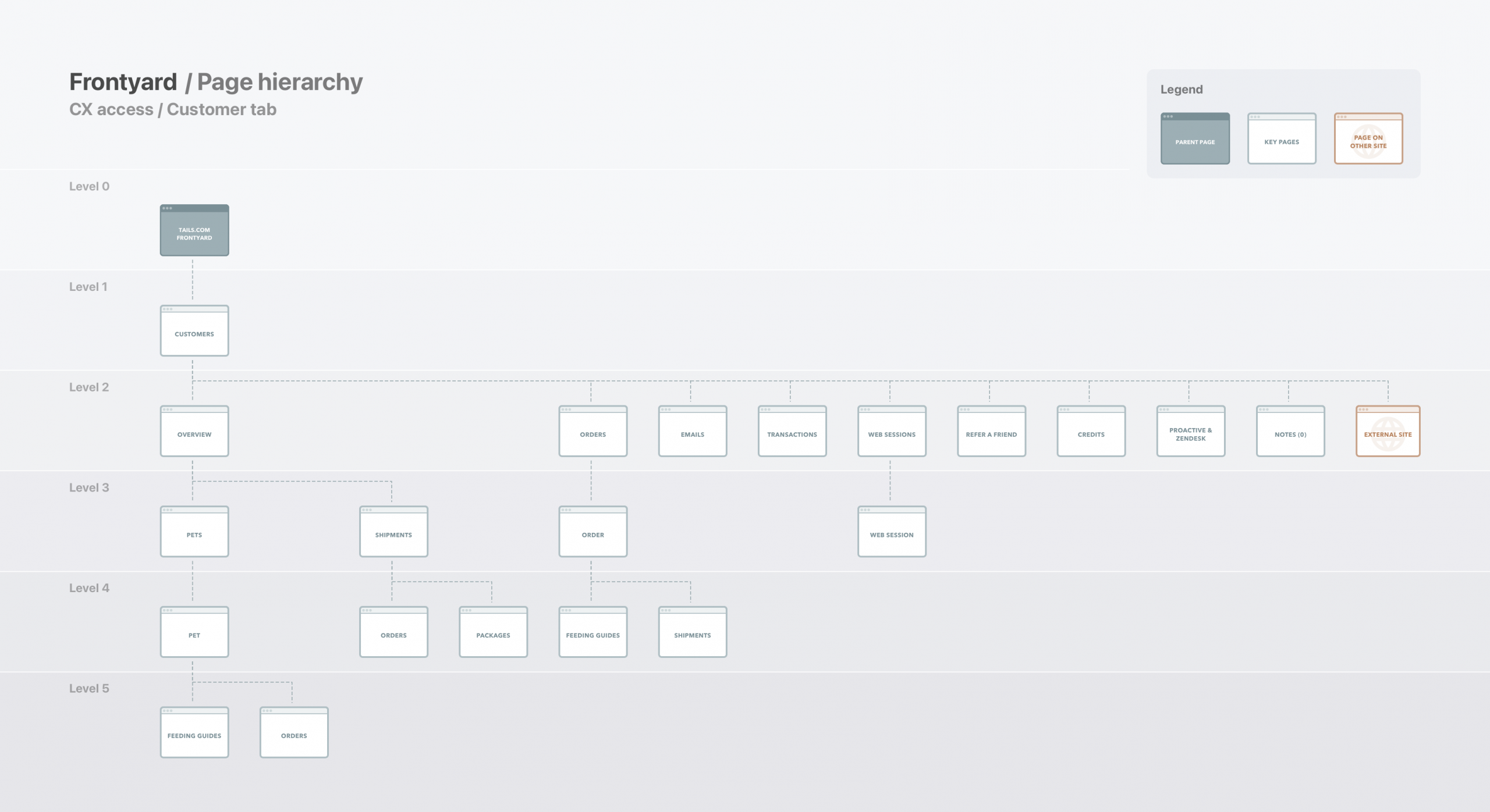
Beneath the interface sat a deeply nested and fragmented structure, making it difficult to navigate and understand how things connected.
Phase 1 – Reskin
Same content, better experience
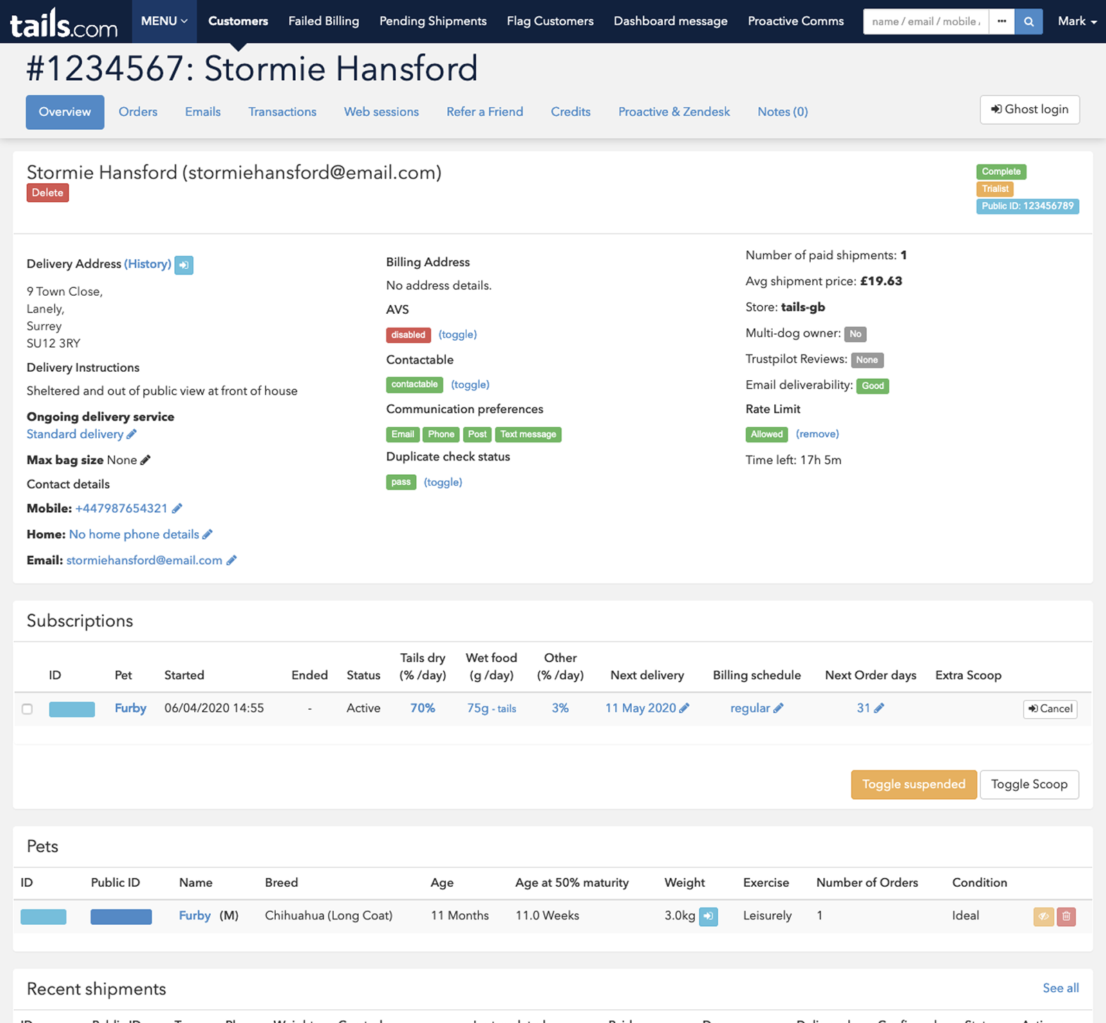
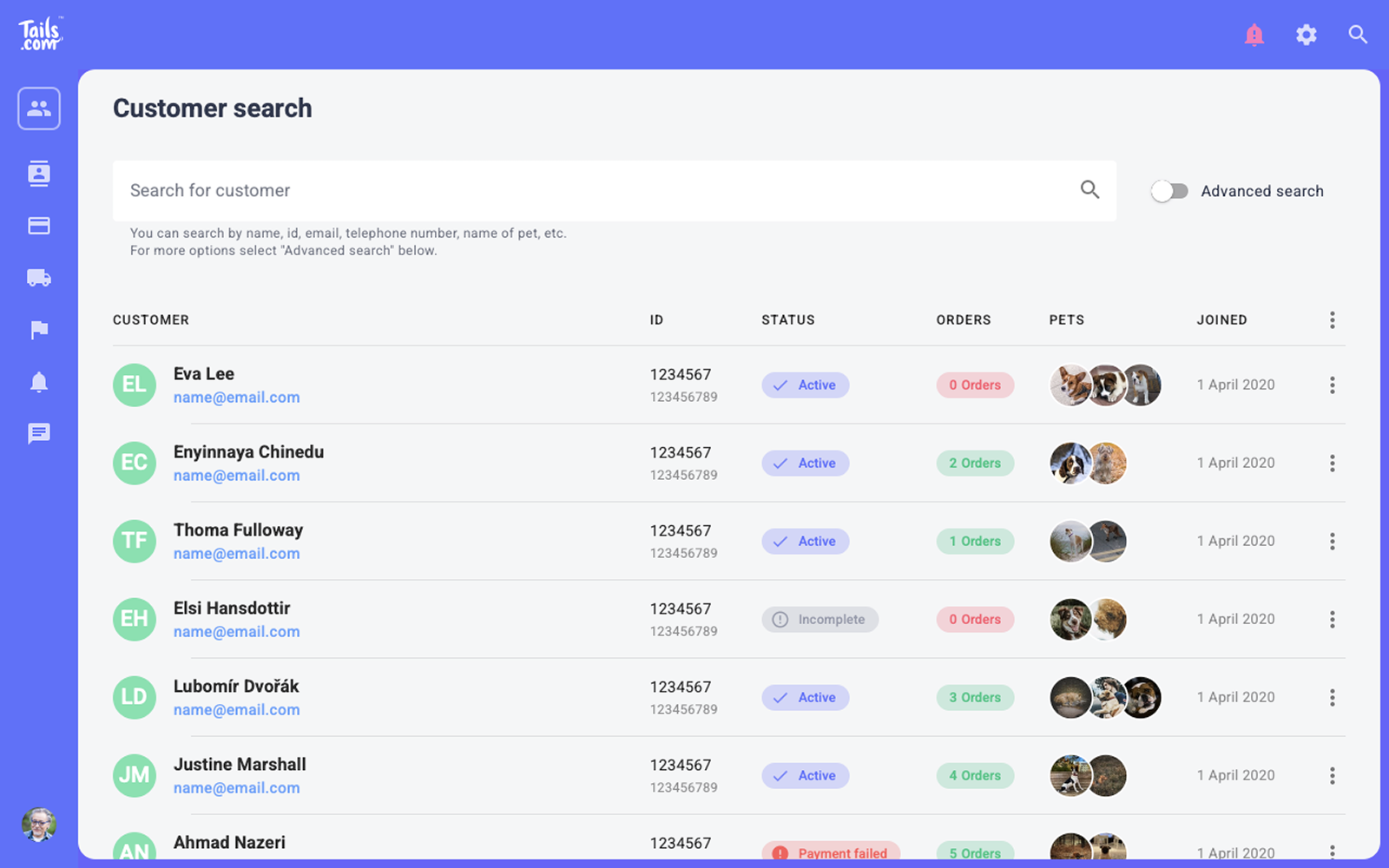
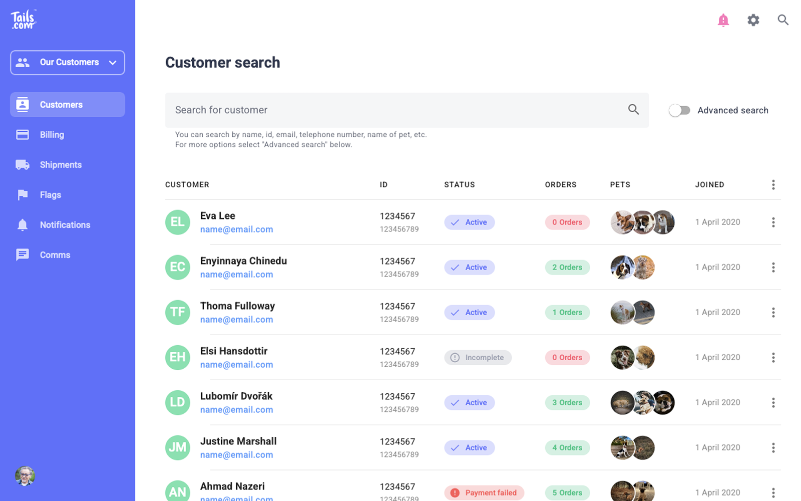
Given the technical constraints, the first step was to improve the experience without changing the underlying structure. The goal was to make meaningful usability improvements within what was realistically achievable.
This focused on:
-
Strengthening visual hierarchy to make key information easier to scan
-
Introducing more consistent UI patterns across screens
-
Reducing visual noise and improving readability
These changes addressed many of the issues raised by support staff and made the system easier to use day-to-day, without requiring significant engineering effort.
Phase 2 – Rethink
How do we make it even better?
With the immediate usability issues addressed, I explored a more fundamental redesign of the system, focusing on how it could better support support workflows without the limitations of the existing structure.
This included:
-
Grouping related information more logically
-
Prioritising the most important data and actions
-
Simplifying navigation and reducing cognitive load
This direction moved beyond visual improvements, rethinking how the system was organised and used. While it would have required a more significant rebuild, it demonstrated how the experience could be improved more fundamentally.
Outcome
What changed
The initial improvements made the system easier to scan and use day-to-day, reducing the time needed to find and understand key customer information during support calls.
More importantly, the work helped clarify the limitations of the existing setup and provided a clear direction for how the CRM could evolve to better support support workflows over time.