Working closely with their in-house marketing and design team I helped In-Sync to create a more user-focused digital experience.
Understanding
What was the current situation?
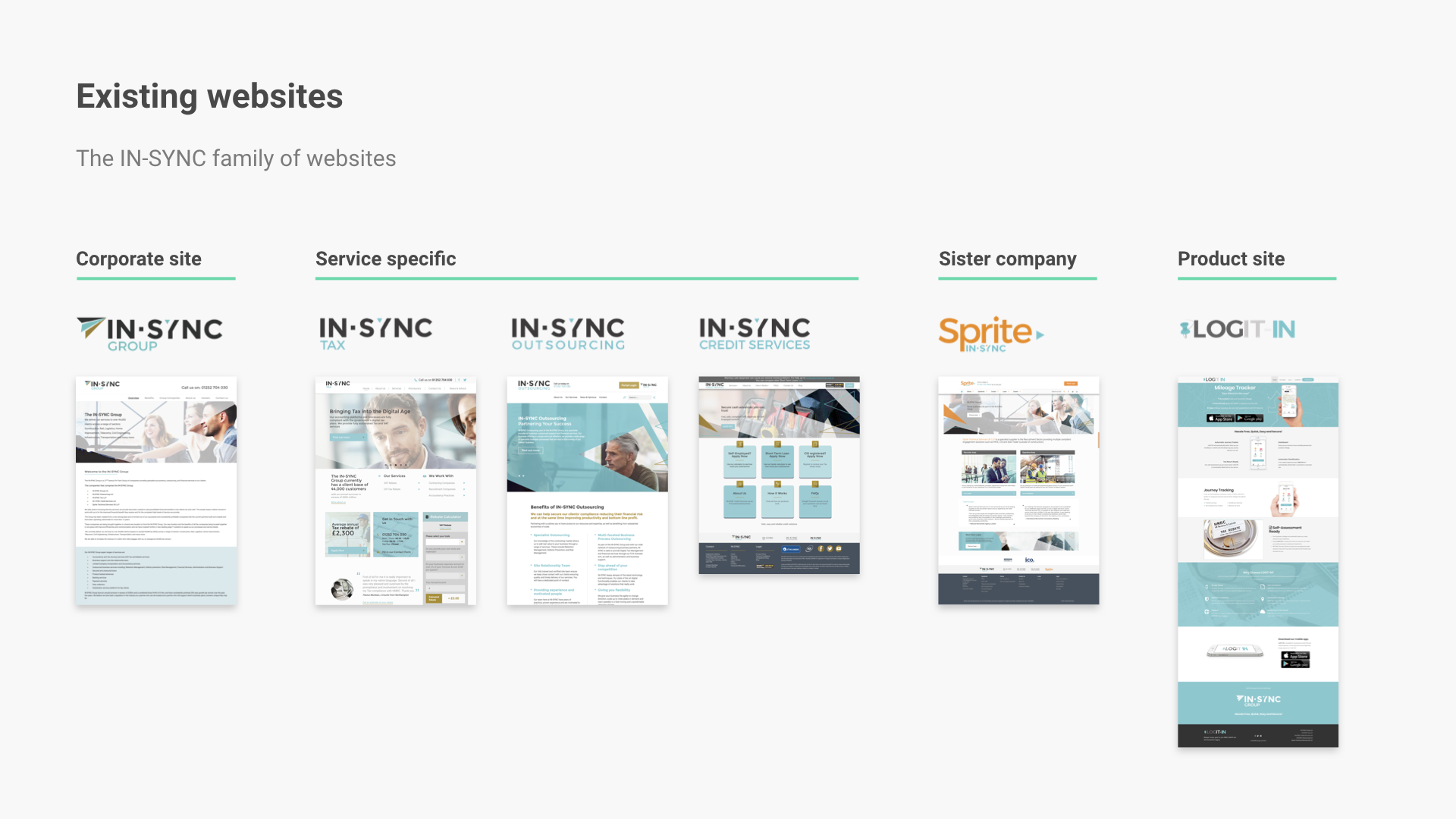
To get an understanding of the current state of affairs, I first had to get myself up to speed on what the company did, the services they offered, where they were going and what competition they had. Luckily I had direct contact with some key stakeholders and senior staff, so this part was pretty painless.
I then thoroughly researched their existing online presence and provided a detailed audit to help us identify where and how we could make improvements.
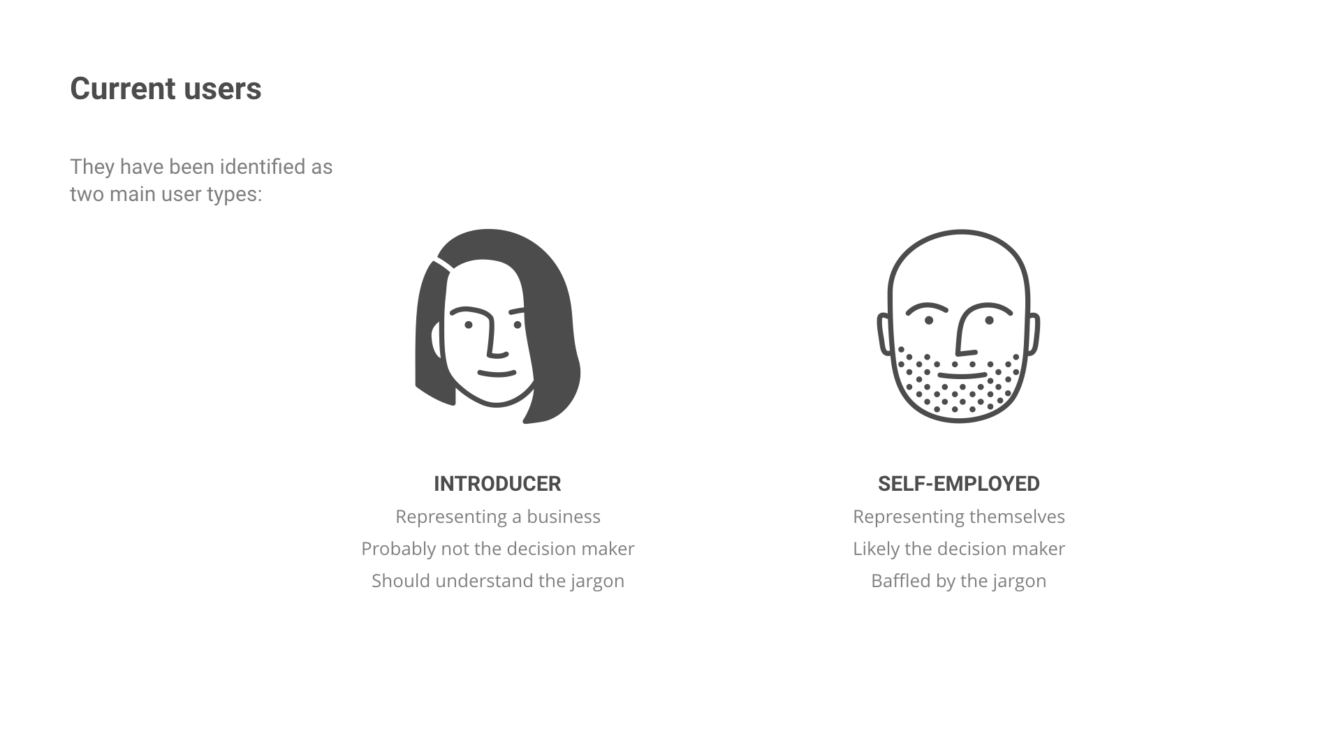
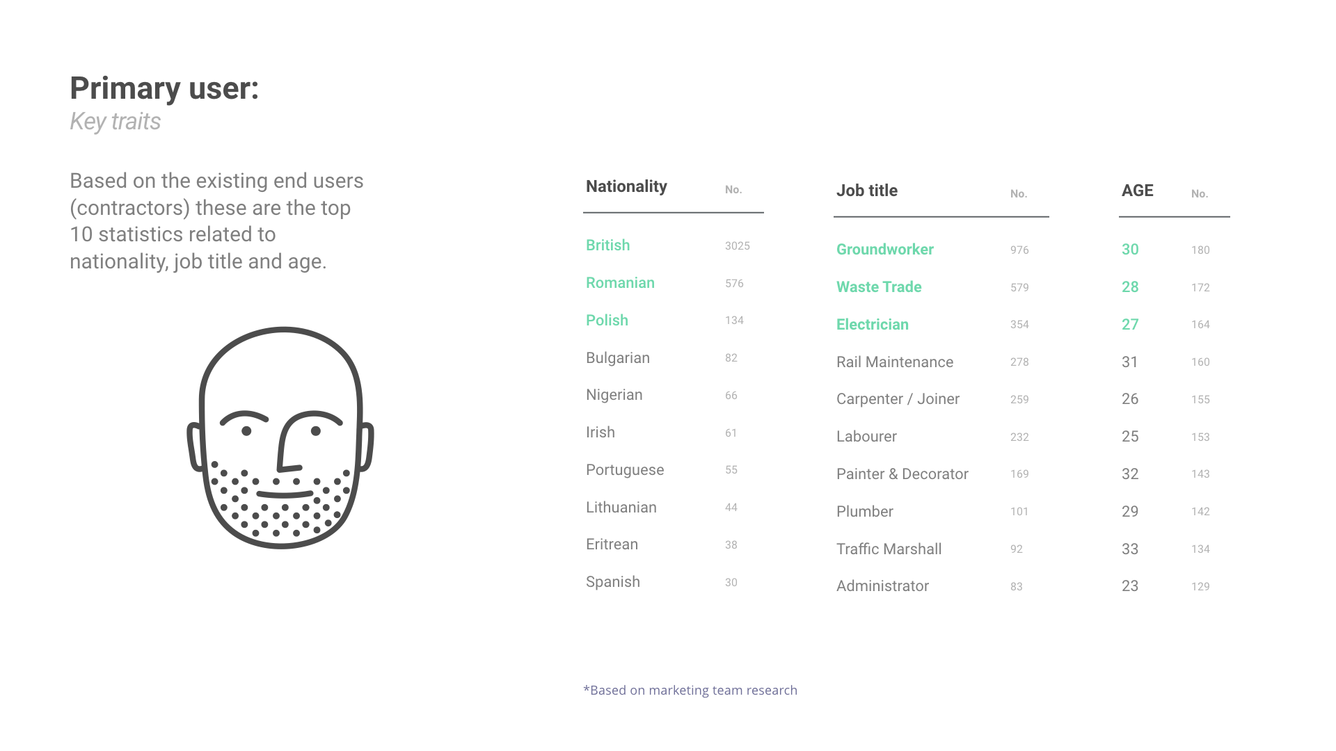
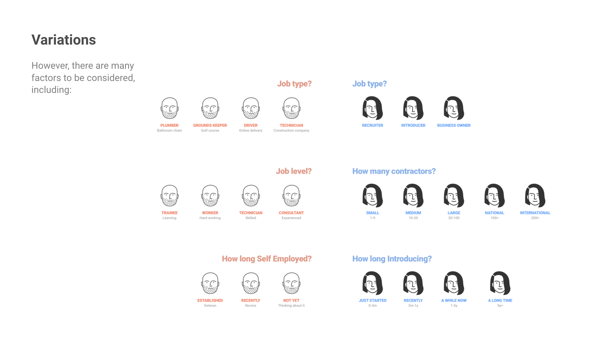
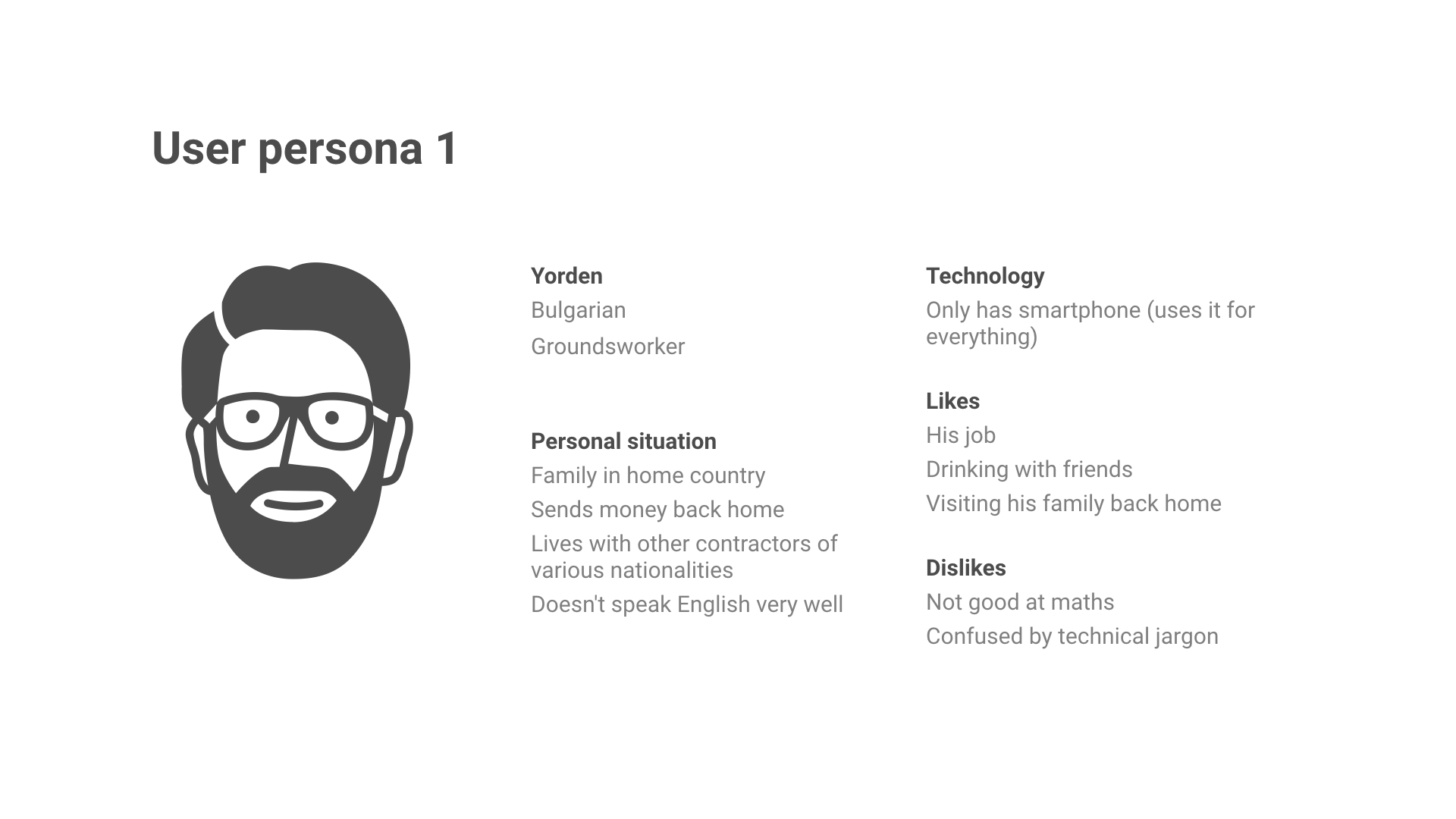
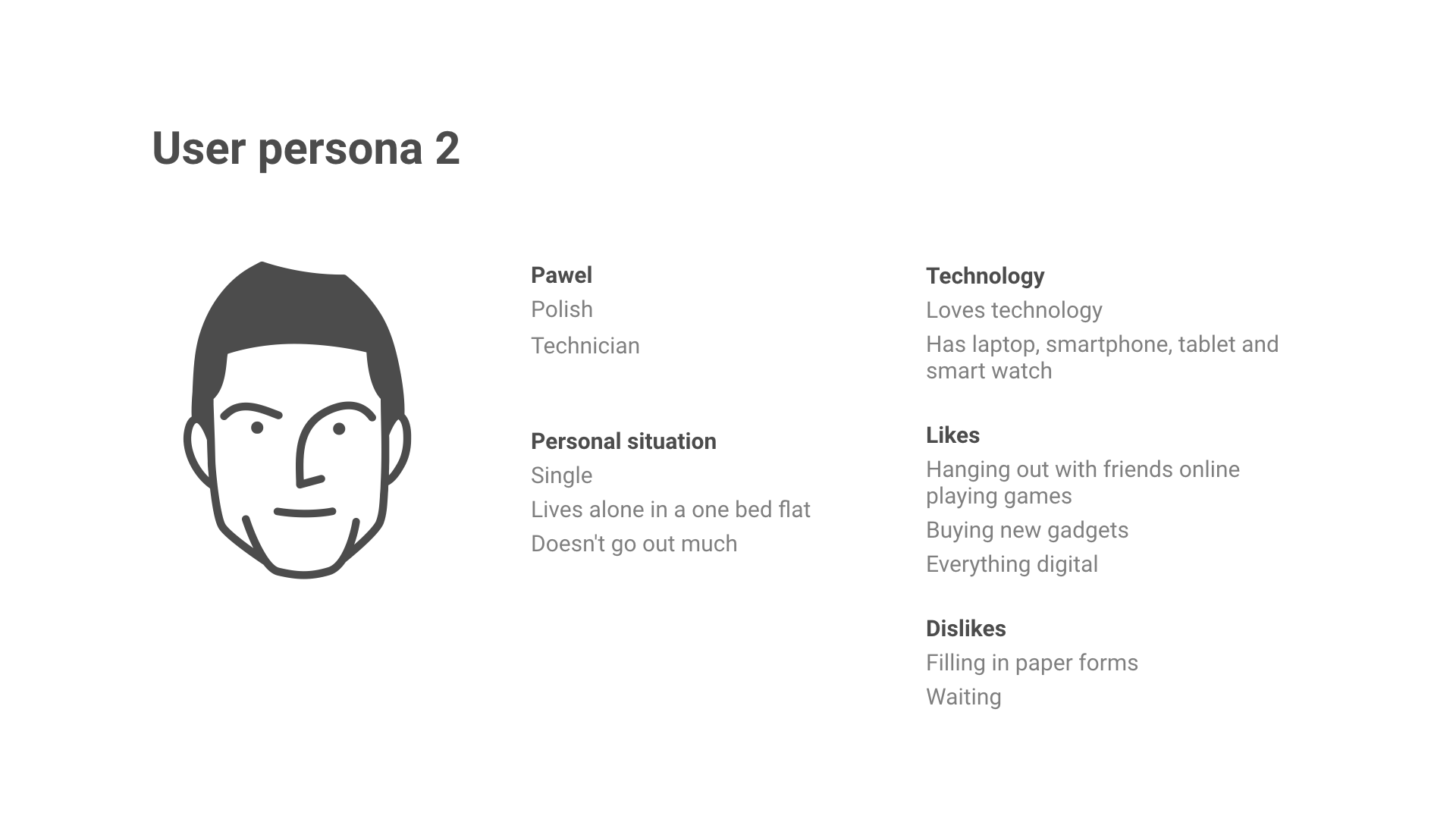
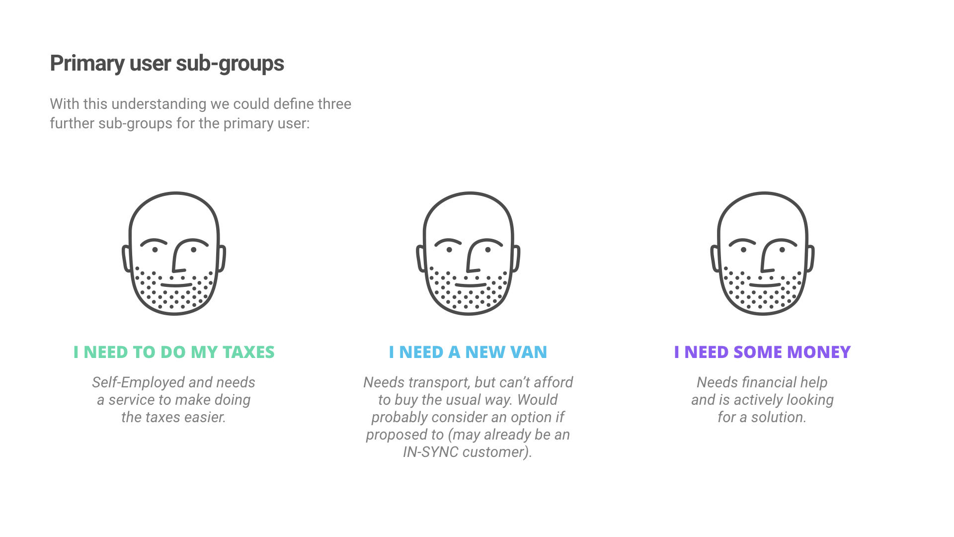
User research
Getting to know the customers
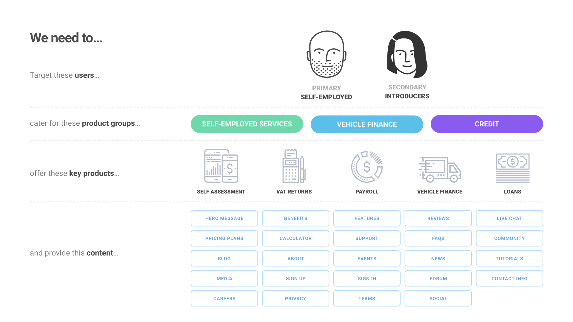
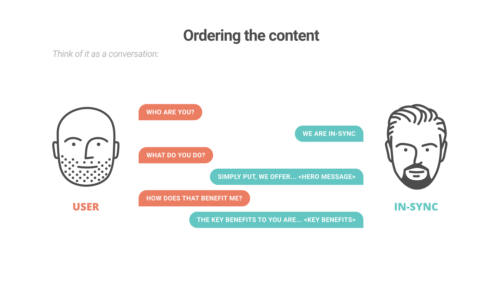
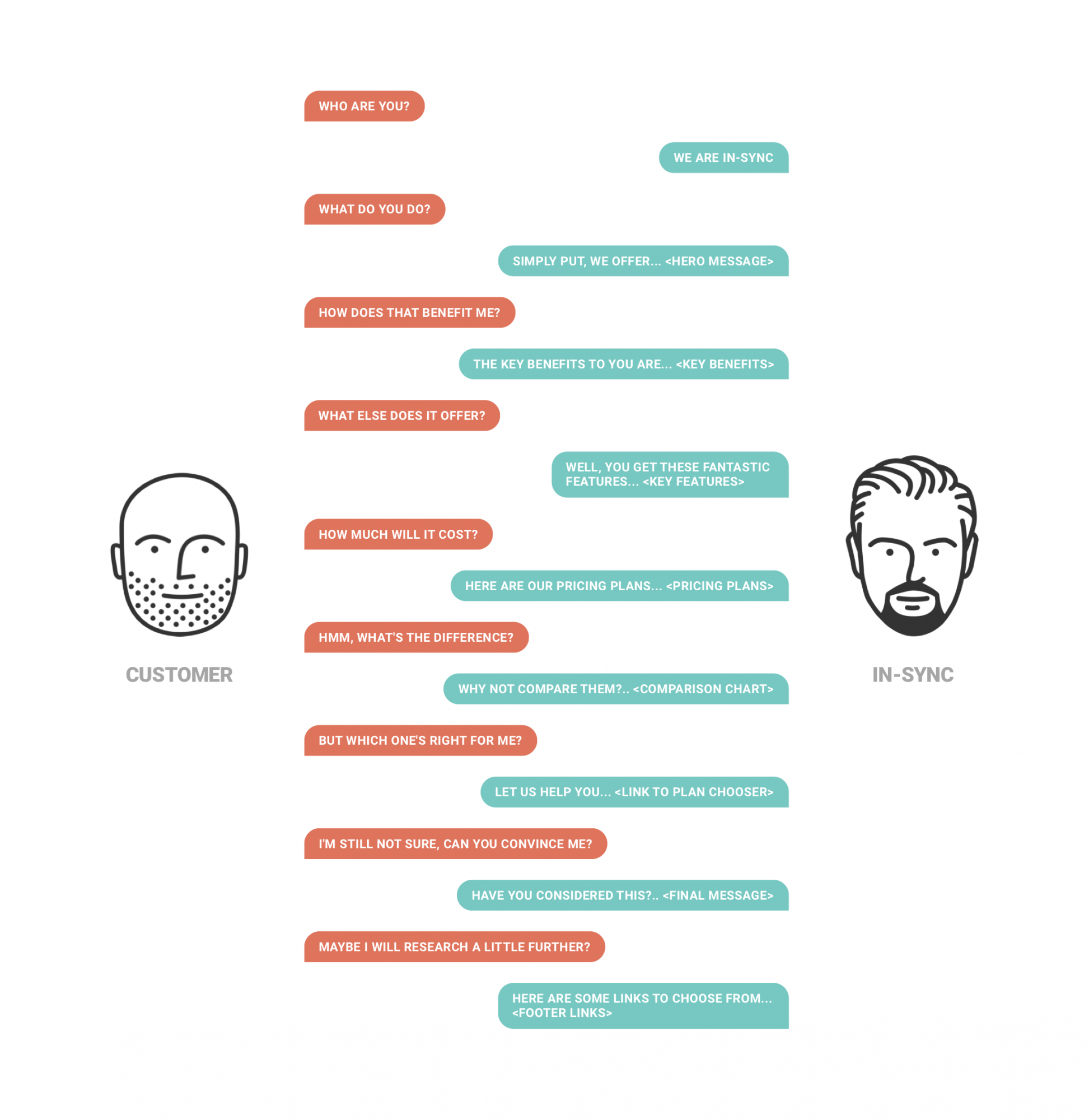
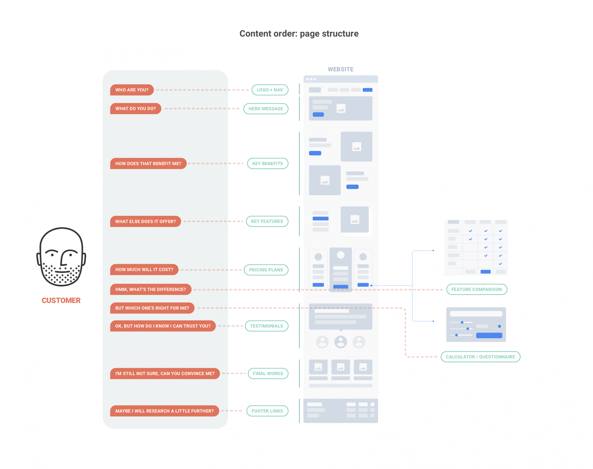
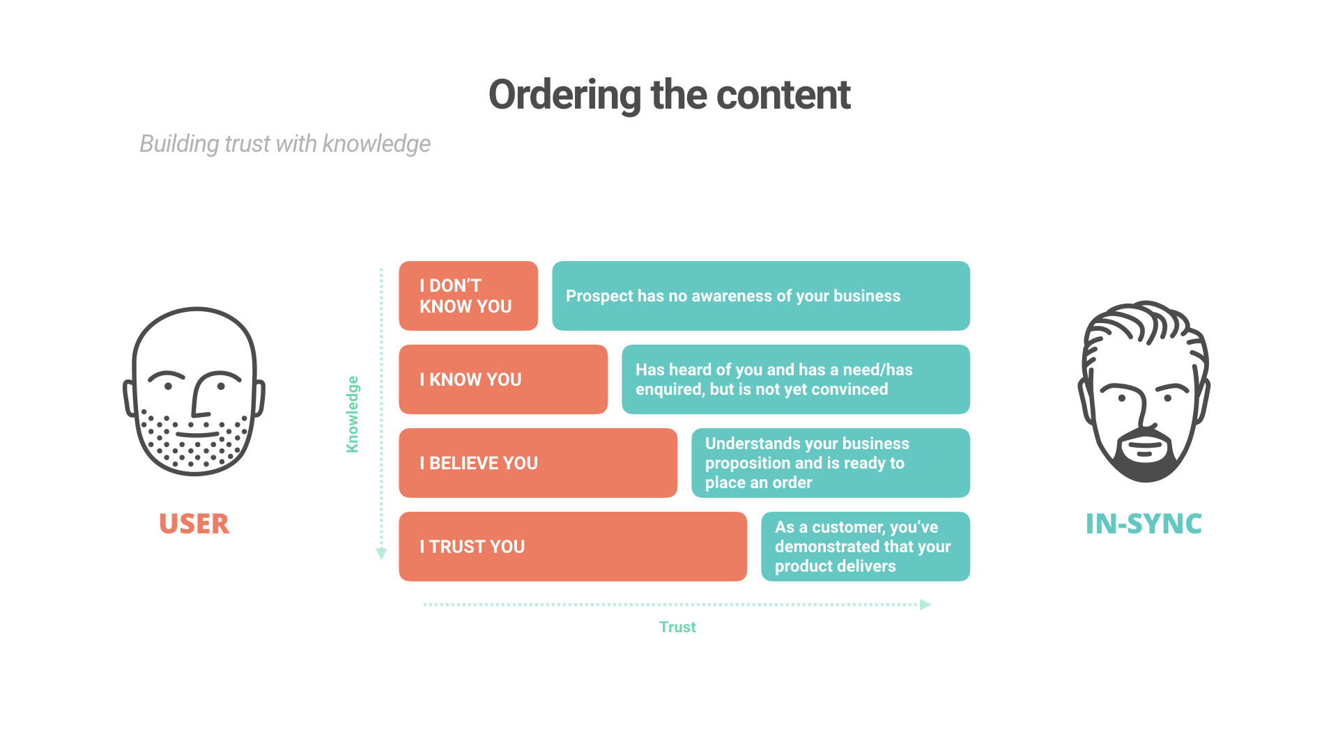
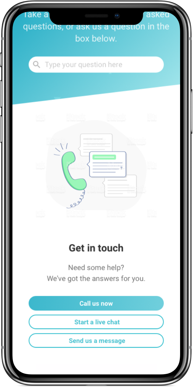
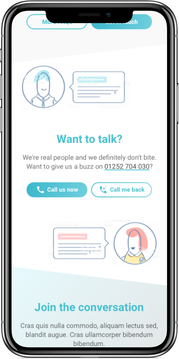
The content
What the customer wants to know
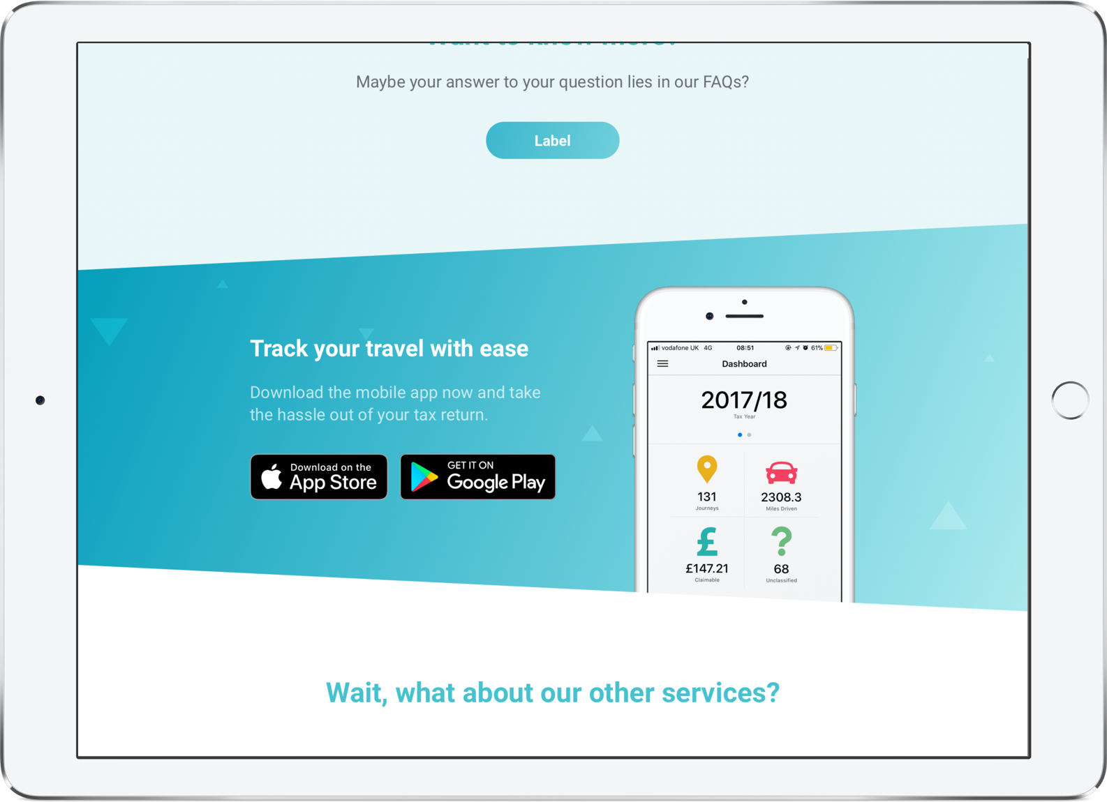
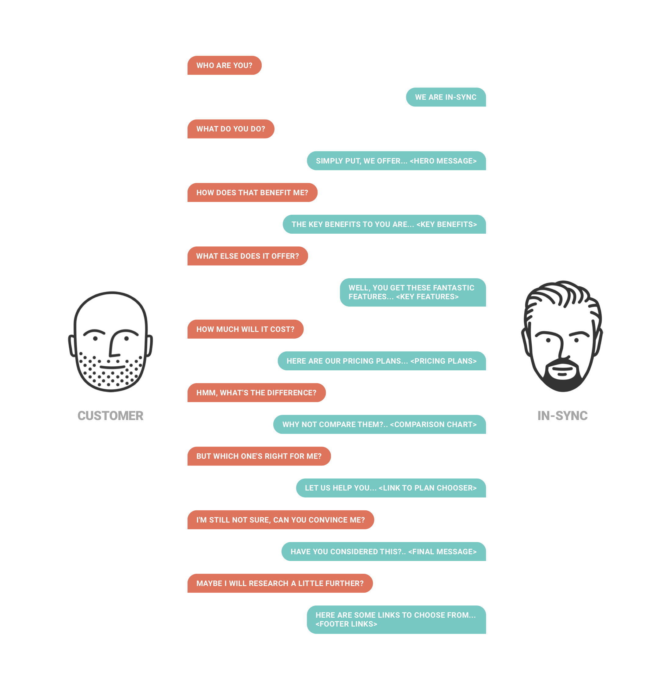
Like many company websites the content suffered from ‘information overload’ and a LOT of industry jargon that can be overwhelming for a potential customer. The content needed simplifying and organising in a way that would lead the customer through their journey in a more natural way.
To better understand this journey I scripted out a conversation as if the customer were inquiring about the company through a conversation (focusing on the most important issues). This then helped us to structure the landing page in a way that would answer the customer’s questions and lead them all the way through to signing up or getting in touch.
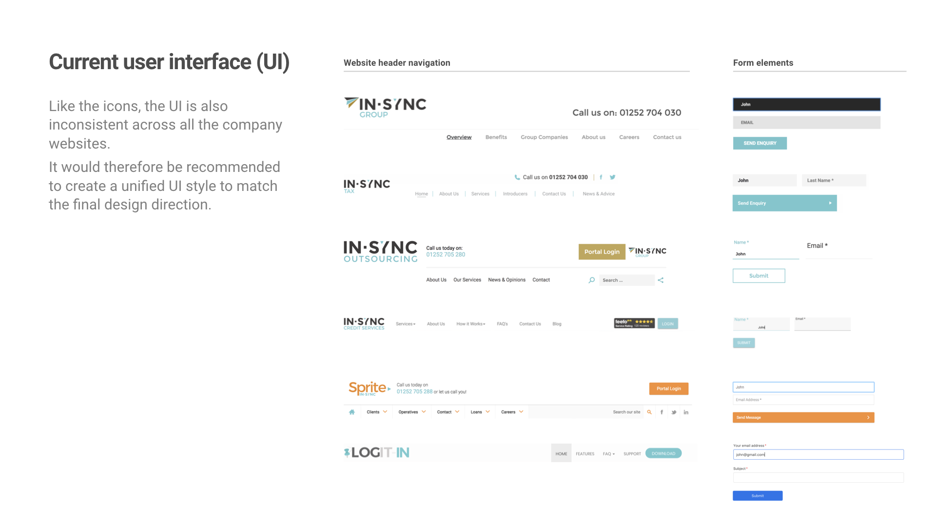
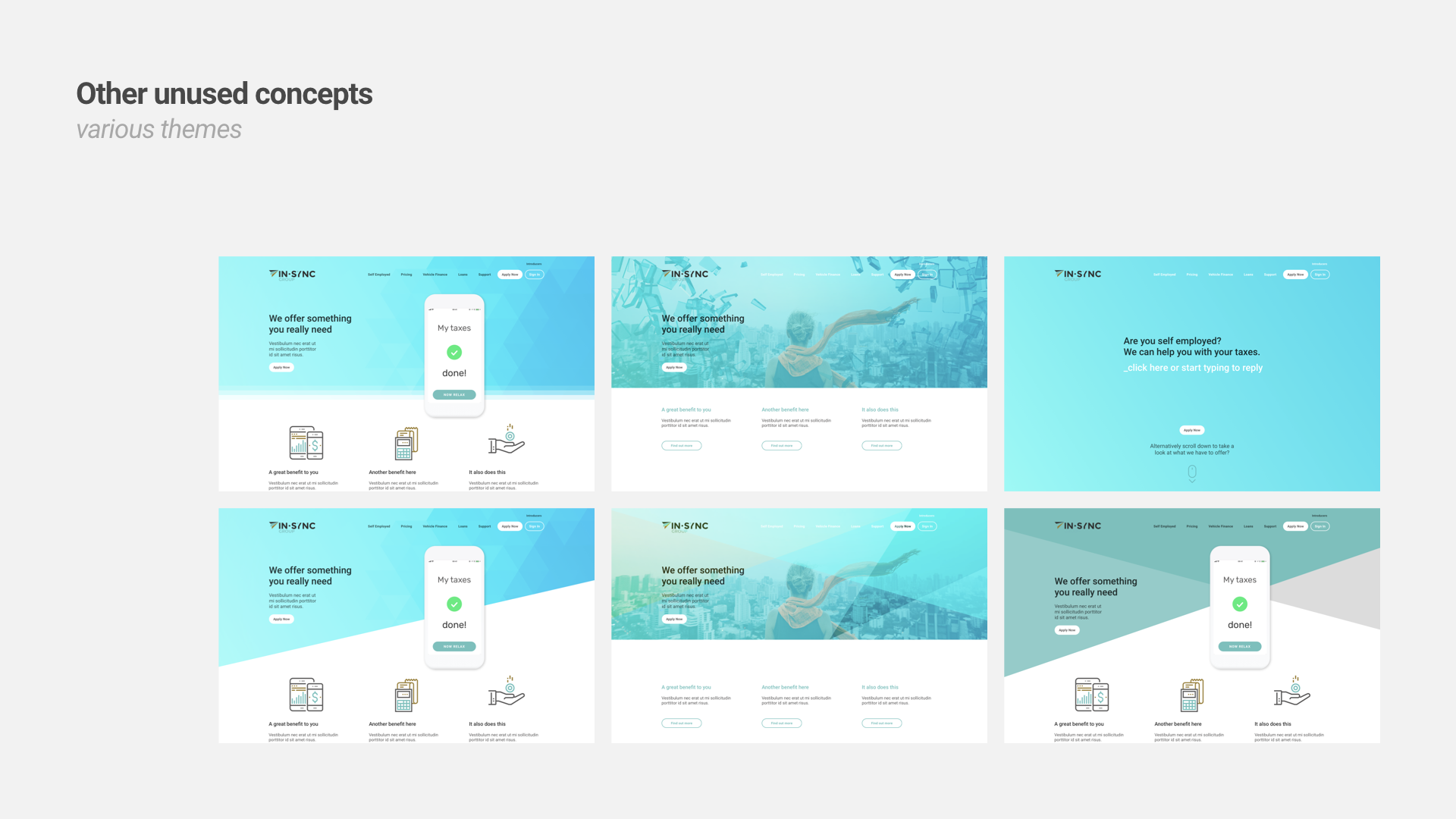
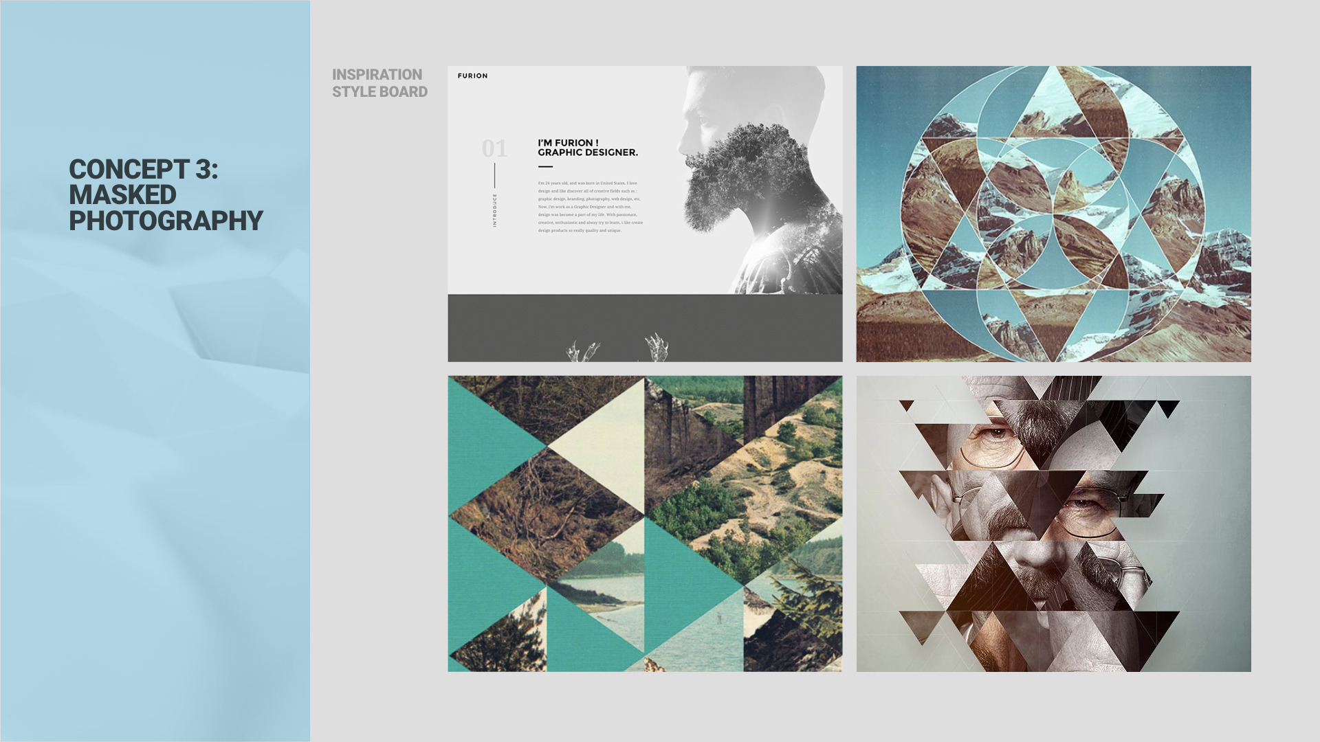
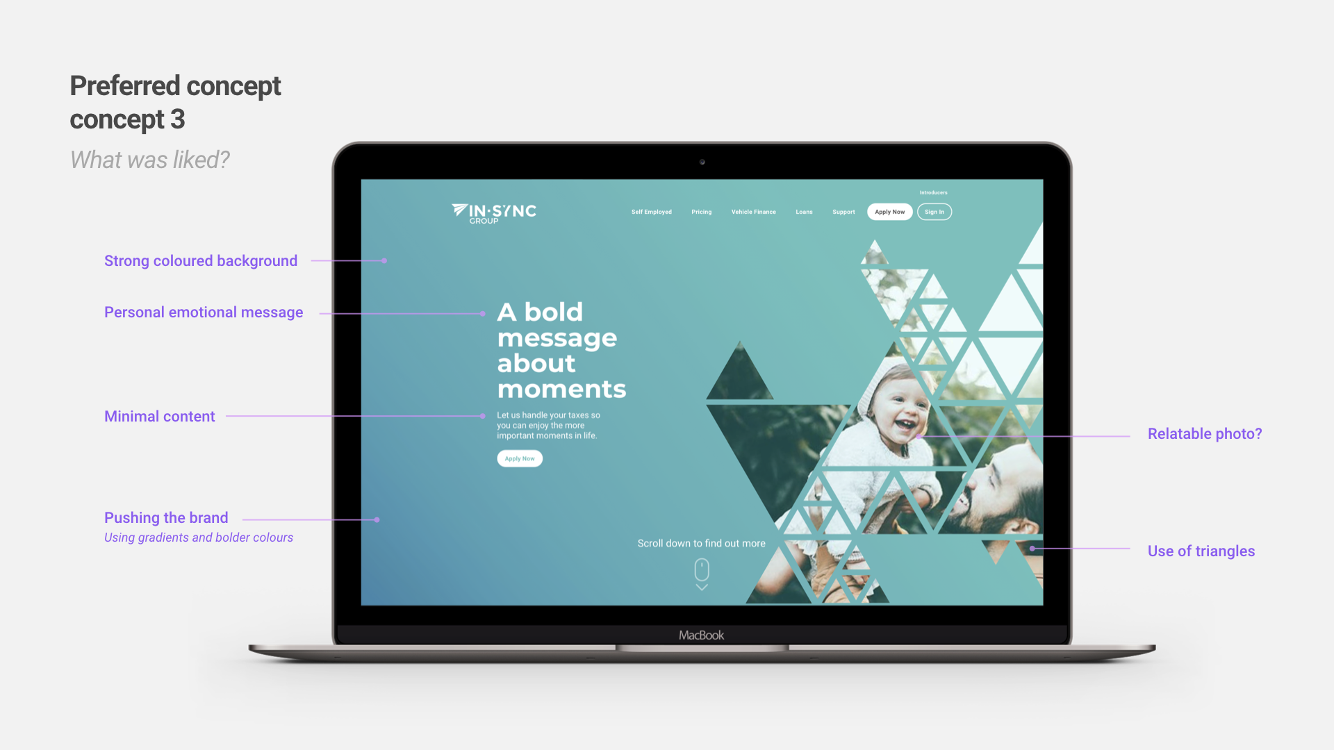
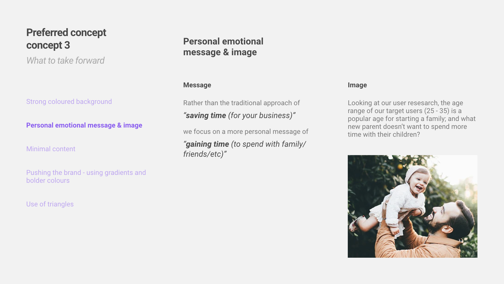
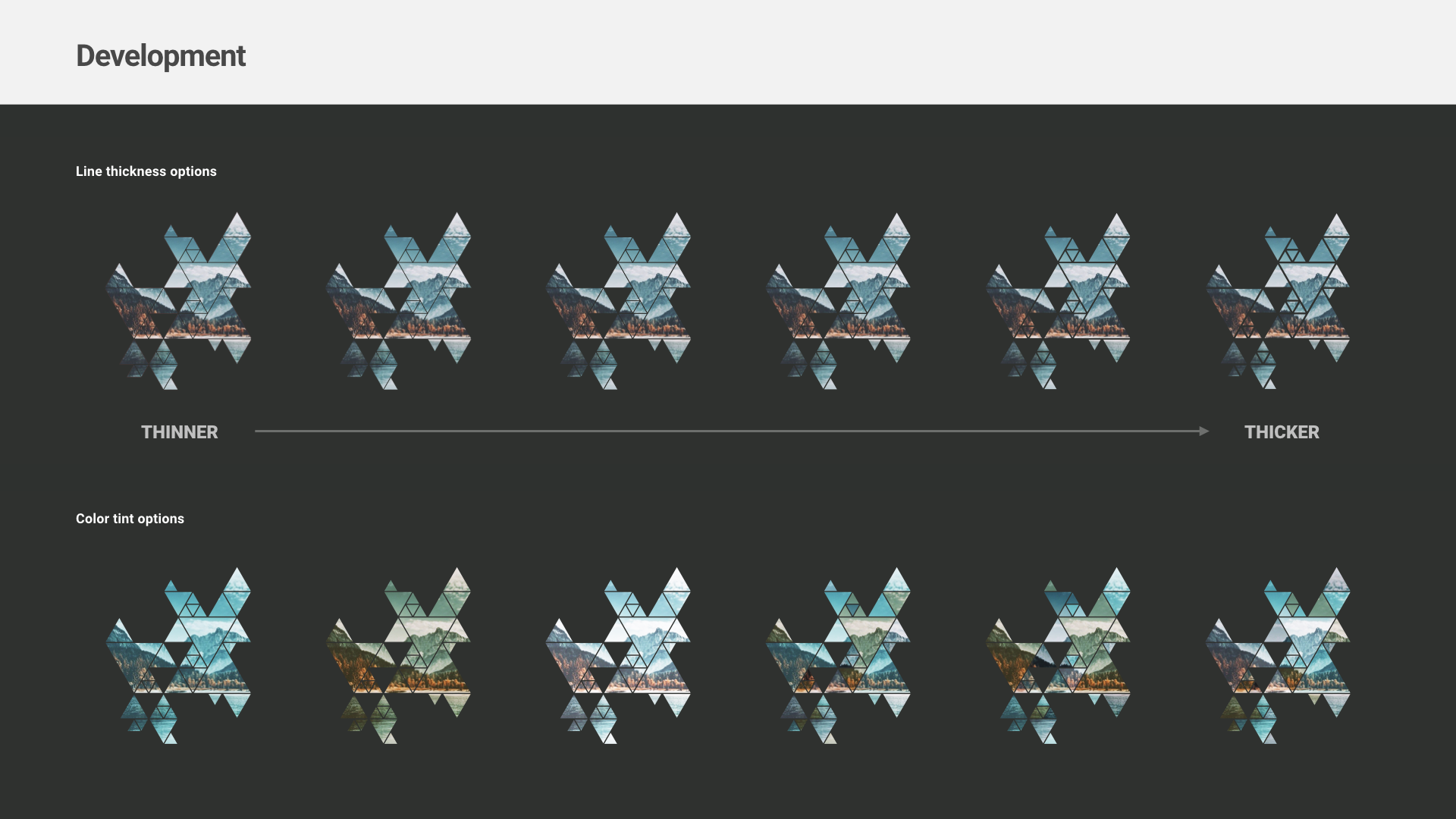
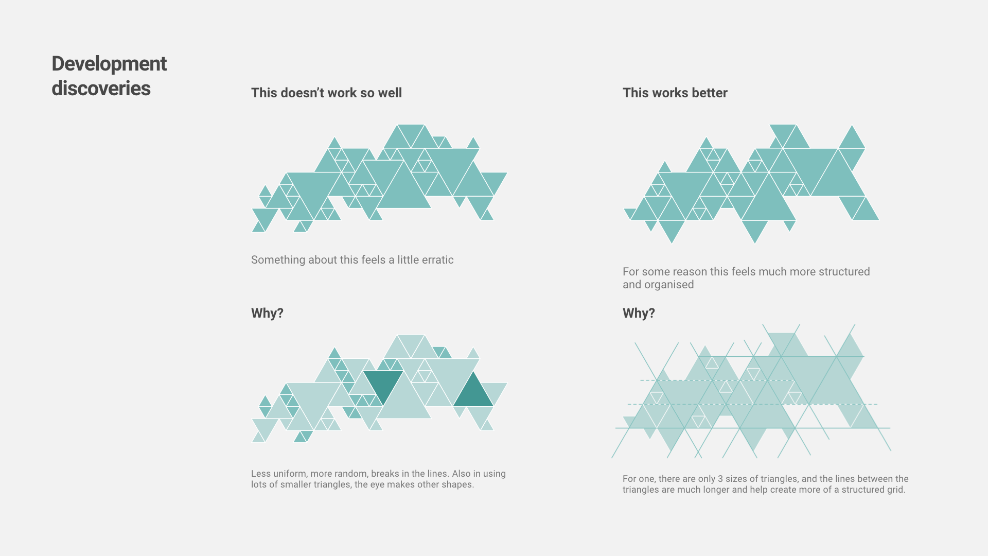
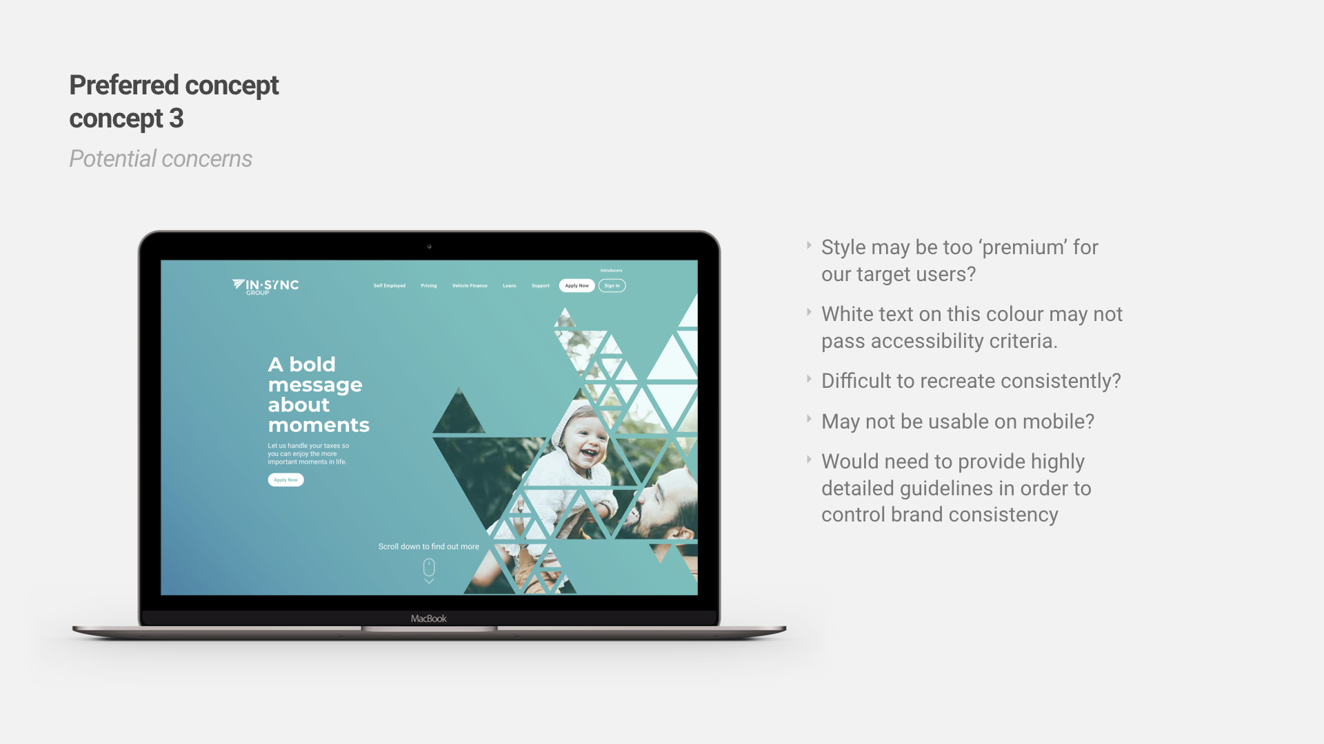
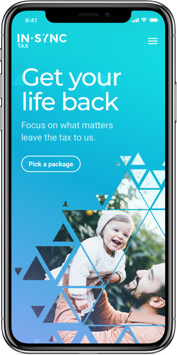
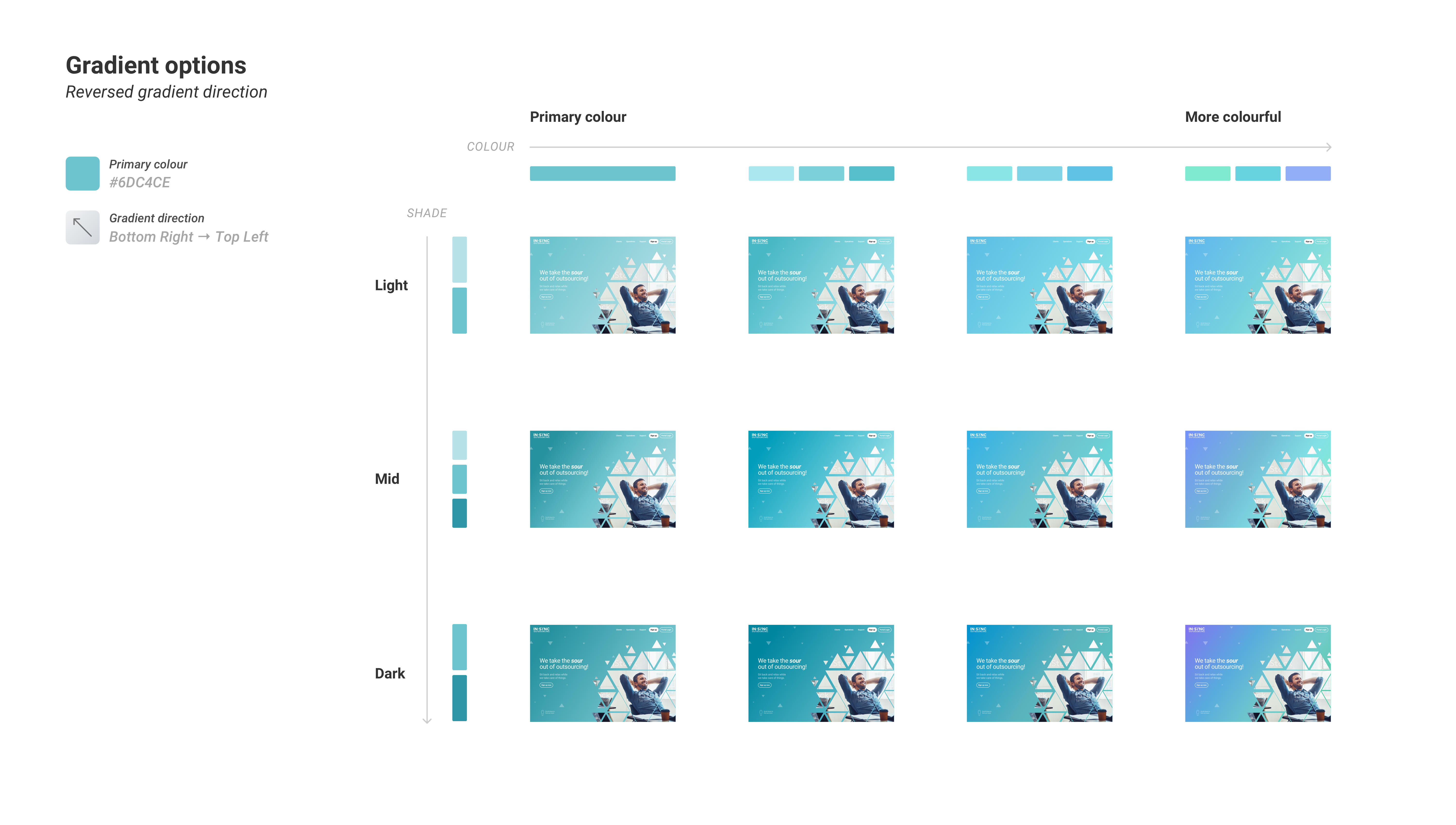
The visual style
Creating the new look
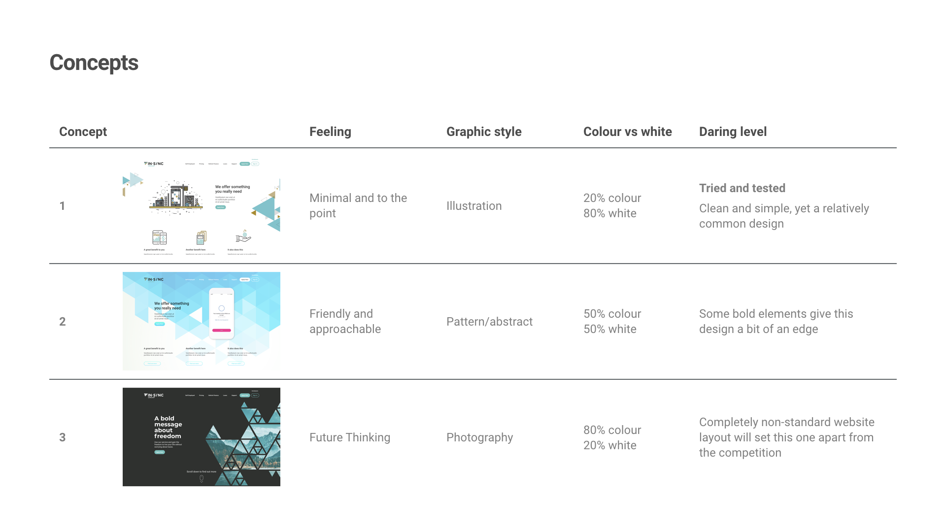
Design
Attention to detail

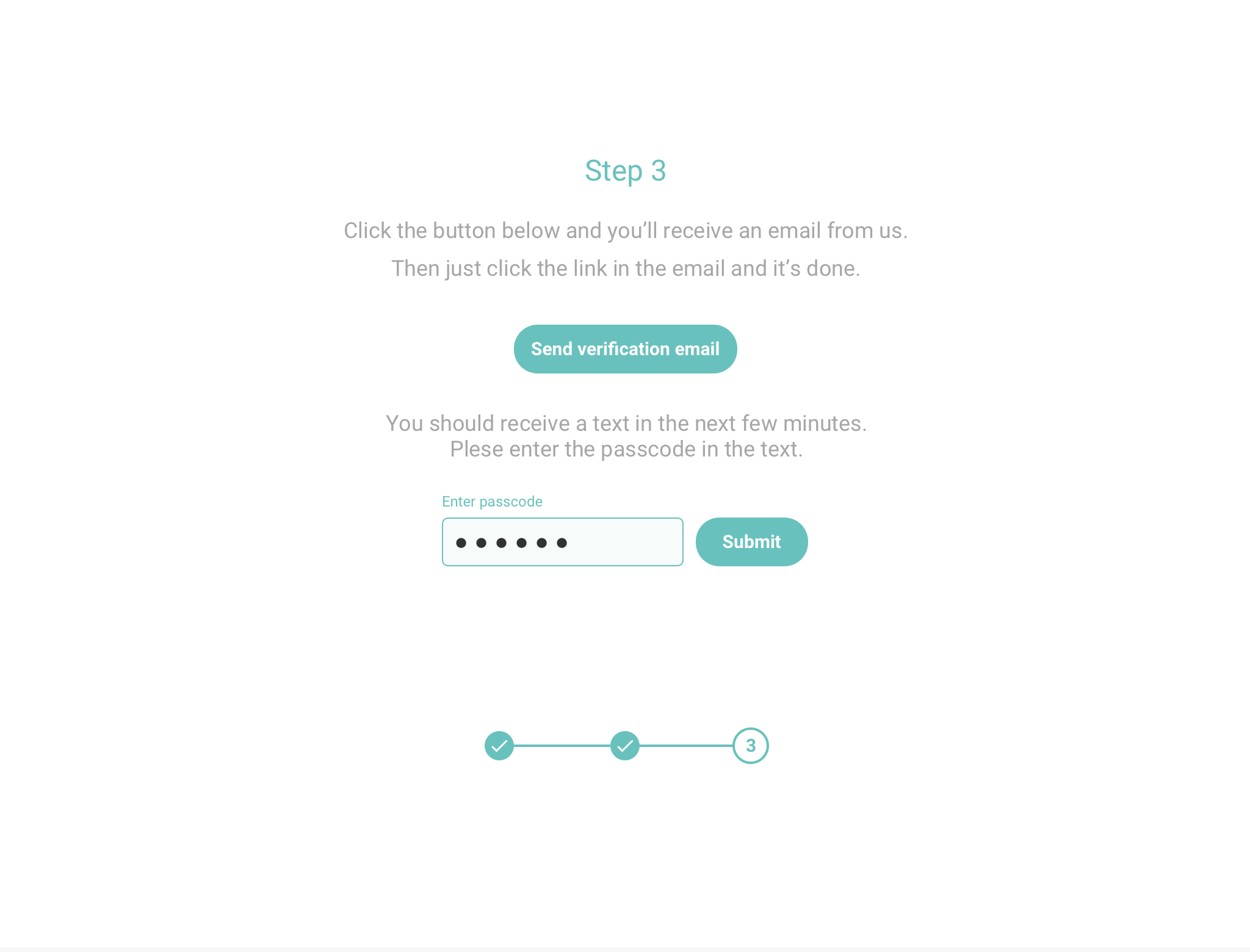
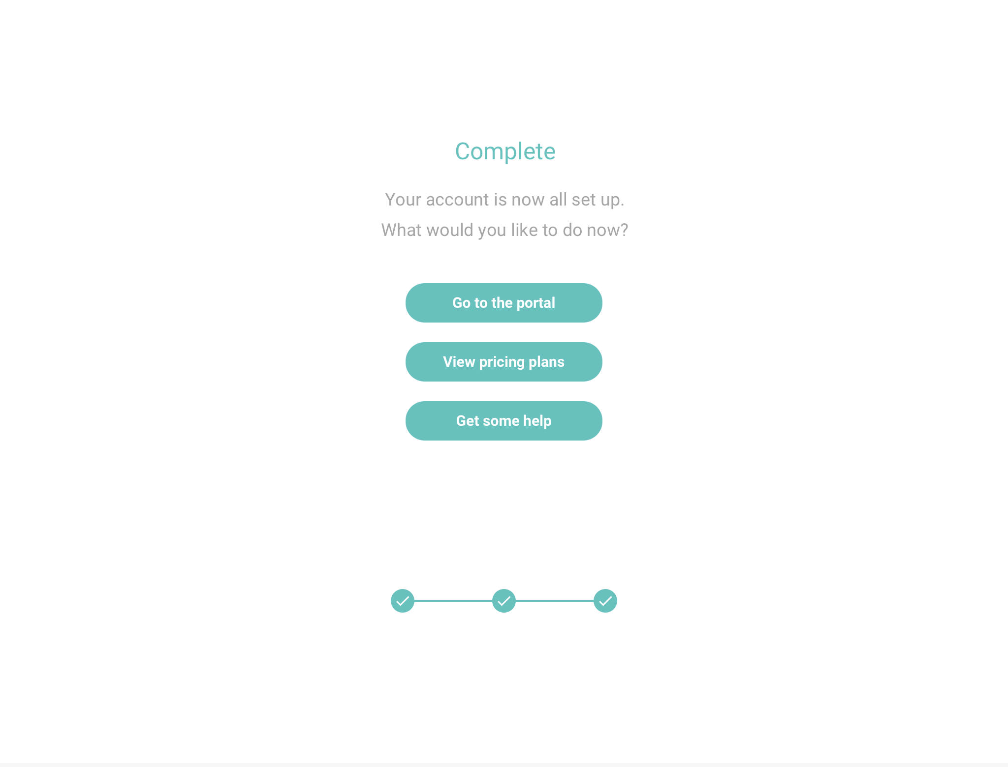
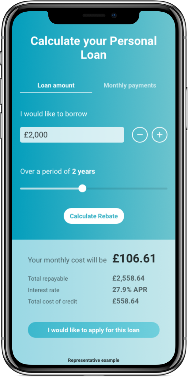
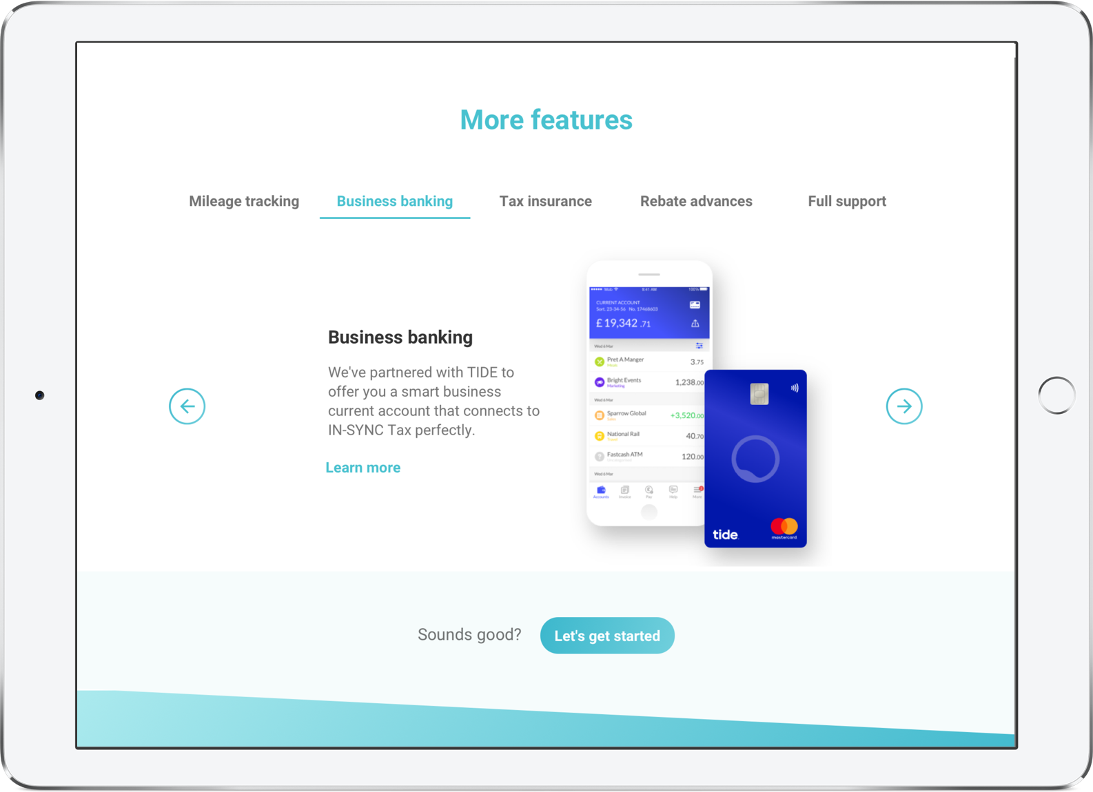
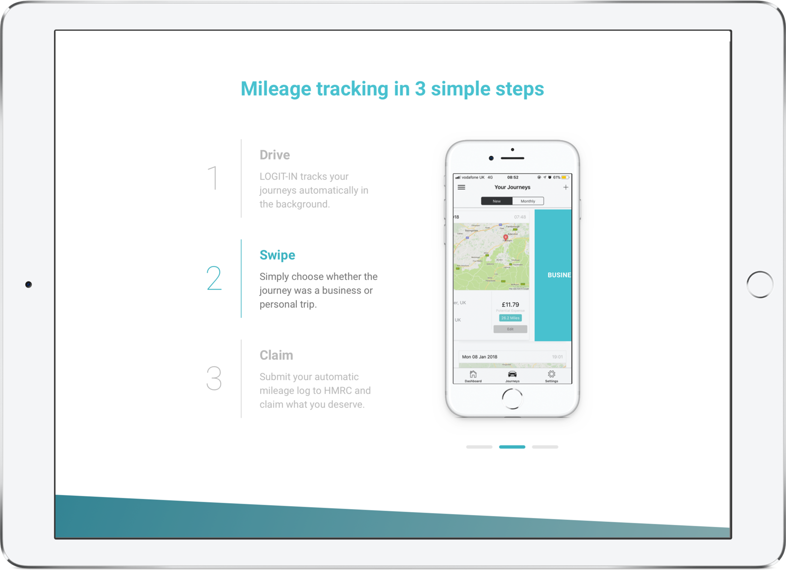
Simplifying processes
Designing for humans
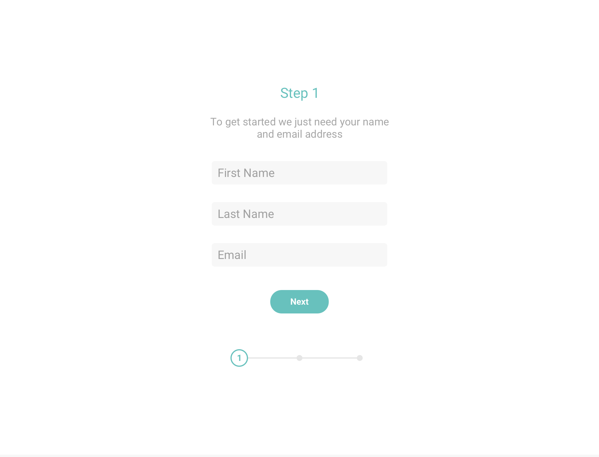
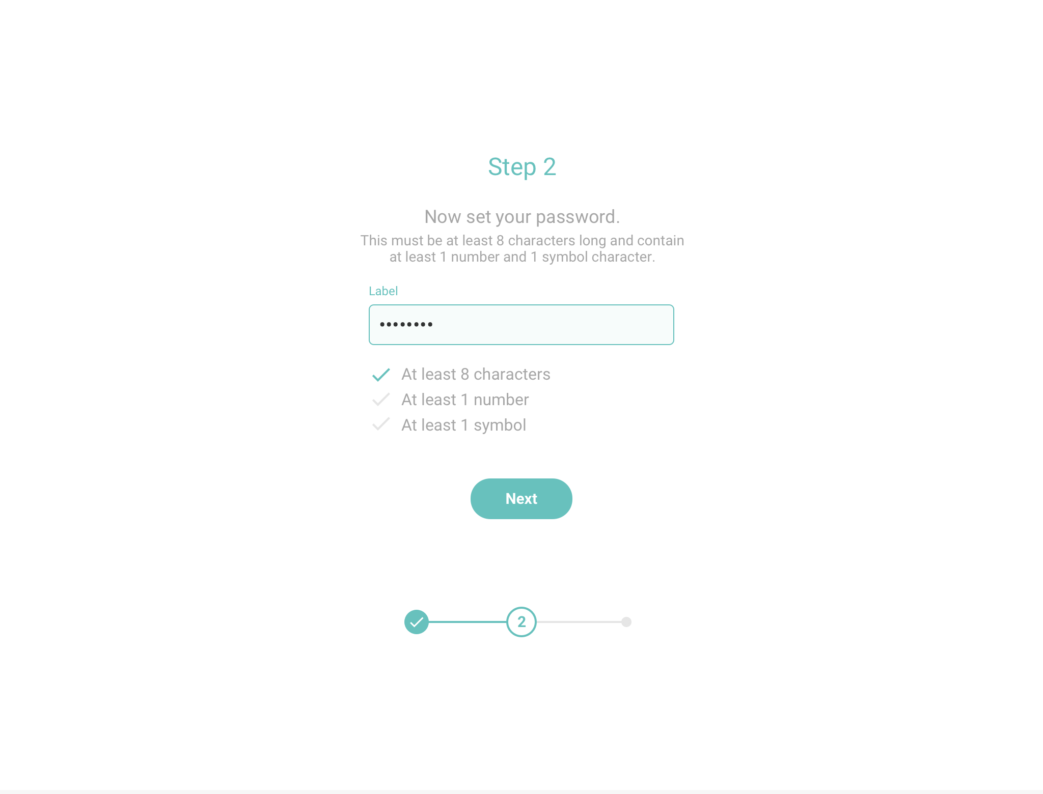
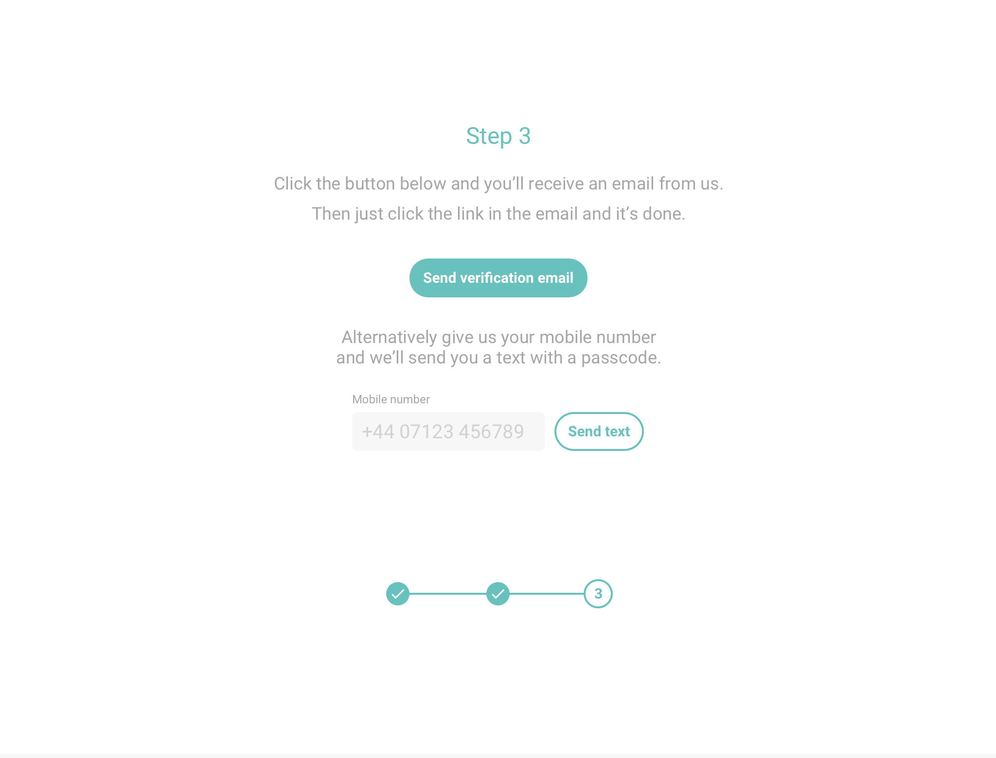
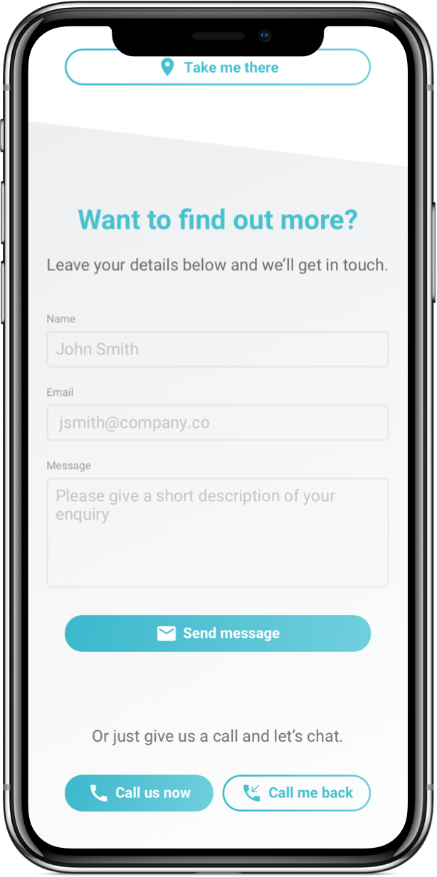
Being a fin-tech company, many of the current forms the user had to fill were lengthy and complicated, with lots of confusing jargon. So we removed what wasn’t essential and simplified what remained, adding helpful hints where required, ensuring there was no confusion for the customer.
The process for a new customer to register, for example, involved providing all their personal information, along with lots of details about their financial situation. In our approach the customer would only need to provide their contact details to register, getting them on the system, giving them the flexibility to provide more information only when they needed to do so.
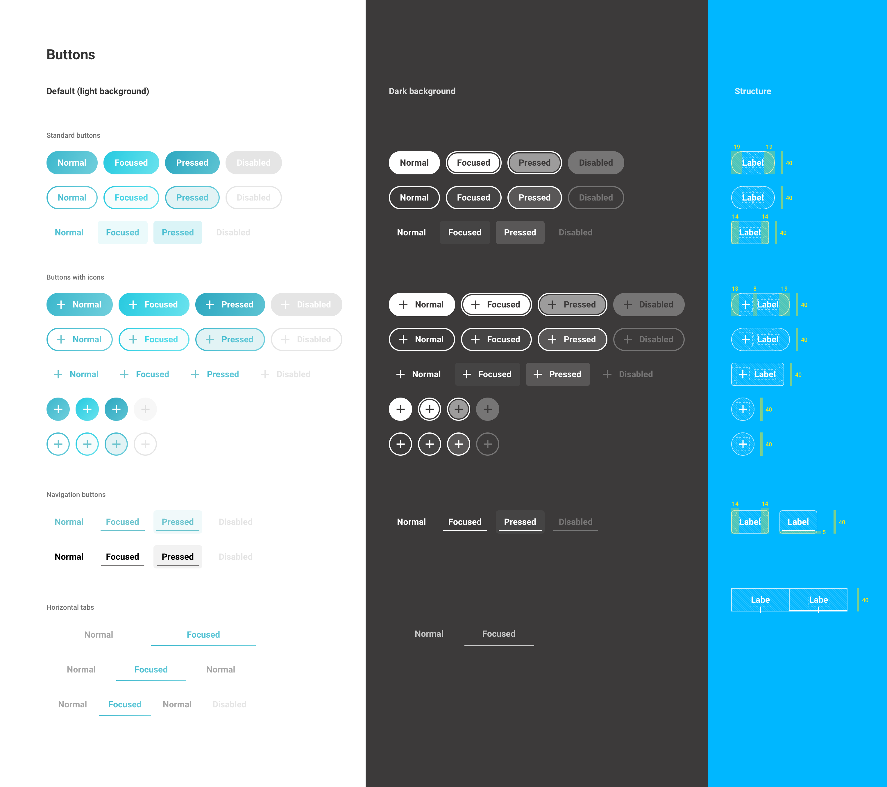
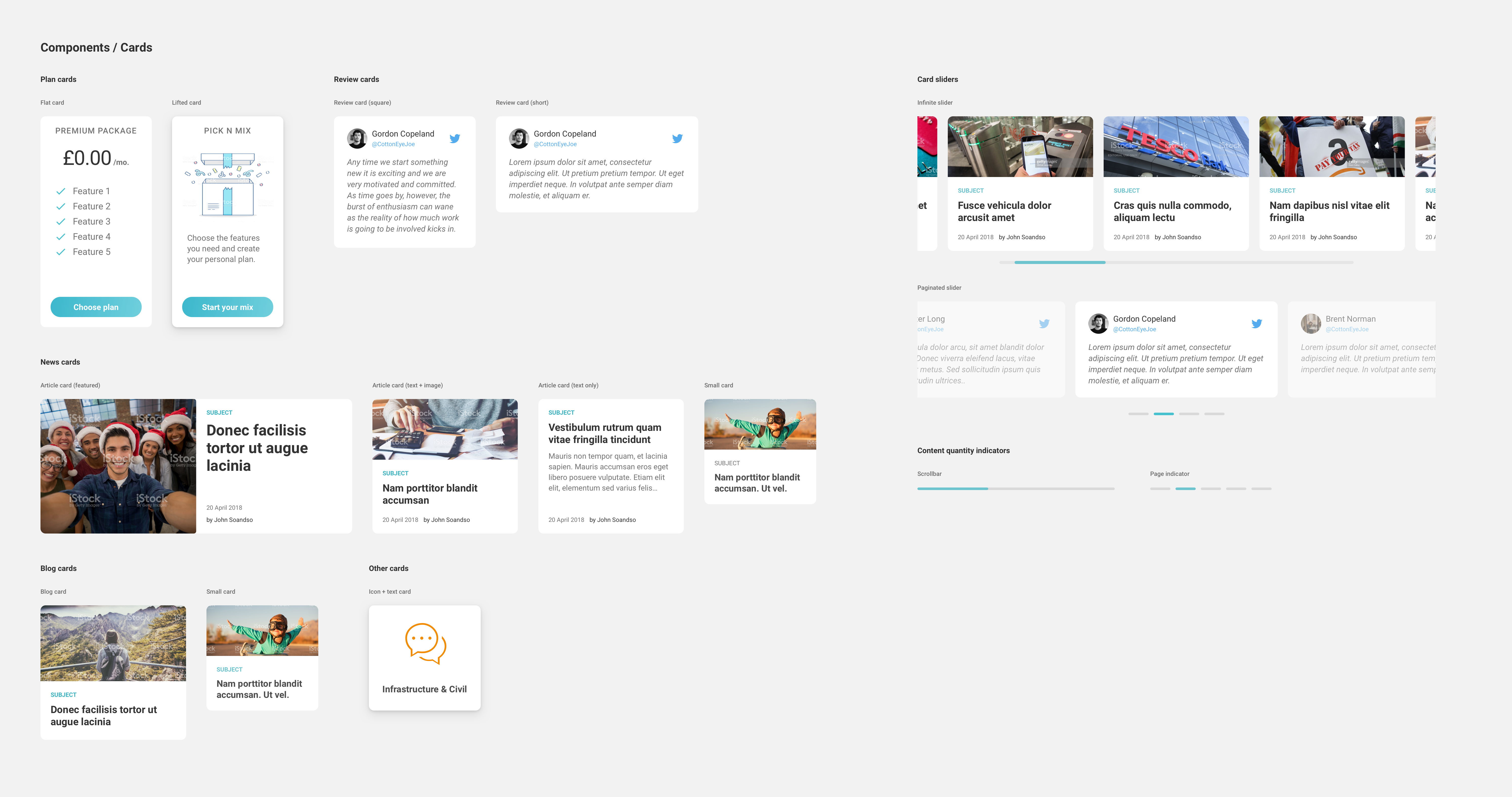
Documents and guidelines
Building a legacy
To help keep a consistent visual style to their various websites (and to ensure all the attention to detail we put in wasn’t for nothing!) I created a detailed set of tools to help the on-boarding process.
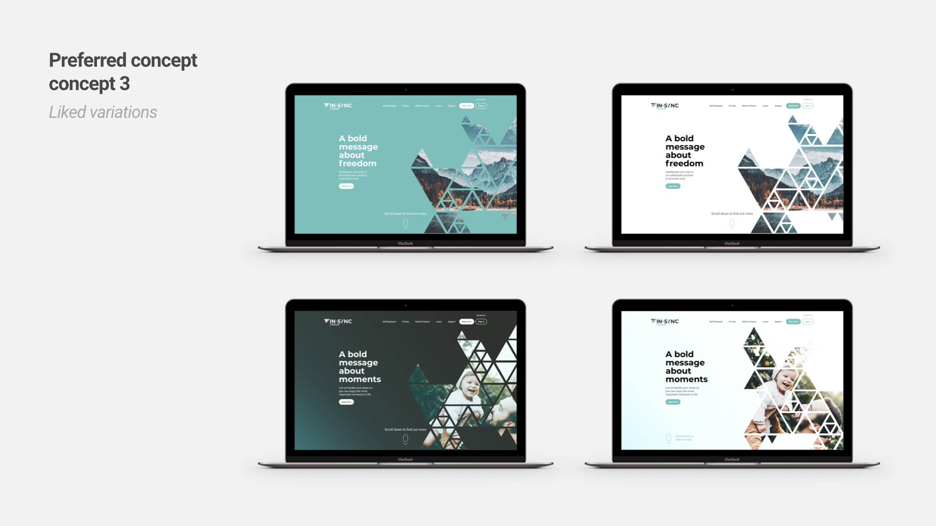
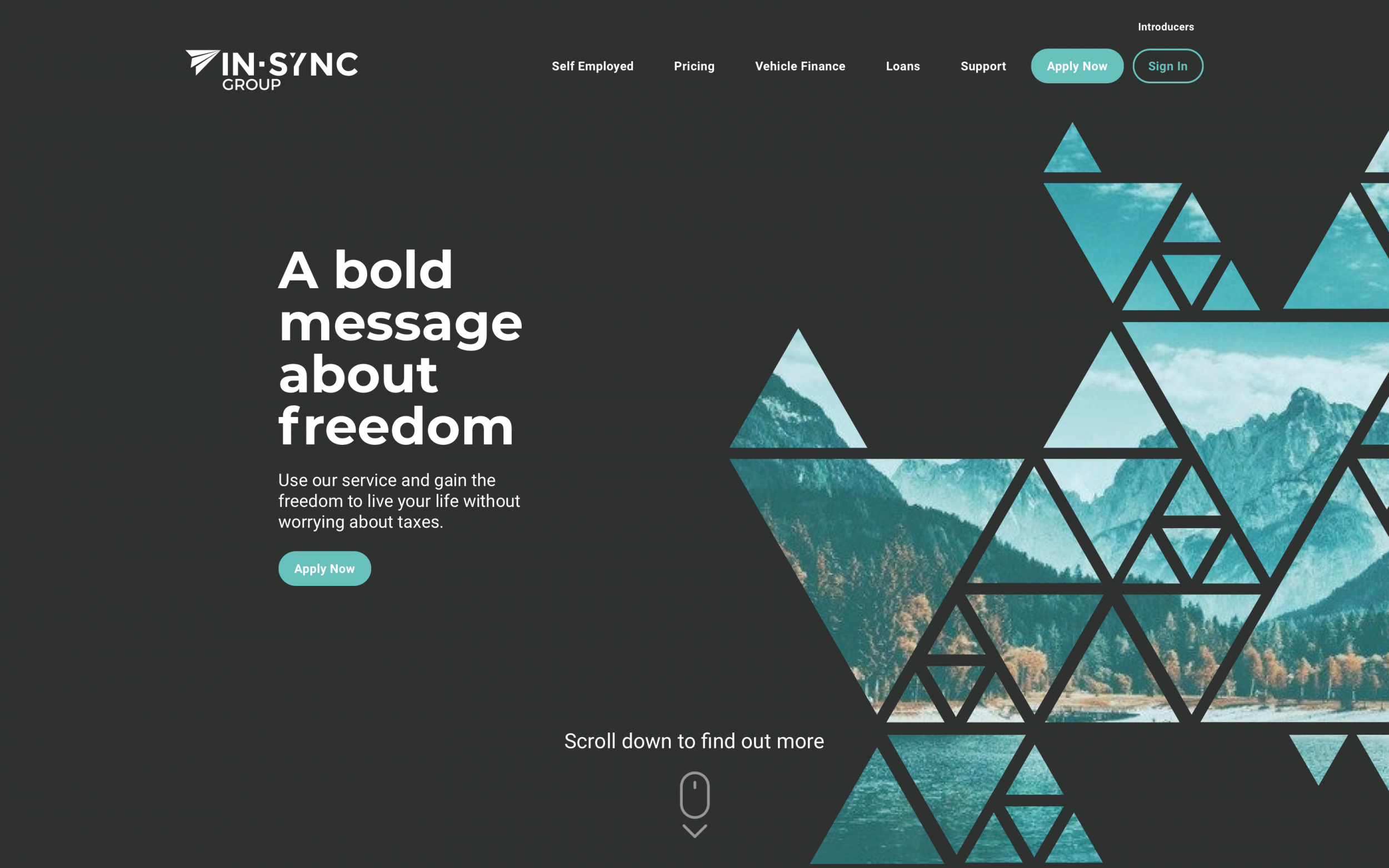
Conclusion
The End Result
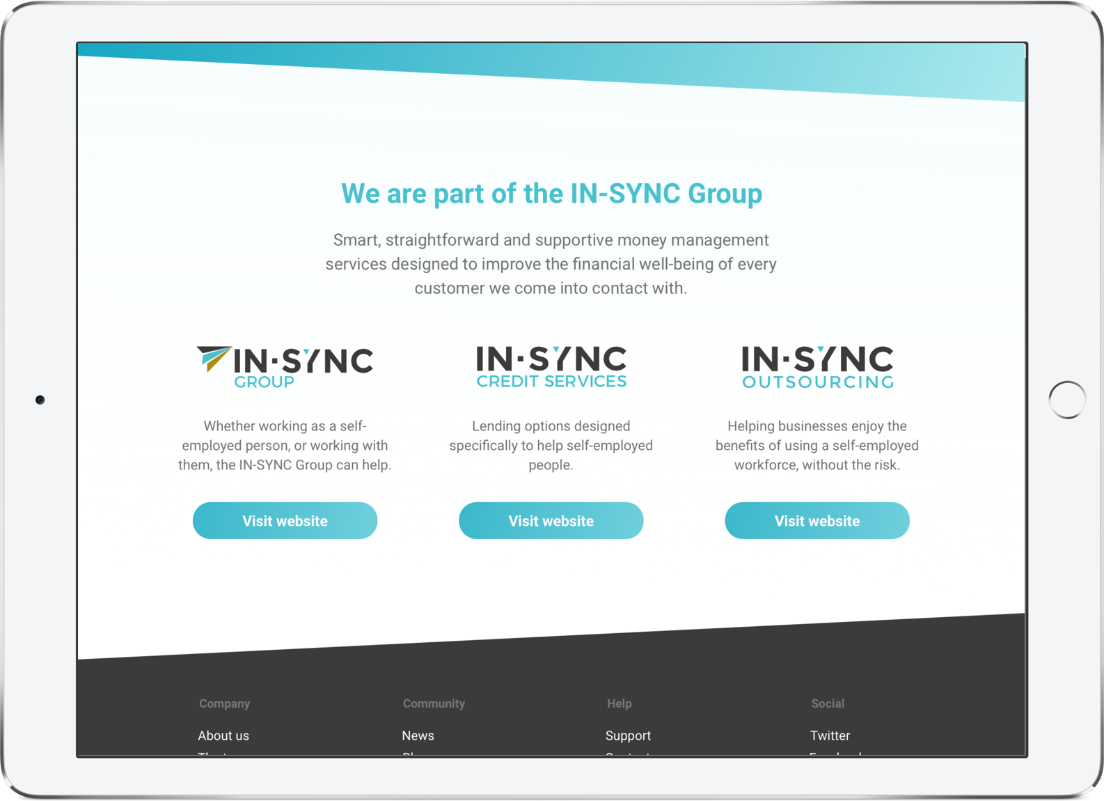
The final website designs