Just Eat was introducing live order tracking into an experience that relied on rough ETAs and periodic updates. I worked on integrating this into the app and improving how users understood their delivery in real time, particularly around the map, ETA, and how updates were communicated.
The brief
What they wanted
Just Eat had recently bought a similar food delivery service based in Canada called SkipTheDishes and, along with it, the ability to add live order tracking.
My main task was to help integrate live order tracking into their takeaway app. In addition I was also asked to help improve the existing map interface and propose any new features to further enhance the post-order experience.
![[LEFT] The existing map interface (showing the current driver location, updated at intervals, not live), and [RIGHT] the live tracking as seen in the SkipTheDishes app.](https://markkernohan.co.uk/wp-content/uploads/2018/11/Before-and-Skip.png)
My approach
Research and understanding
Knowing that the developers would first have to integrate the existing API before making any adjustments, my initial approach was to study the SkipTheDishes app, compare with what we currently had and then determine the bare minimum we would need in order to create an MVP to test and build upon.
I then looked at other products using live order tracking to see what problems were already solved and what features we might want to include.
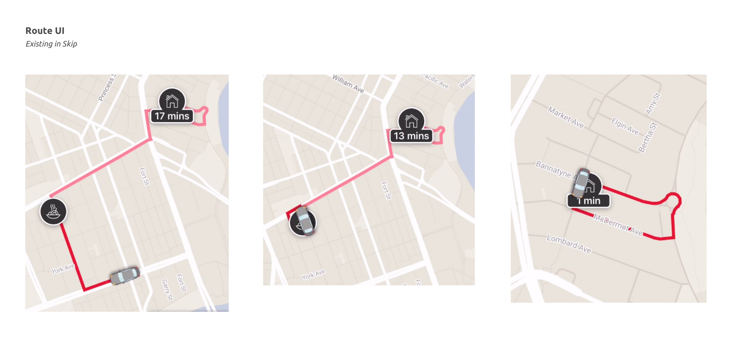
After picking apart Skip’s interface we had a clear list of elements we would require to provide the basic experience on which we could test, iterate and improve.
The MVP
Applying what I learned
Having broke the new feature down into its basic elements I could then apply it to the existing Just Eat components which would give us at least a fuctioning base model to start playing with and testing with our customers.
Enhancements
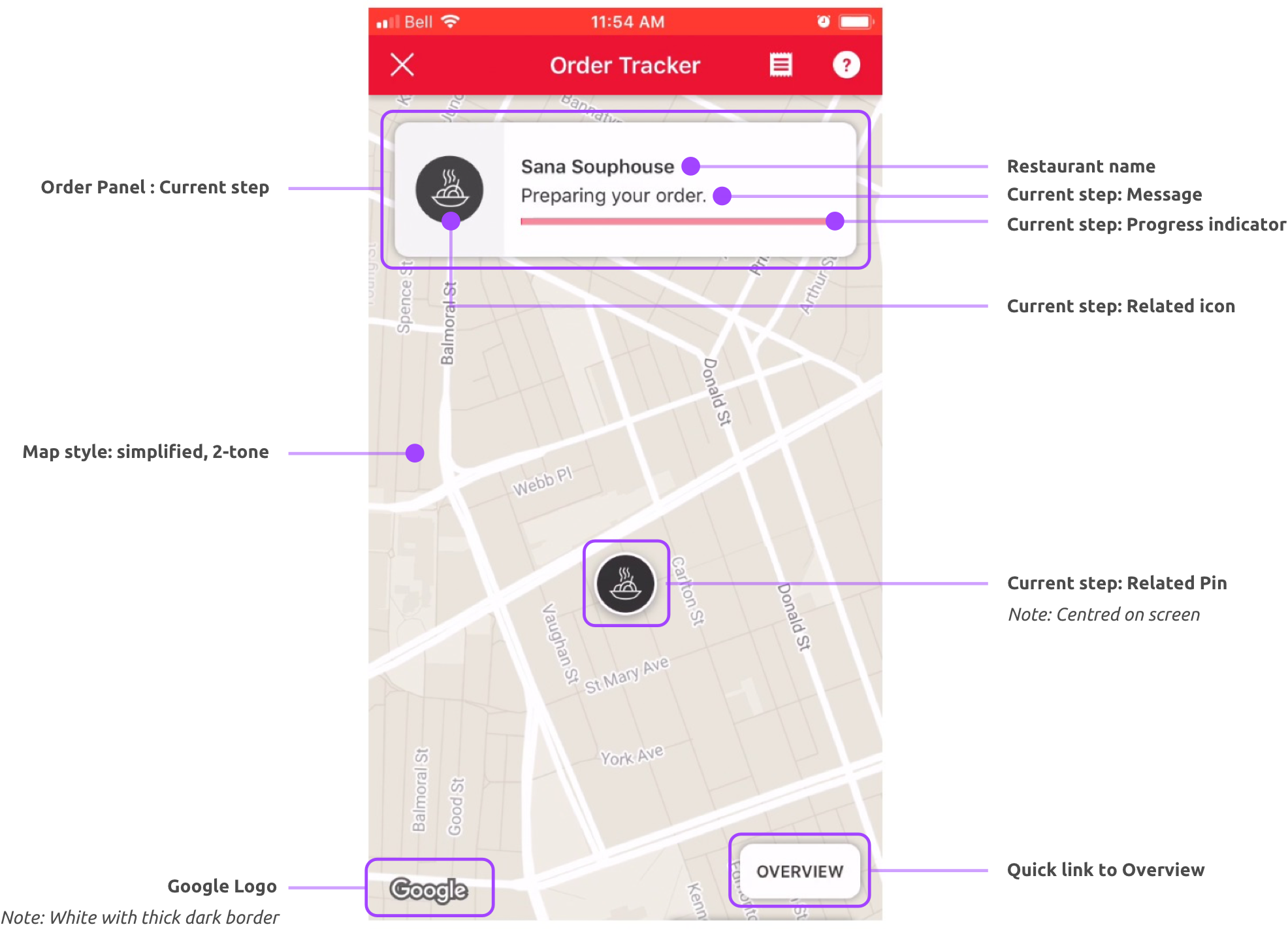
Updating the map interface
While there were a lot of elements to cover in the UI (a lot more than we expected), the tricky part was creating something that was clear and intuitive to use, while also looked good, was on-brand and felt in-sync with the rest of the app.
The main areas we needed to focus on were:
- Where and how to show the ETA countdown
- Restyling the map UI elements
- Review the map style
- The progress info
- The summary panel and driver information
- Key user actions
We also needed to take a look at the existing map interface and define what were the components and features we have and what we would need.
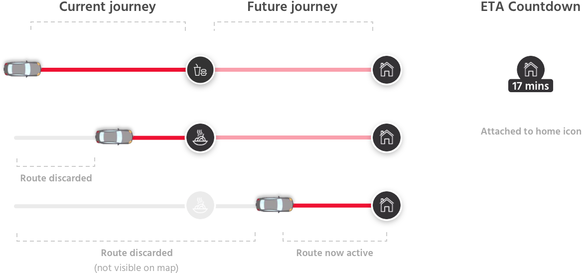
Development of the countdown timer UI attached to the courier pin.
Showing the options on a map background makes a huge difference.
This style was chosen as it was easier to see exactly where the driver was.
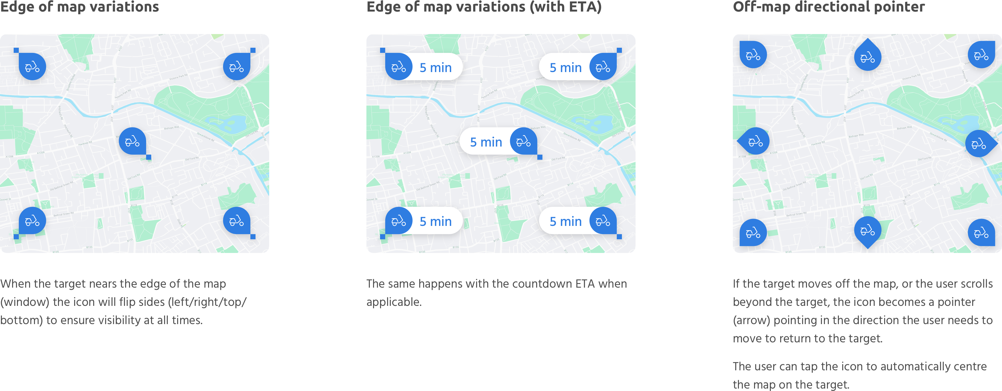
How the pin UI would work in different positions on the map.
Breaking down the key features users would need on the map.
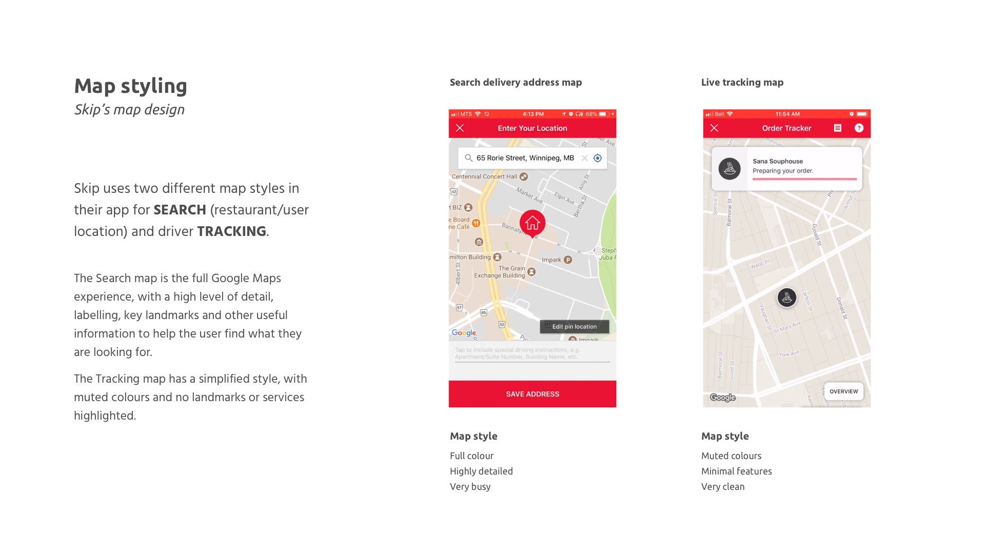
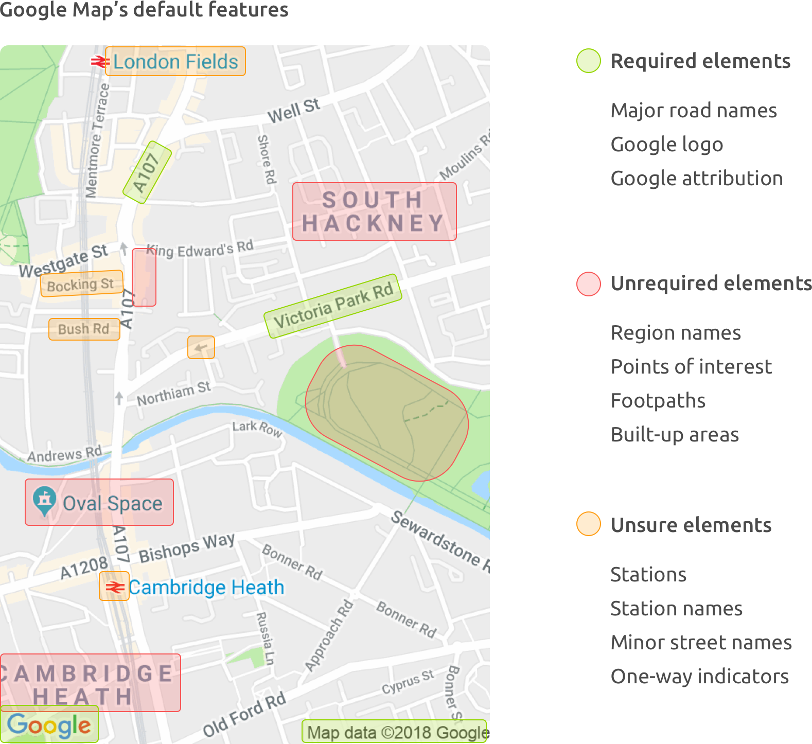
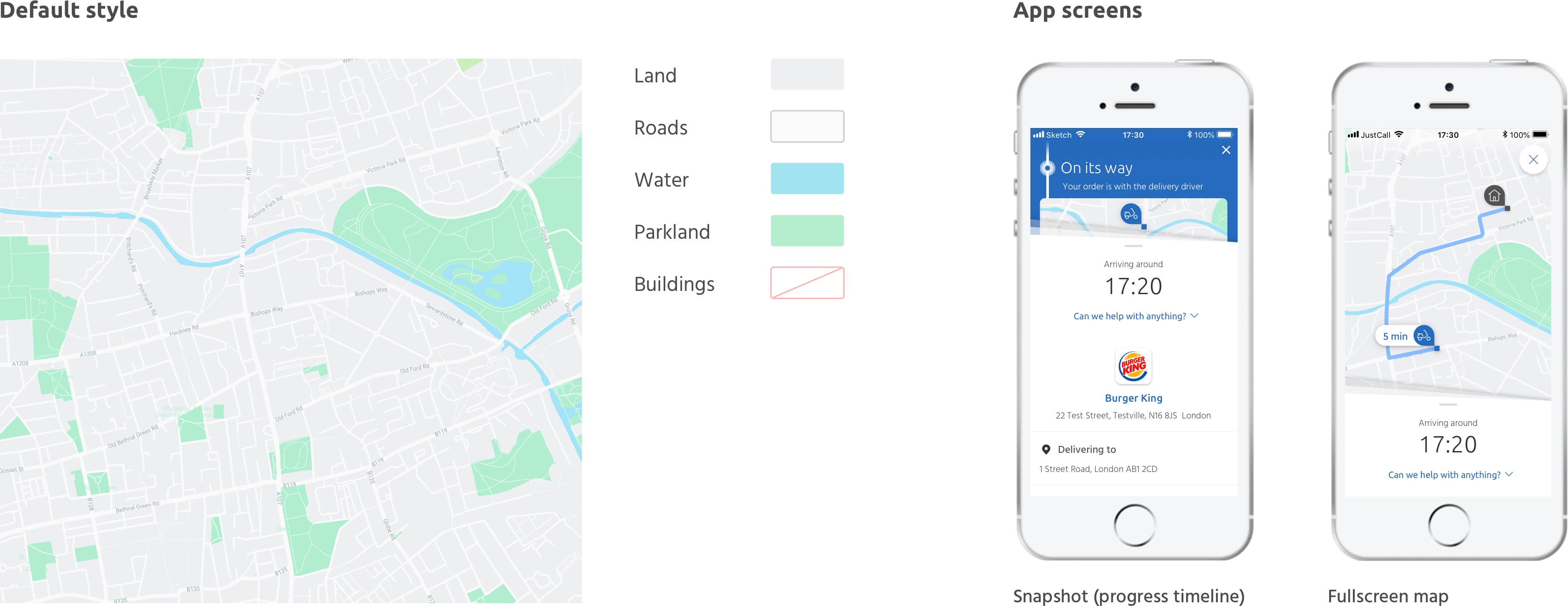
I used a google map custom styler to simplify the map to show only what users needed.
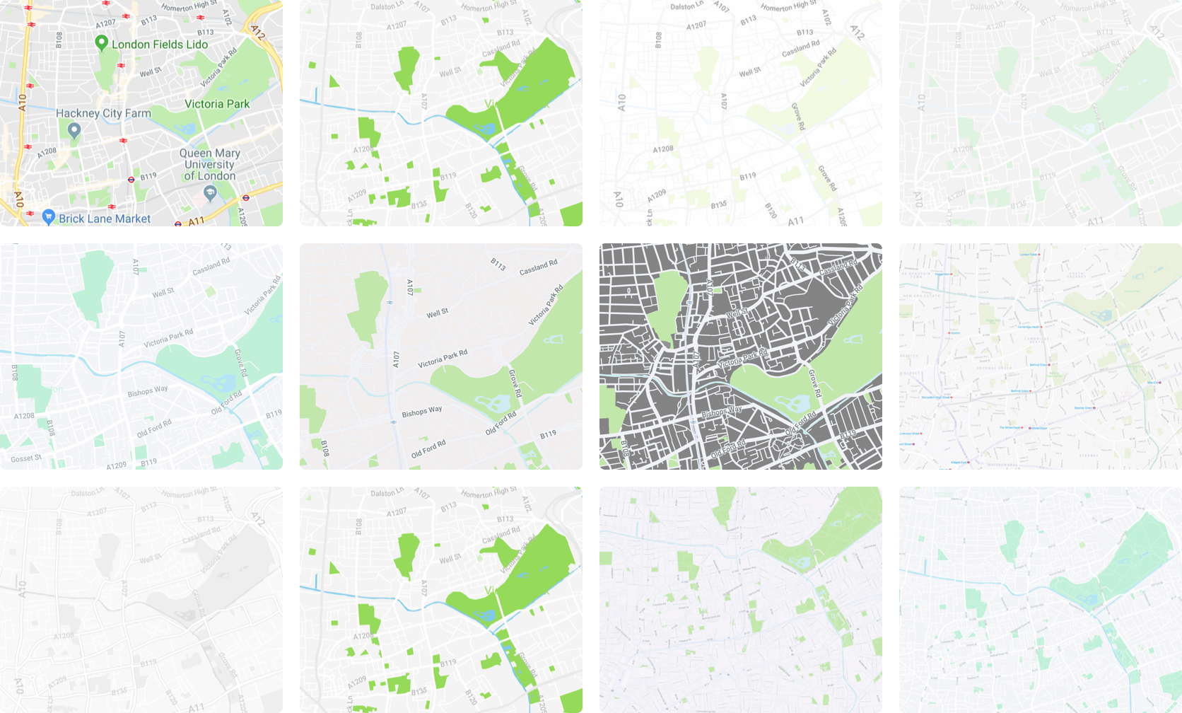
This was the chosen style based on simplicity, colour scheme and the desired level of information.
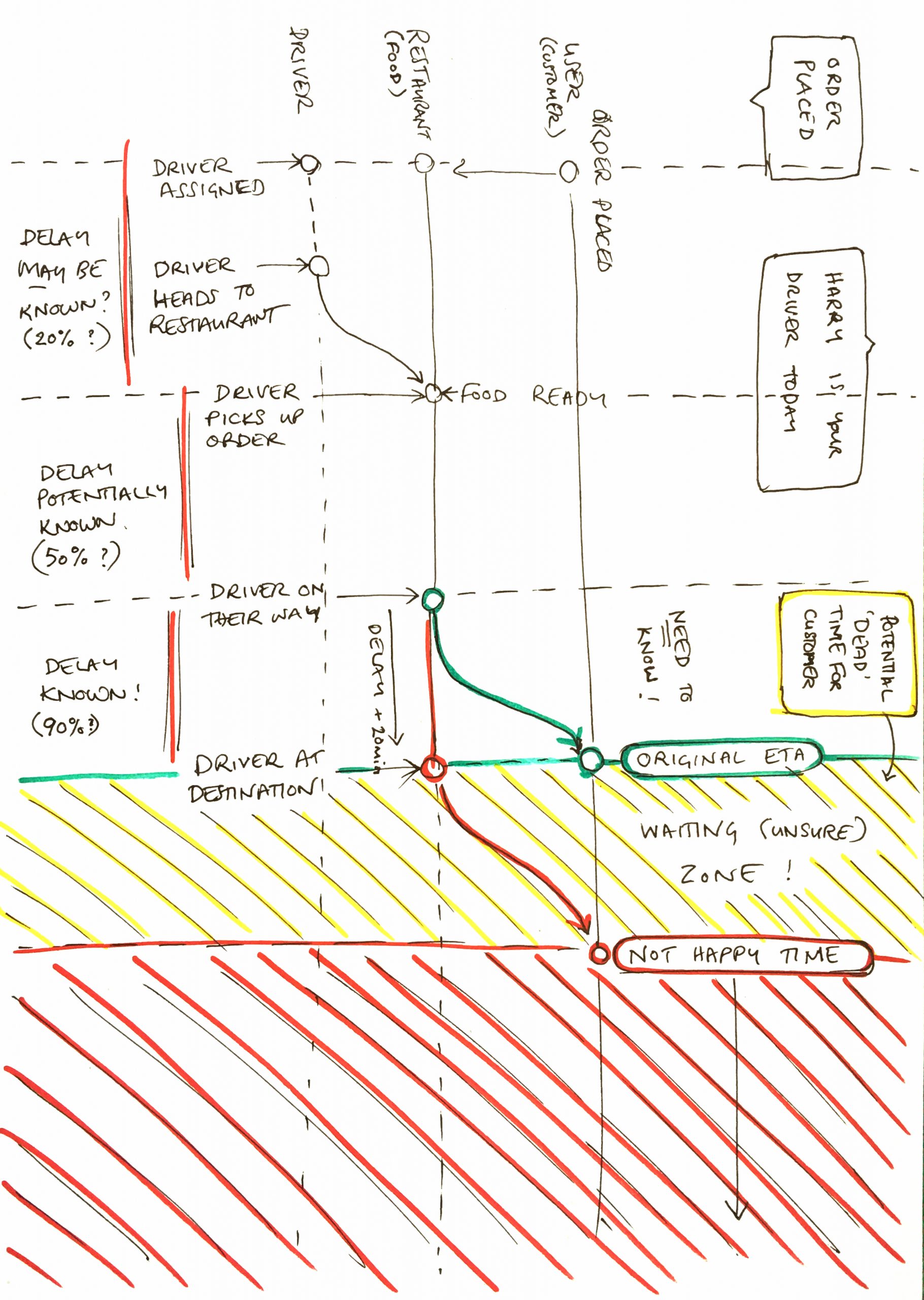
Planning all the steps we need to consider when notifying the user.
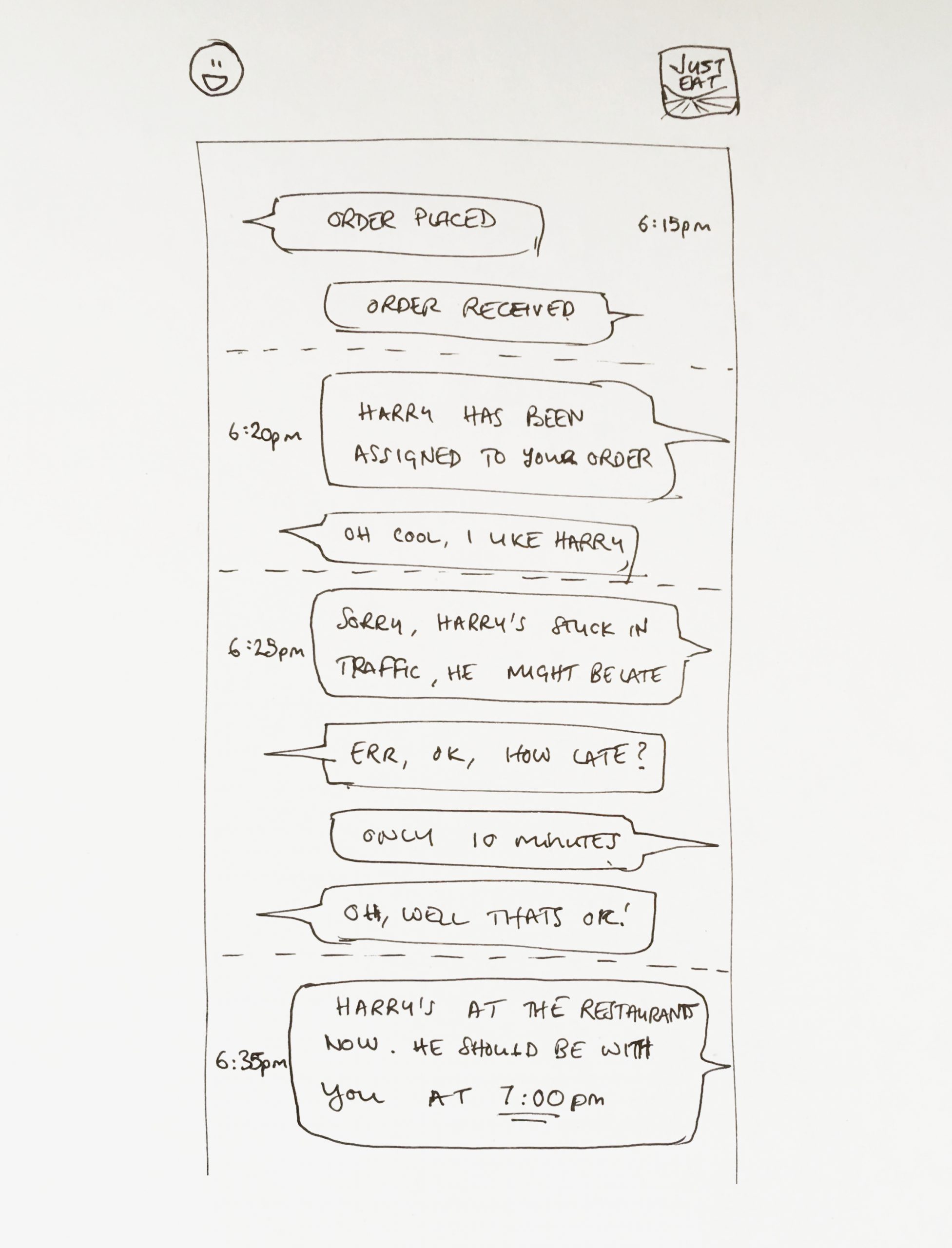
In order to understand if we’re missing anything I decided to write the notifications out like a conversation.
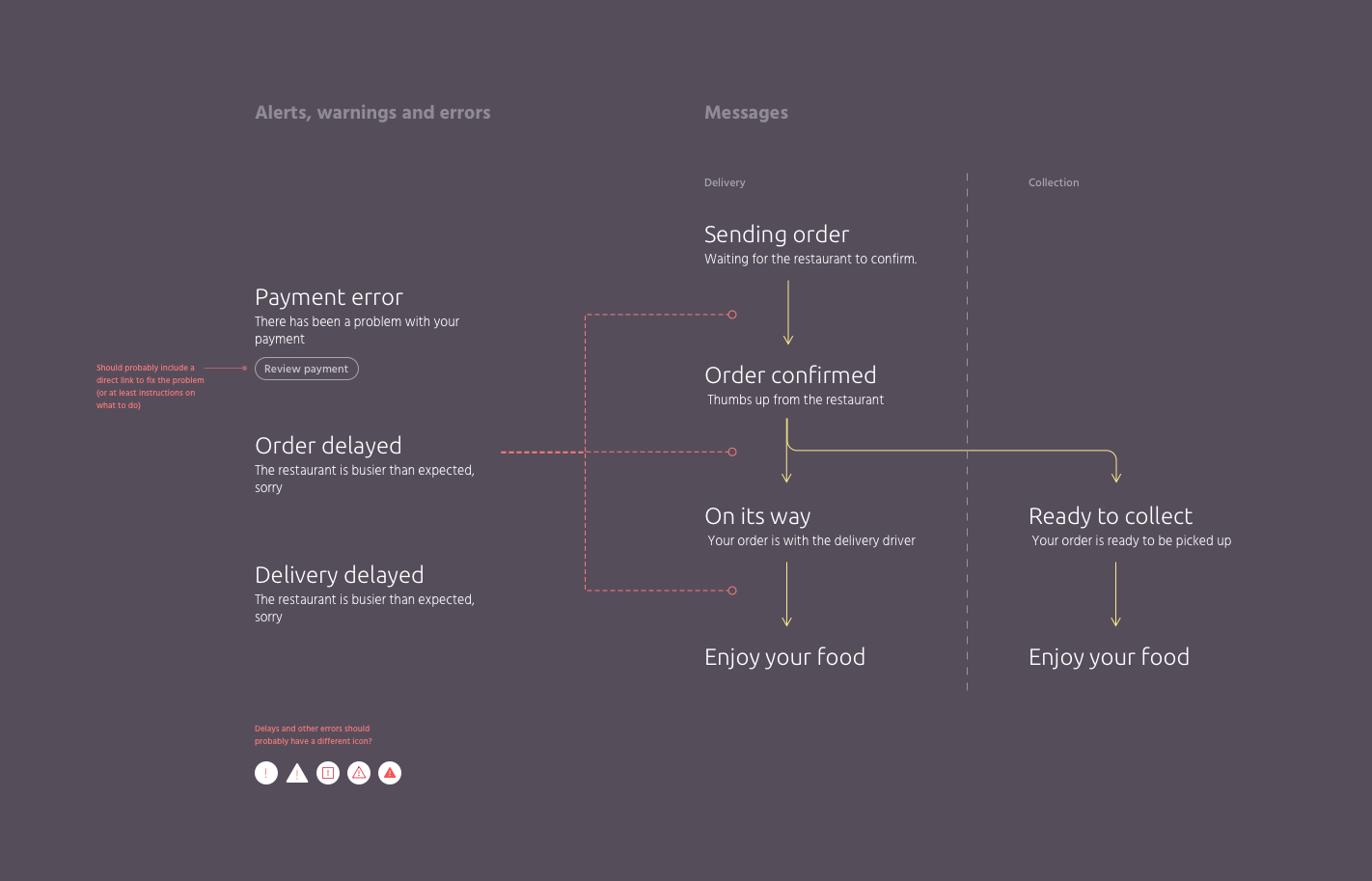
The actual alerts and notifications we send to the user.
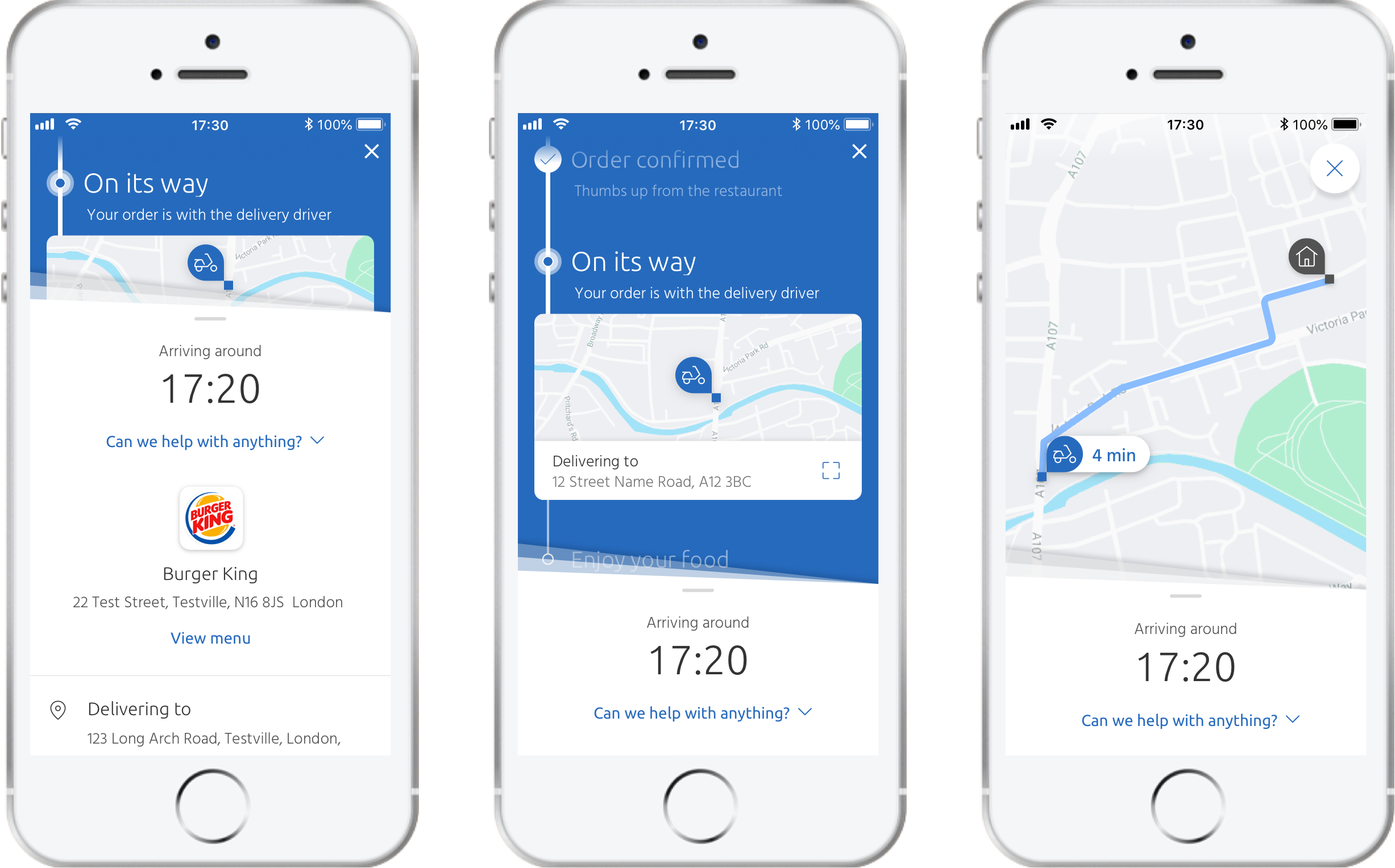
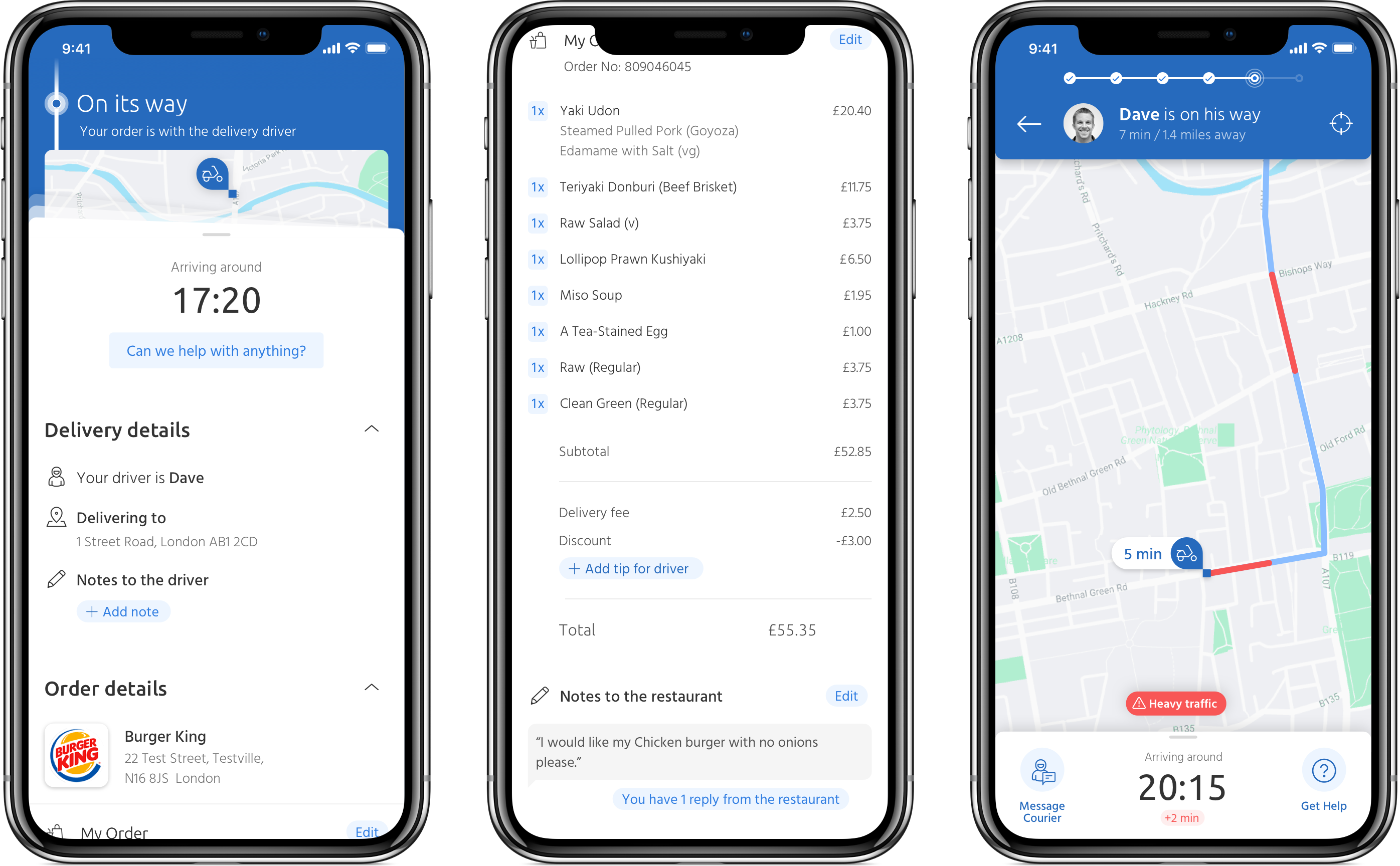
The post-order screens after the UI refresh and adding the new tracking features.
Area for concern
The problem of the multidrop
When we set out to add multidrop, a feature that allowed drivers to handle several deliveries in one journey, the first challenge was simply how to show it on the map in a way that made sense. As I explored different approaches, I realised another issue: users might not be comfortable with other customers seeing exactly where they lived. I pushed to address this concern and worked on a solution that gave users clarity without compromising their privacy.
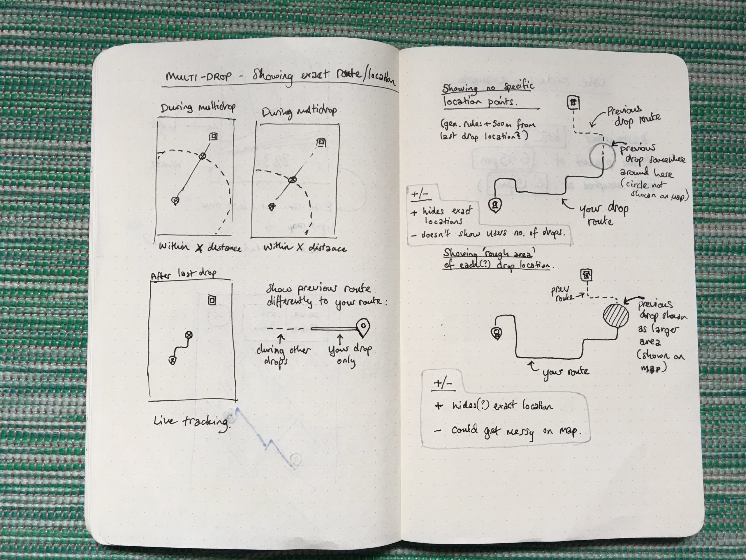
Some initial sketches for multidrop.
Early explorations of the multidrop map UI showing the concern of user privacy.
User testing
Getting feedback
We conducted live user testing sessions every 2 weeks where we would run real users through prototypes, ask questions, A/B test designs, perform card-sorting and other useful tests, which we were able to watch from our observation room.
We would then review the data and make changes to our objectives if necessary.
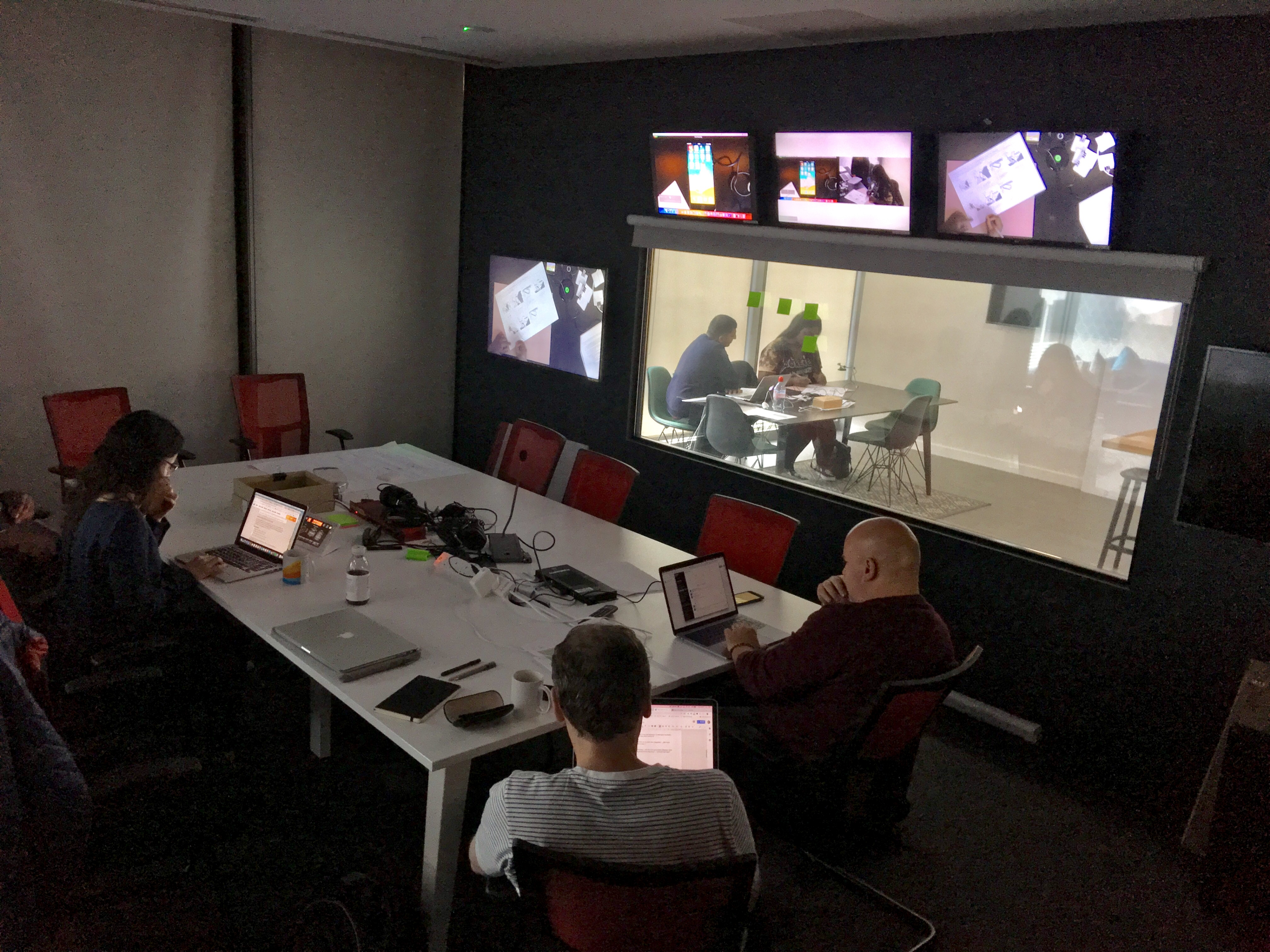
One of the user-testing sessions.
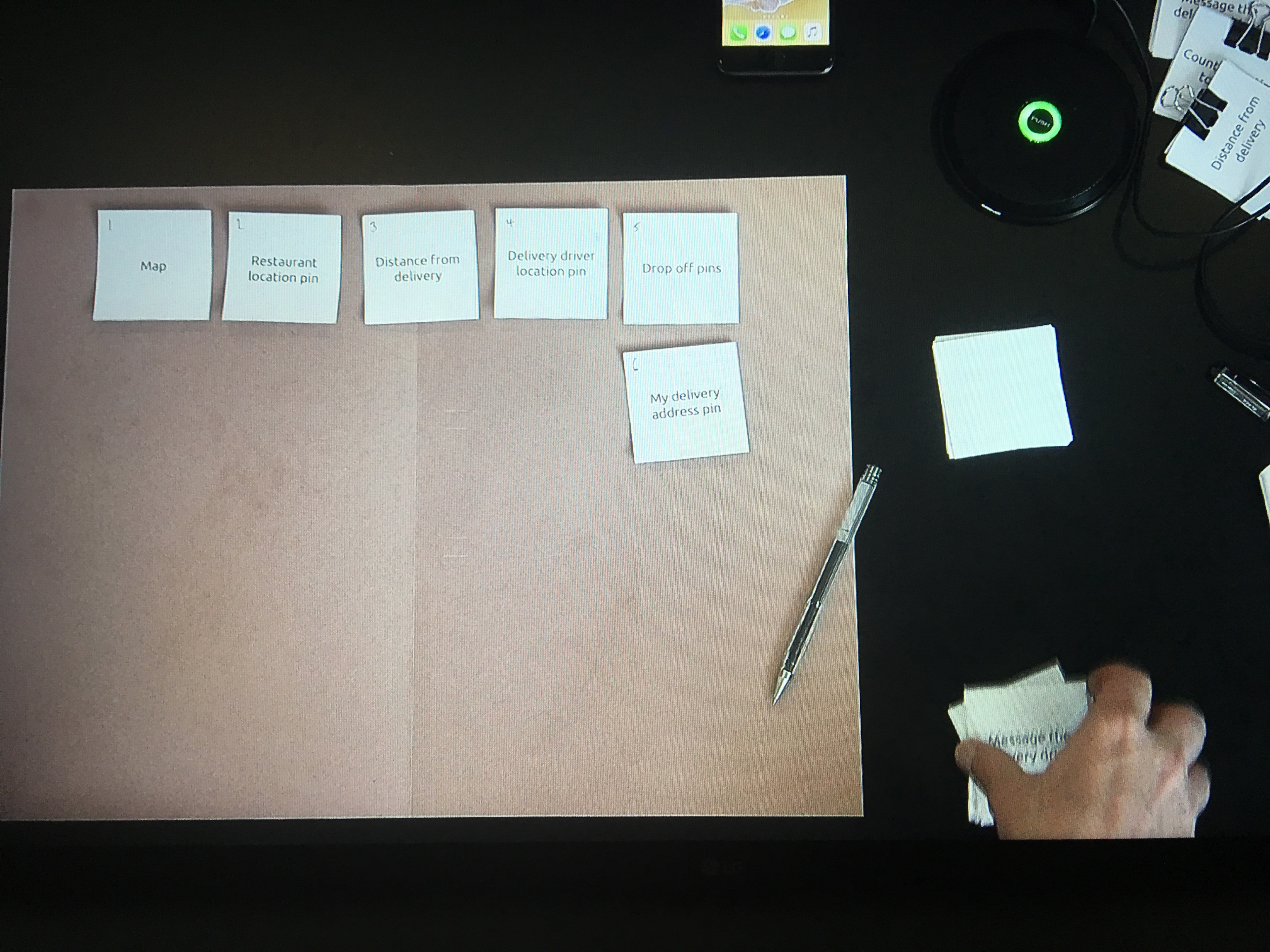
We conducted card-sorting sessions to test what features were important to users.
Conclusion
The final product
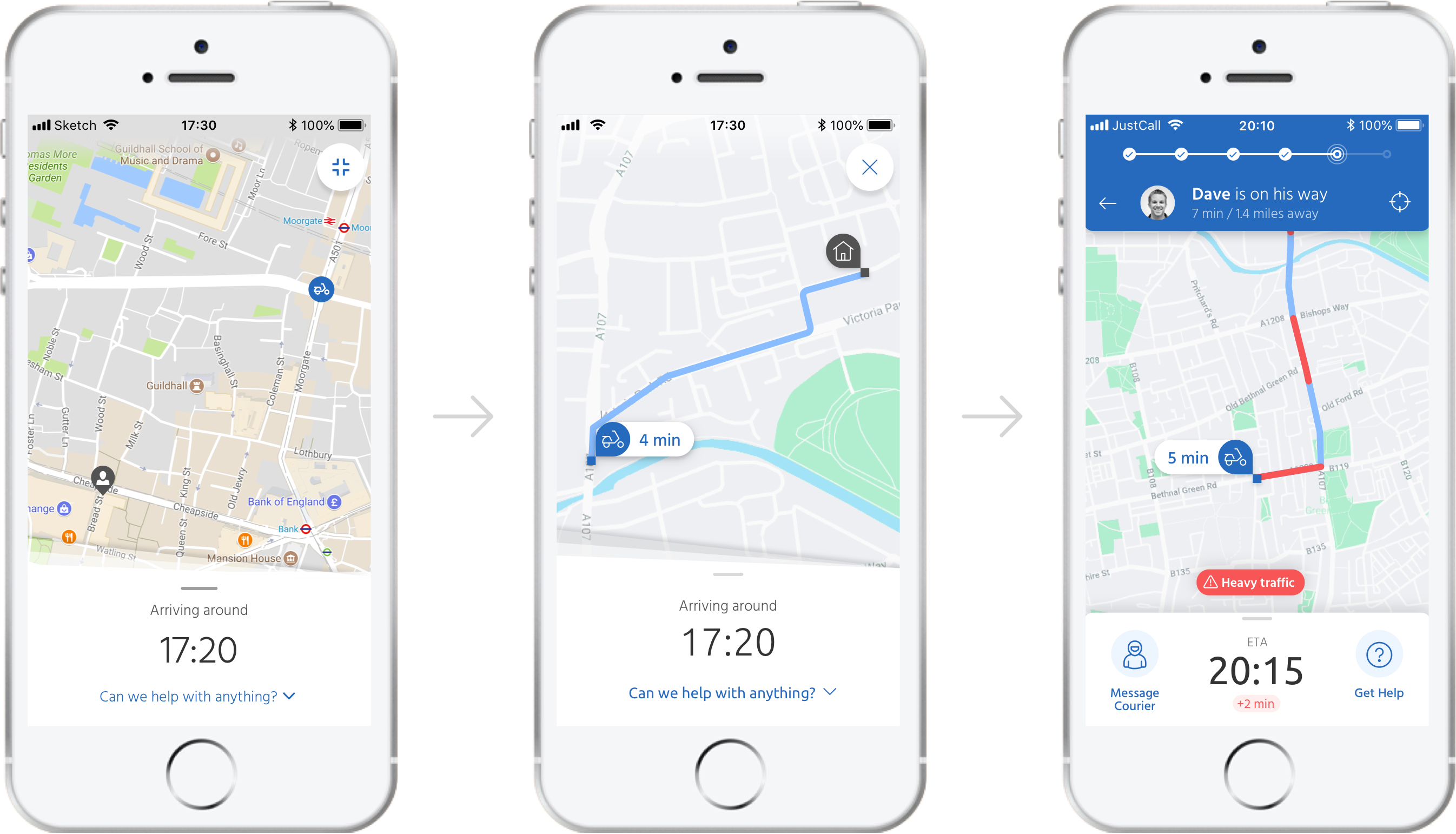
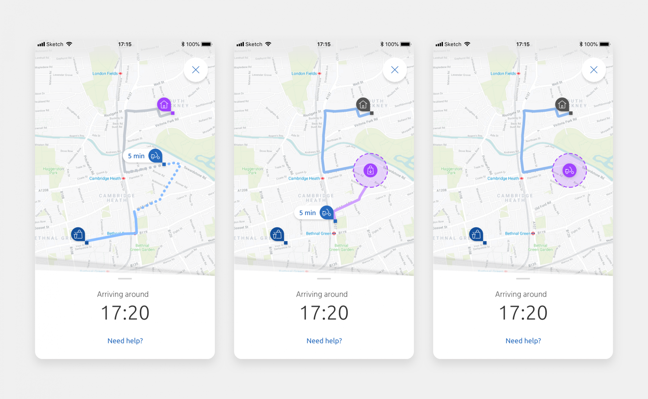
Comparing the map as it was before I started (left), the updated build-ready design (middle) and what we proposed for the future tracking experience (right).
Future thinking
Improvements and suggestions
While we had very specific requirements for the current roadmap, we were able to spend time on further enhancements to be considered for the future.
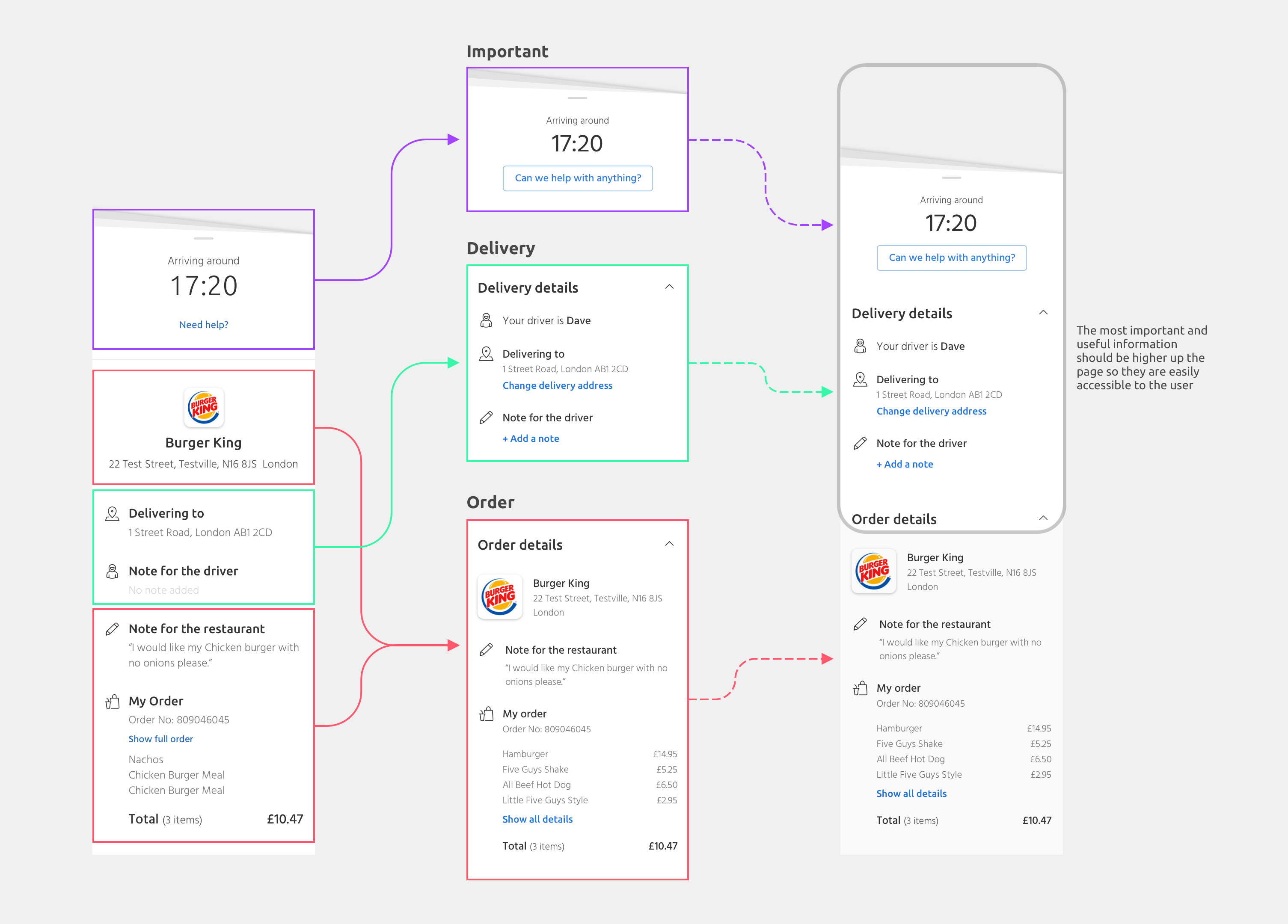
A re-evaluation of the order summary content to place the most useful information nearer the top.
Concept design for future version of the order tracking feature.