The UI needed a redesign. Two years, four platforms, and a mixed reality mode later… we got there.
A New Perspective
Changing the way I think
Coming from a product and service design background, I had to rethink how I approached UX. In games, especially VR, the goal isn’t just usability, it’s experience. I had to unlearn some product instincts and start thinking in terms of feel, flow, and feedback.
[Thankfully, I’d been a VR enthusiast for years, with personal projects and DIY headset experiments under my belt.]
Early Work
Fixing things to understand them
Before diving into the redesign, I spent time working on smaller improvements to help me better understand the game’s systems, constraints, and quirks. These incremental updates gave me hands-on experience with the flow of the game, the player mindset, and the realities of shipping across platforms.
The first was a streamlined Arcade Mode, designed to simplify the experience for public and event-based setups, minimal options, clear navigation, fast onboarding.
Soon after, I worked on a major multiplayer overhaul for the PlayStation VR2 launch. Sony’s platform required strict adherence to legal and social safety regulations, which meant reworking flows, messaging, and features to ensure compliance. It was a crash course in balancing platform policy with game feel.
Together, these early projects shaped how I approached the full redesign, not just as a visual update, but as a deeper systems-level rethink.
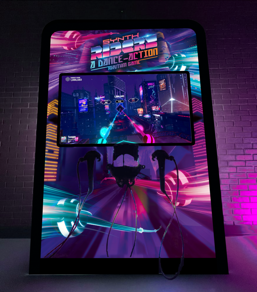
Synth Riders Arcade cabinet
The audit
Knowing what to fix starts with knowing what’s broken
Over time, Synth Riders had grown through constant content additions, features, and platform expansions. While this kept the game fresh, it also led to a UI that was increasingly layered, inconsistent, and difficult to navigate, particularly for new players, with key features hidden, unclear option hierarchies, and a growing gap between player expectations and the experience the UI was providing.
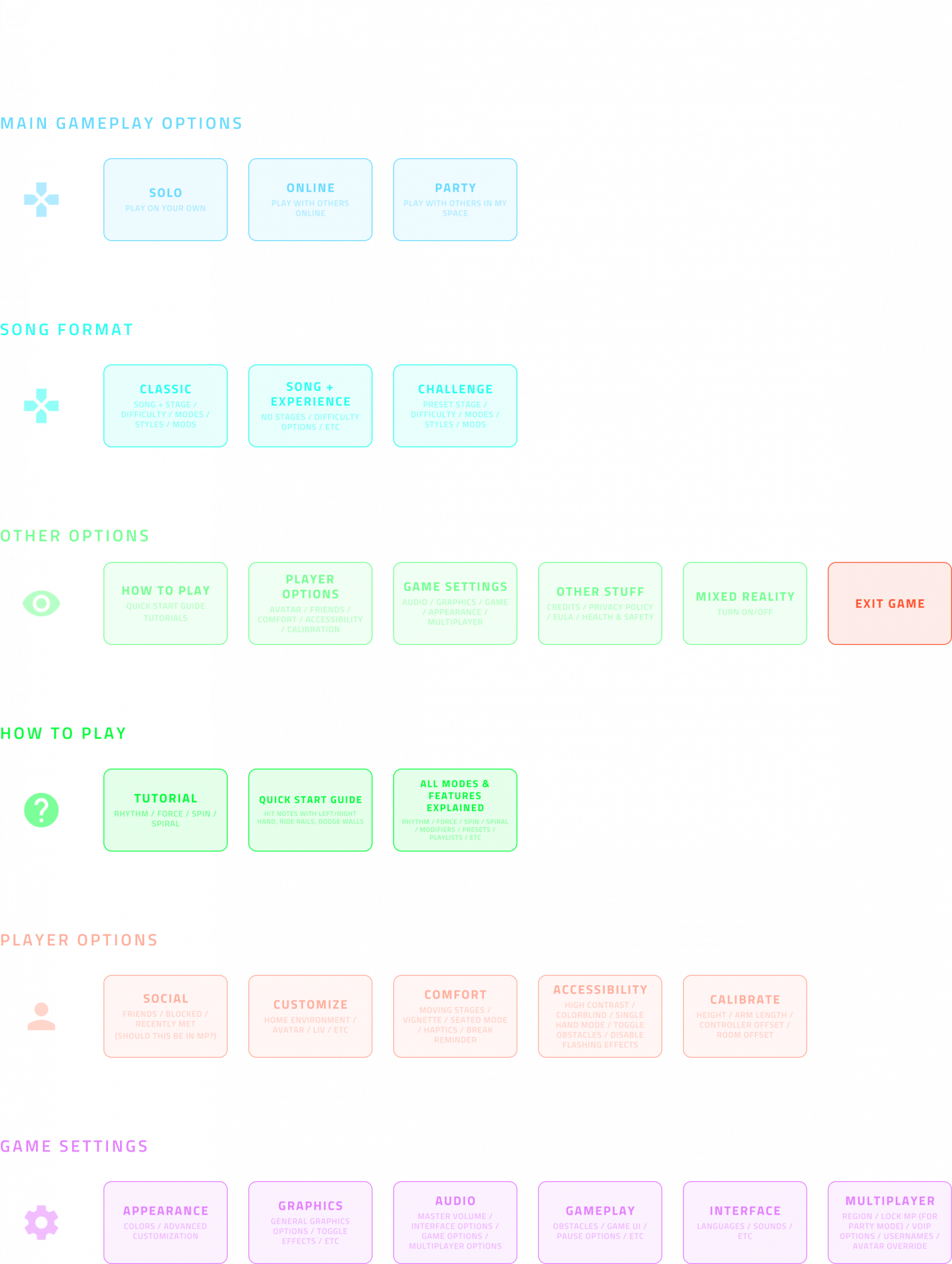
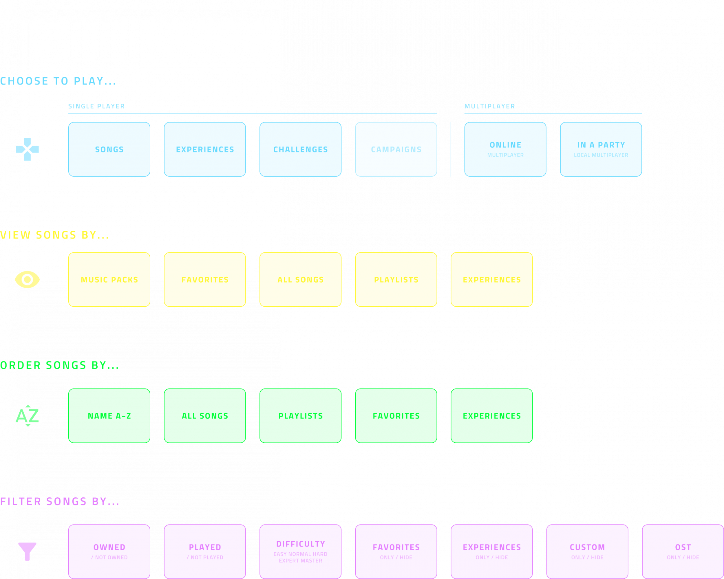
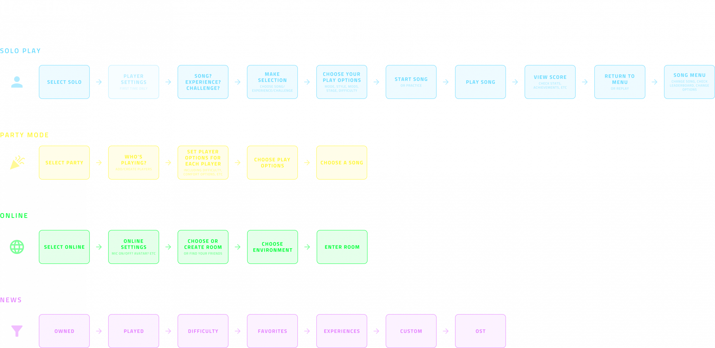
With a better understanding of the game’s systems and player expectations, I kicked off the redesign with a full UI audit. I mapped out every screen, state, and interaction across all supported platforms, identifying inconsistencies, bottlenecks, and areas where the UI was showing its age.
This wasn’t just about visual polish. I looked at flow efficiency, hierarchy, responsiveness, and readability, especially with accessibility in mind. I also worked closely with devs and QA to understand technical constraints and what could realistically be improved within Unity’s UI system across different headsets.
The audit highlighted recurring issues: unclear hierarchy between modes and modifiers, poor discoverability of key features and content, inconsistent interaction patterns across platforms, and UI elements that had been added incrementally without a clear underlying system. This deep analysis became the foundation for everything that followed, setting clear goals for clarity, consistency, modularity, and platform flexibility.
The design
Creating a new look
Before addressing the visual style, the focus was on clarifying how the UI worked: defining clear hierarchies, grouping related options by intent, and aligning the interface with how players actually made decisions. This meant separating core play styles, modes that fundamentally changed gameplay, and modifiers that layered on top, making the system easier to understand without removing depth for advanced players.
Now we had a better structure, we needed to work on the style. In games visual style is way more important than it is in practical products. Less is more certainly isn’t as much of a priority and, while visual clarity and accessibility is important (especially in VR), the visual design still needs to be exciting and engaging to the player.
Luckily Synth Riders already had a clear visual direction – Synthwave meets sci-fi. So, after a ton of research into games, sci-fi movies and the synthwave genre [all of which I already was a huge fan], and a lot of experiementing, I came up with a new design that was clean and simple, yet futuristic and, above all, SYNTHWAVE!
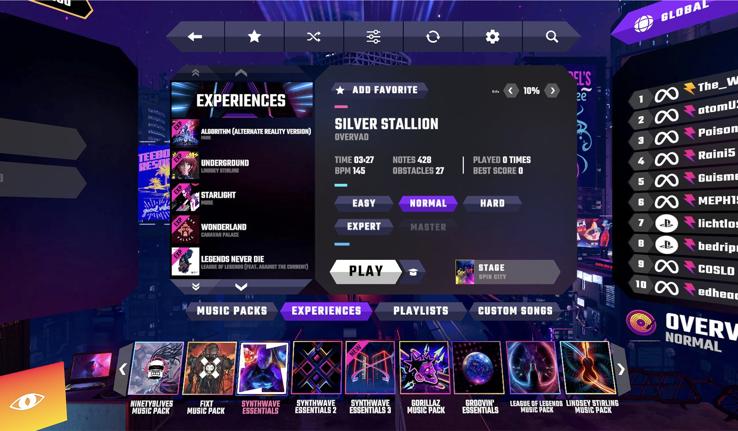
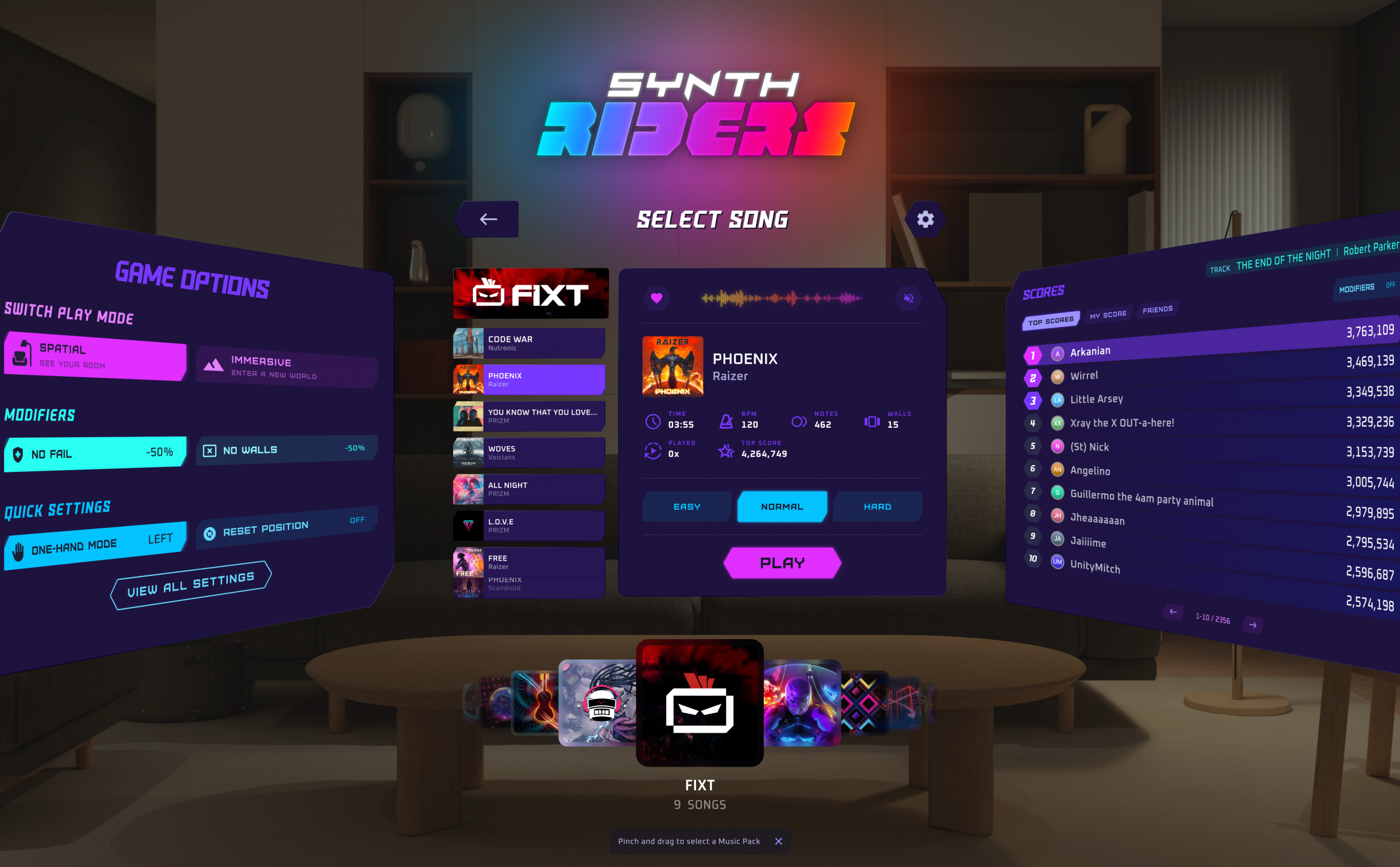
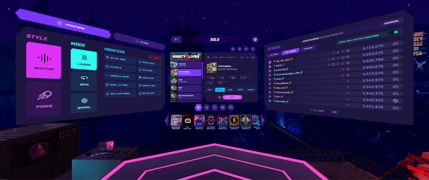
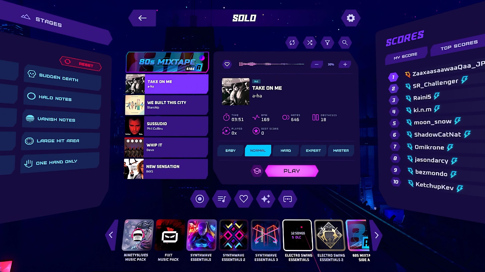
Song selection menu – before
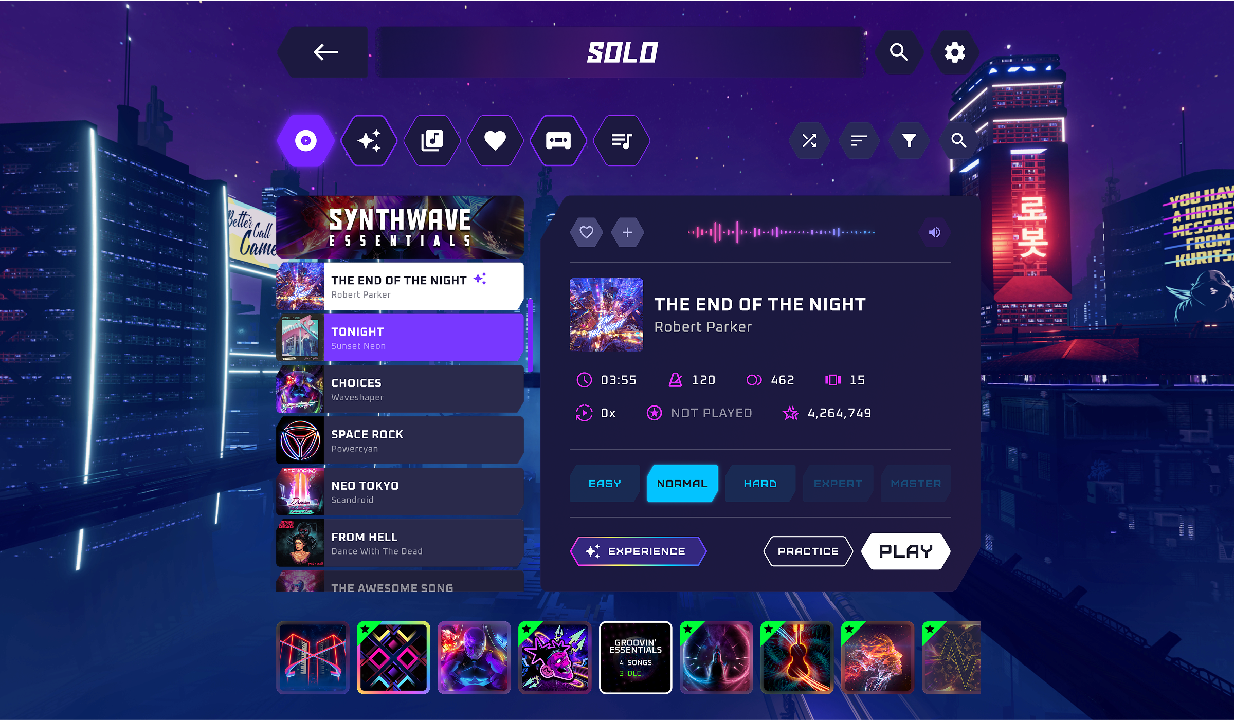
Song selection menu – after
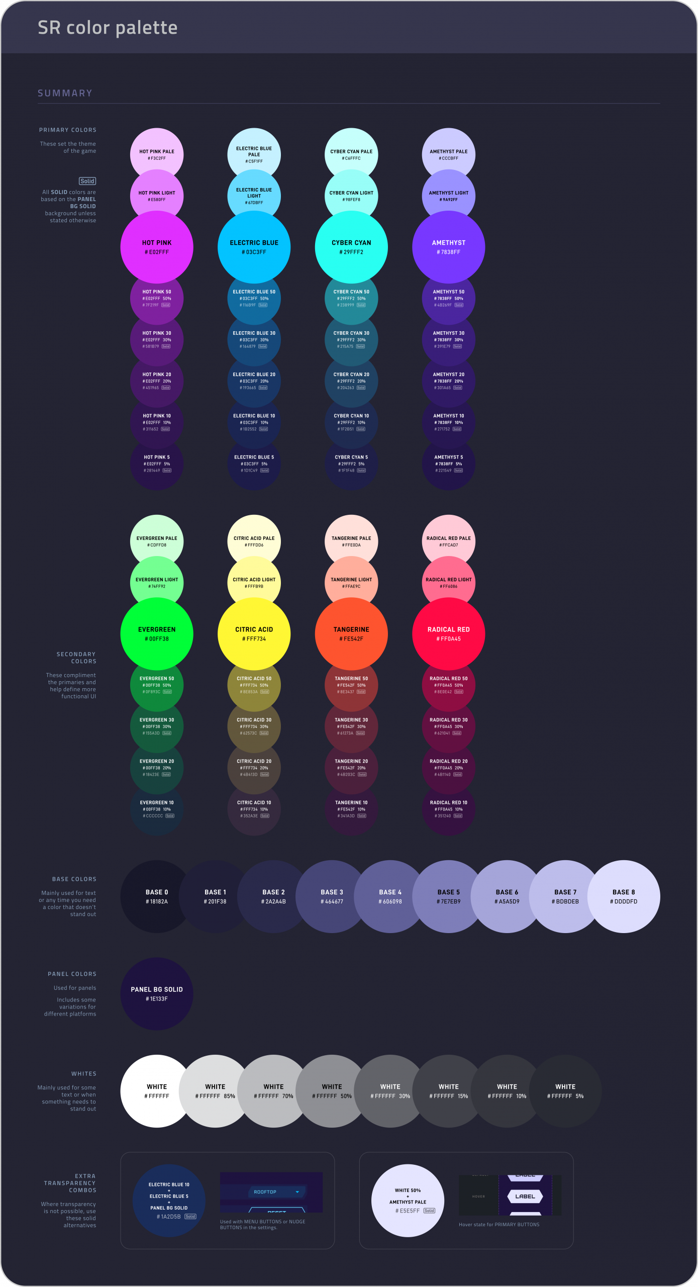
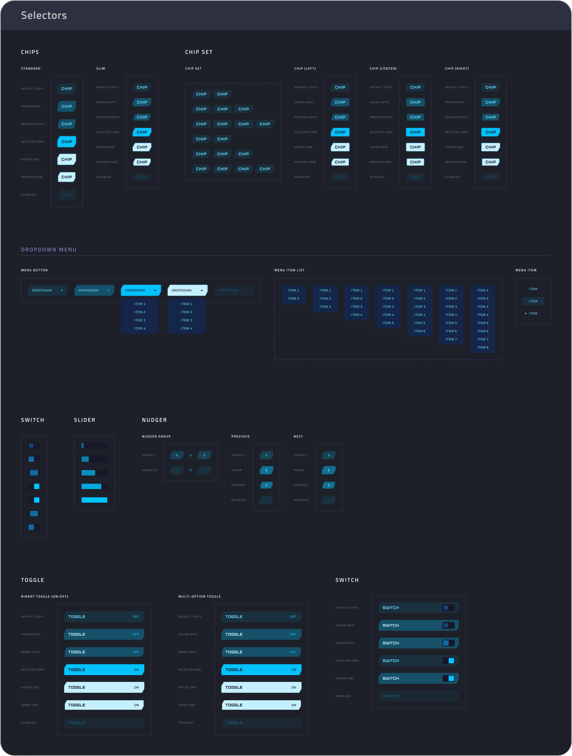
Alongside the redesign, I created a documented design system covering layout, components, states, colour usage, and interaction patterns. This system allowed the UI to scale across platforms, reduced friction during development and handover, and made it possible to adapt quickly when new platforms and features were introduced.


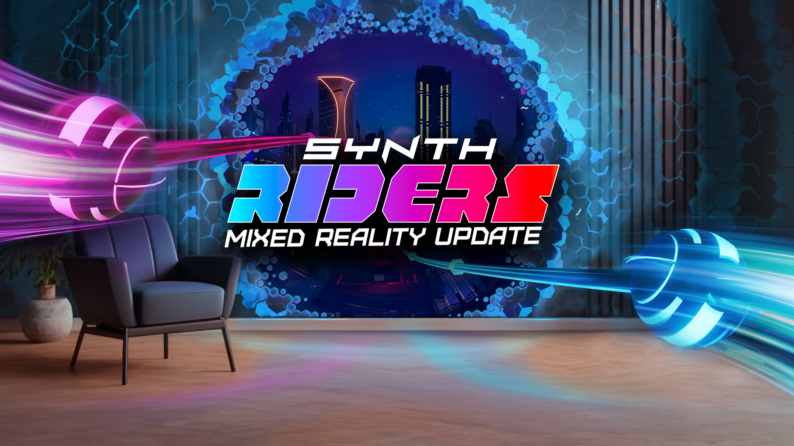
Mixed Reality mode
Wait, we’re doing what now?
Just as the redesign started gaining momentum, the scope shifted. First, we were tasked with introducing a Mixed Reality mode, blending digital elements with the physical world using passthrough. Designing for this meant rethinking spatial awareness, player context, and clarity in environments that were no longer fully under our control. It added complexity, but also opened the door to something exciting.
Then came a request to mock up a potential mobile version of the game for early discussions with a streaming platform. While the project didn’t move forward, the constraints of mobile (smaller screens, tighter UI) actually helped inform the visual clarity and hierarchy that ended up shaping the redesign.
Neither of these were planned, but both helped push the UI toward something leaner, more focused, and more adaptable across devices.
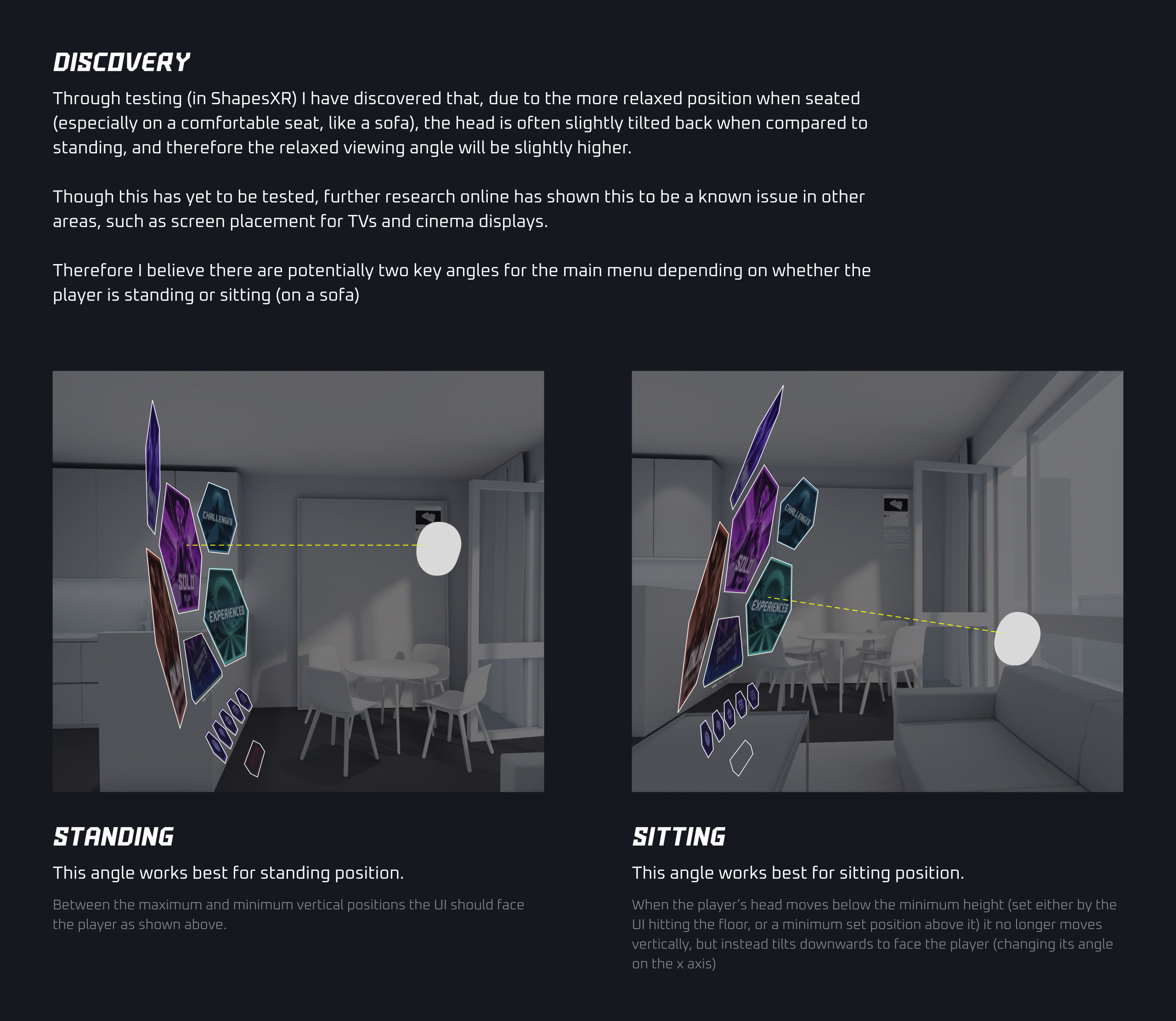
Testing the new menu in mixed reality mode using ShapesXR
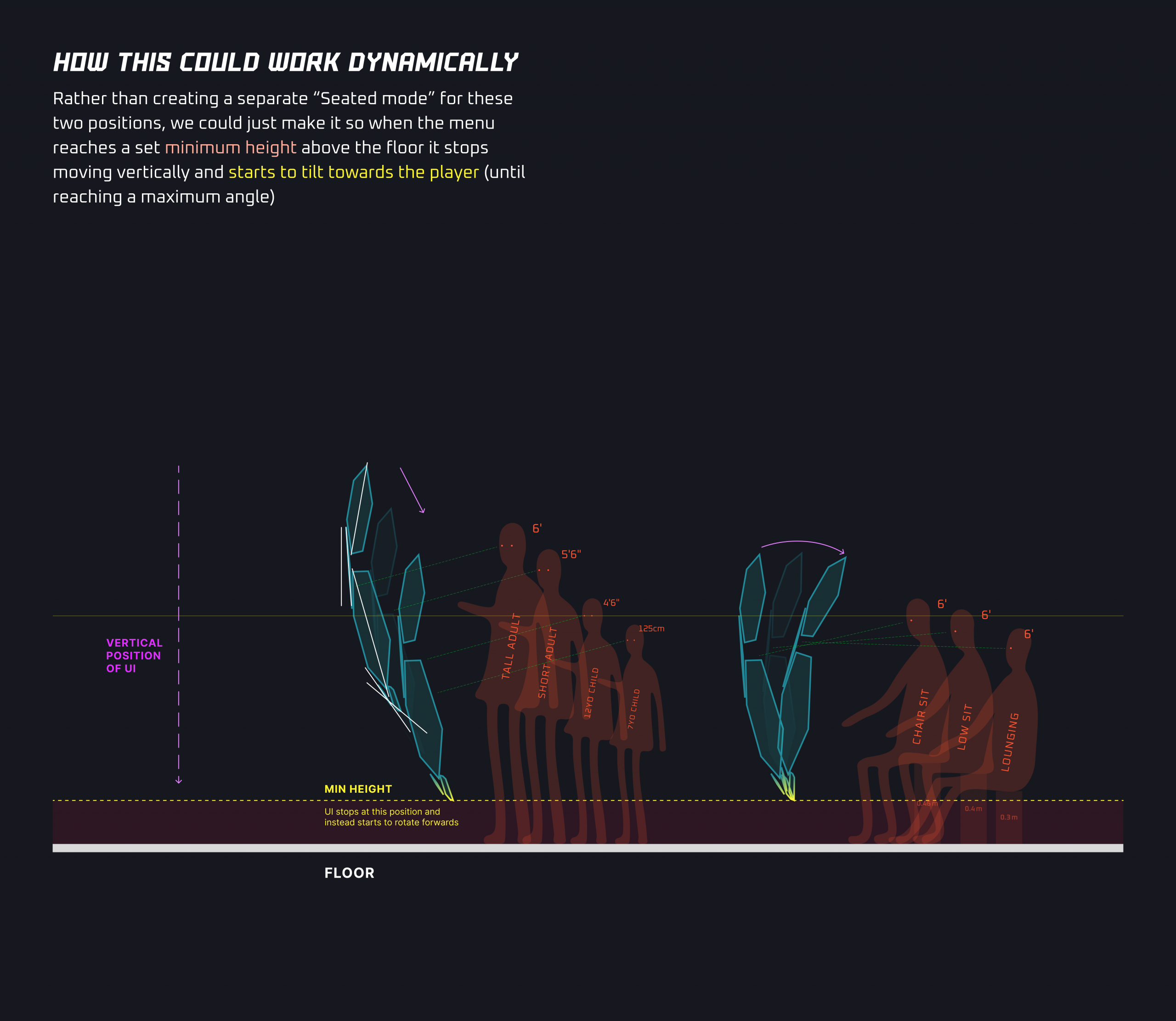
Testing the menu gave insights on how we could adapt for different players
Apple Vision Pro version
No rest for the wicked
After launching the Mixed Reality mode, we were preparing to shift back into the full redesign of Synth Riders, but then Apple got in touch. They were preparing to launch the Apple Vision Pro and felt Synth Riders was a perfect fit to showcase the fitness and gaming potential of the new device. We saw an opportunity to take our new design direction further and used it as the foundation for a completely reimagined version of the game.
Working closely with both Apple and Unity, we redesigned the experience from the ground up to support eye tracking and hand input. The entire UI had to be rethought for seated, controller-free play, with a focus on comfort, clarity, and spatial context.
The result was a fully standalone version of Synth Riders, launched alongside the Vision Pro. It became one of Apple’s flagship gaming titles for the platform, featured prominently on the App Store, and was selected as a finalist in the first-ever Spatial Computing category at the 2024 Apple Design Awards.

Outcome
Outcome
The Apple version influenced the main project heavily and the full redesign launched in November 2024 across all platforms. Community feedback across social channels, launch videos, and creator responses consistently highlighted improved clarity, visual polish, and a renewed sense of freshness, with several long-time players commenting that it felt like rediscovering the game without losing what made it special.
Screenshots from the UI refresh launch
Reflection
What did I learn?
Working on Synth Riders reshaped how I think about UX at scale. It reinforced the value of rapid iteration, community-driven feedback, and designing systems that can evolve under constant change. These are lessons I now bring back into product design, where similar challenges exist but are often hidden behind slower processes and less direct user feedback.