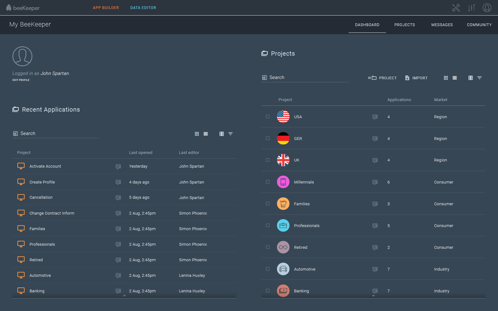
To combat the common problem of uploading the same content across many digital platforms, this product would allow users to design and build the content and functionality of an application and then deploy it across various platforms.
The Brief
My role
I joined the project during the second phase and took over the role of lead designer. I was tasked to improve the look and feel of the product and make it easier for non-technical users to use.
In addition to this I was to integrate a load of new functionality that was on the backlog and needed to be added to the product before launch.
I worked closely with both the product owner and developers to turn a highly technical product into something more intuitive and user-friendly.
The journey
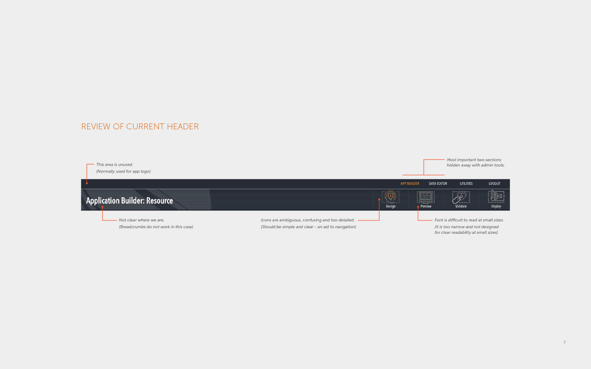
What did I inherit?
The existing designs were complicated, unintuitive and full of unnecessary design flairs that were both confusing and inconsistent.
Research
What I found was:
The mission
I then defined some clear goals to make sure we stay on track:
Presentation
I created simple, but polished presentations to help illustrate my designs (including re-defining the brief, followed by my research, thoughts and considerations, as well as my design iterations). These were well received by internal stakeholders, who were used to the usual “death by PowerPoint”, and so hadn’t seen things explained so simply.
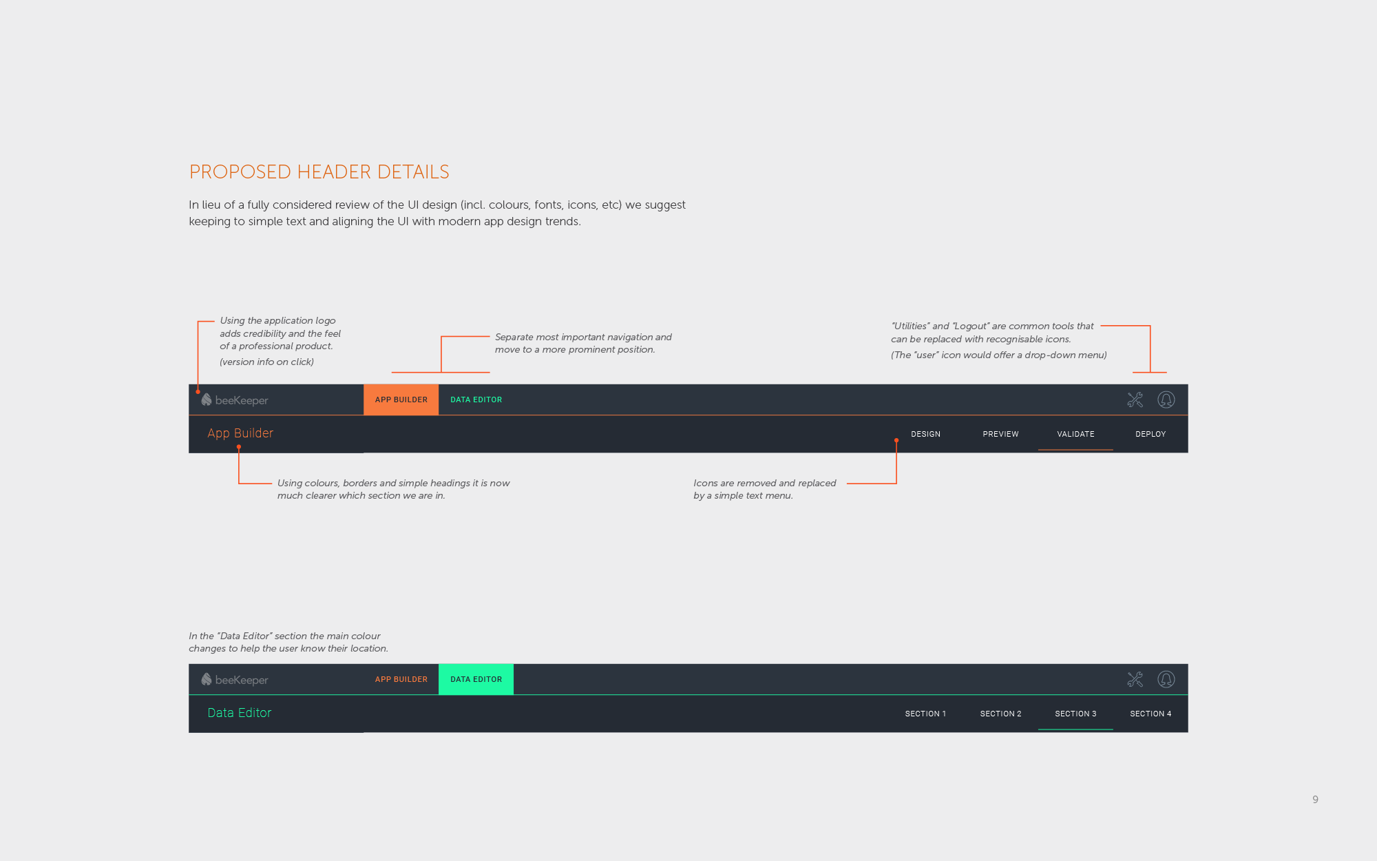
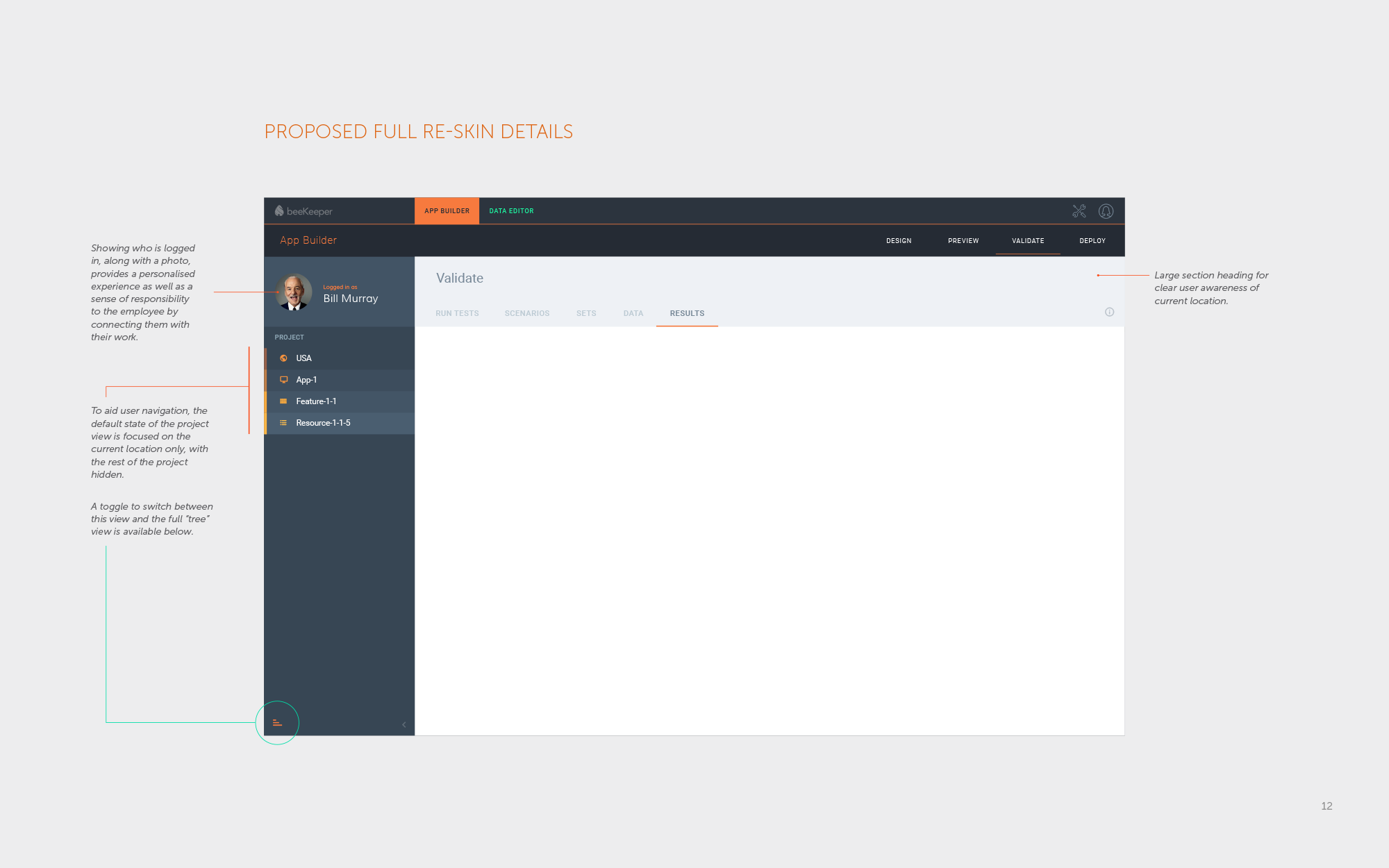
Design
A lean process
As the sole designer on the product I created all the UX flows, wireframes, prototypes, designs and markups.
Due to incredibly short time constraints I often had to skip stages of the process, sometimes jumping straight into designs, but working so closely with the team meant the majority of issues were resolved on the fly.
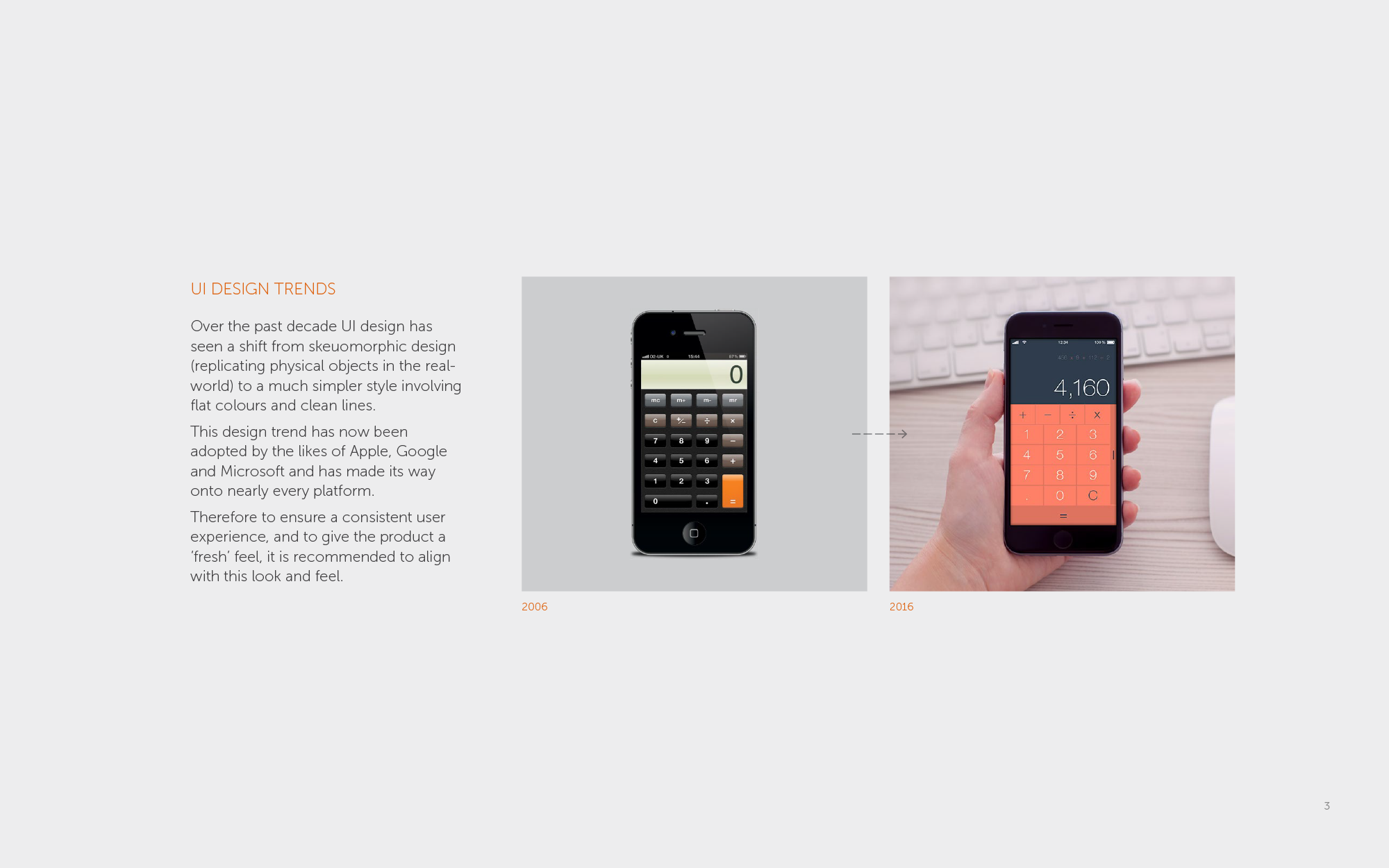
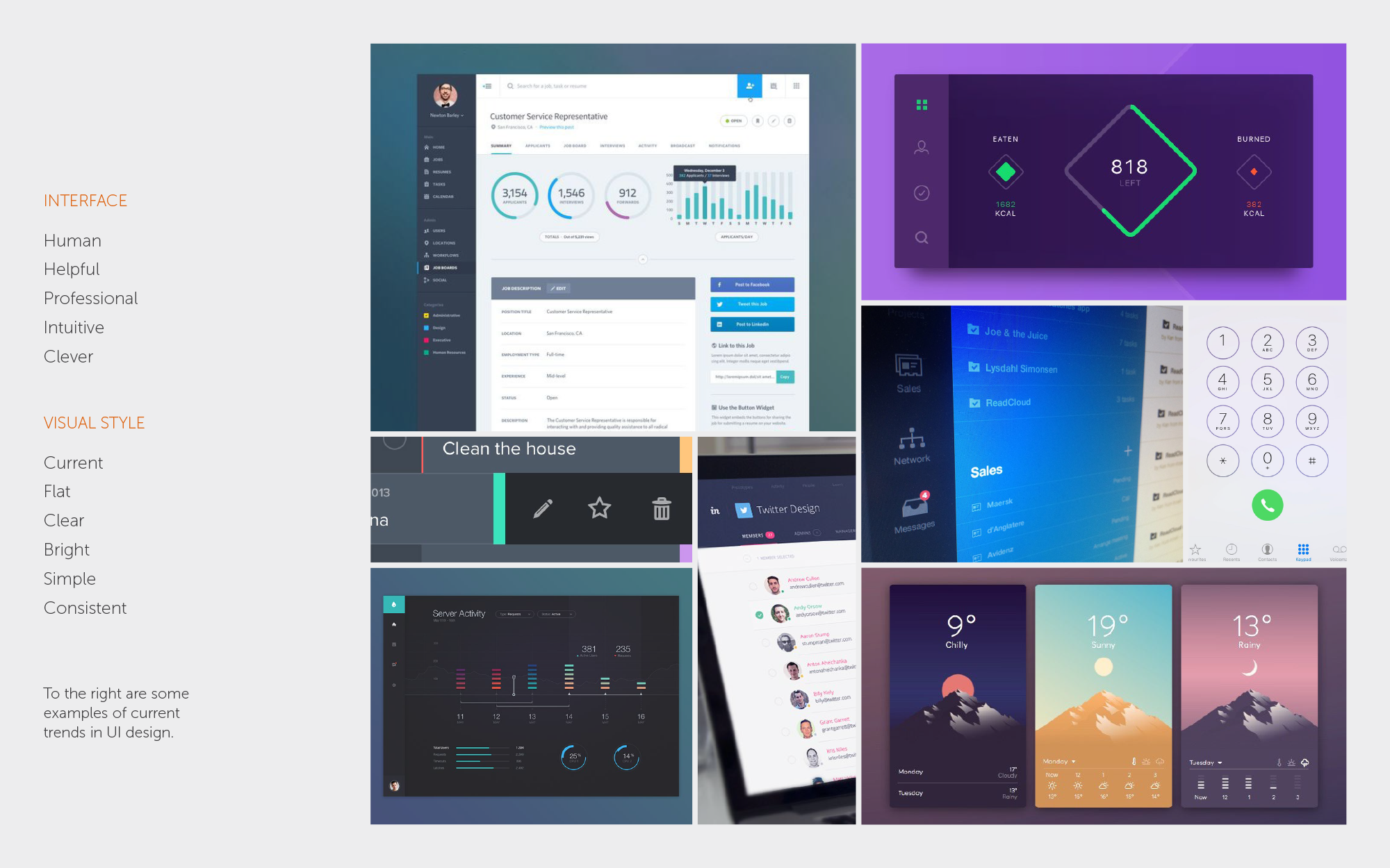
Styling
Material things
As there was a lot of new features to add, and limited time, I suggested using a pattern library as a base for the style to get the ball rolling. I proposed Google’s Material Design, with its modern, flat design and wonderfully clear and detailed guidelines.
It turned out this was a perfect fit as they had recently started rebuilding the product in Angular and there was already a version for Material Design ready to go.
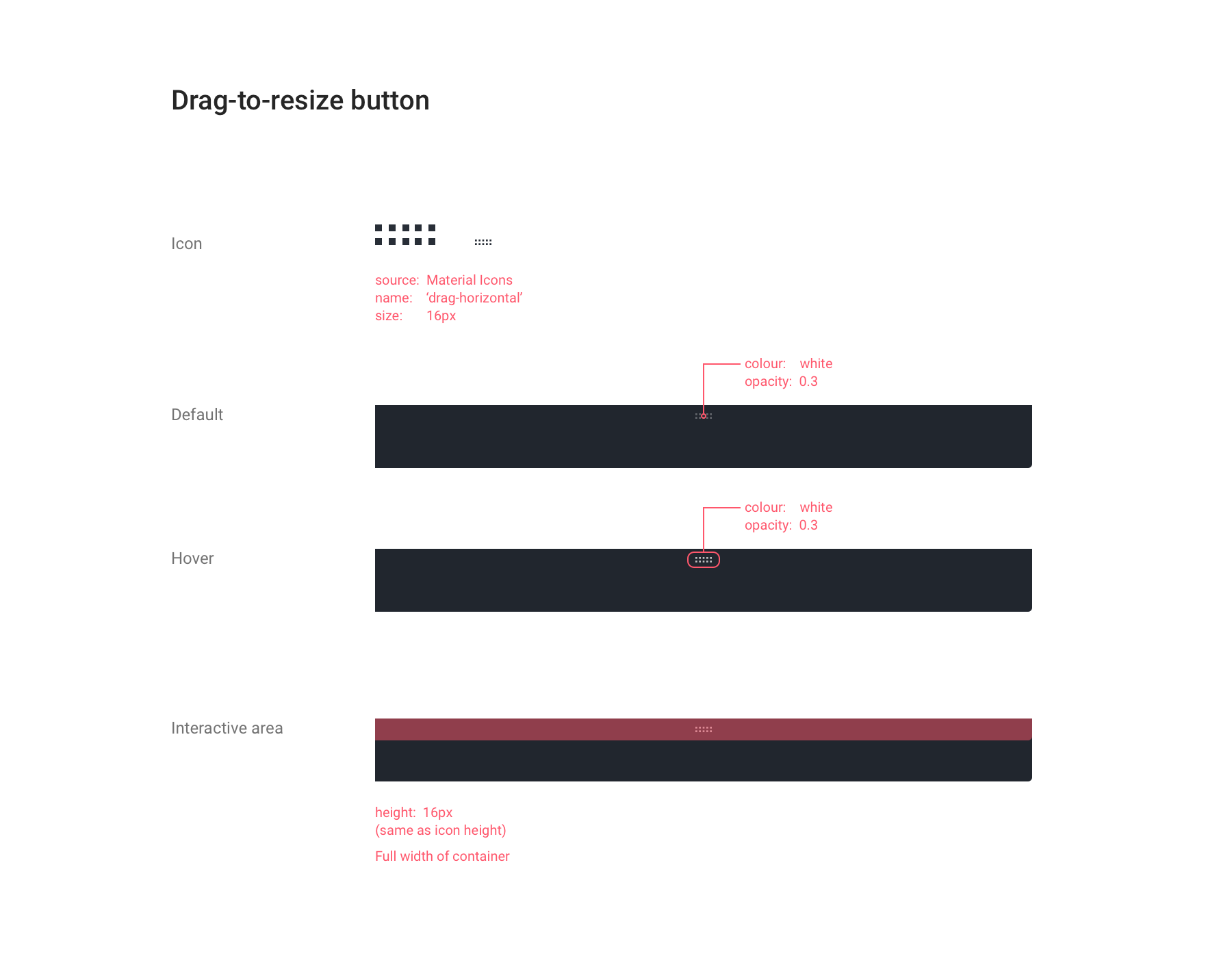
As the product evolved there were enough unique elements that it slowly started to develop a style of its own, which the company adopted to be applied to the rest of their suite of products.
We then built a universal component library to speed up future builds and help other teams implement the style into their products.
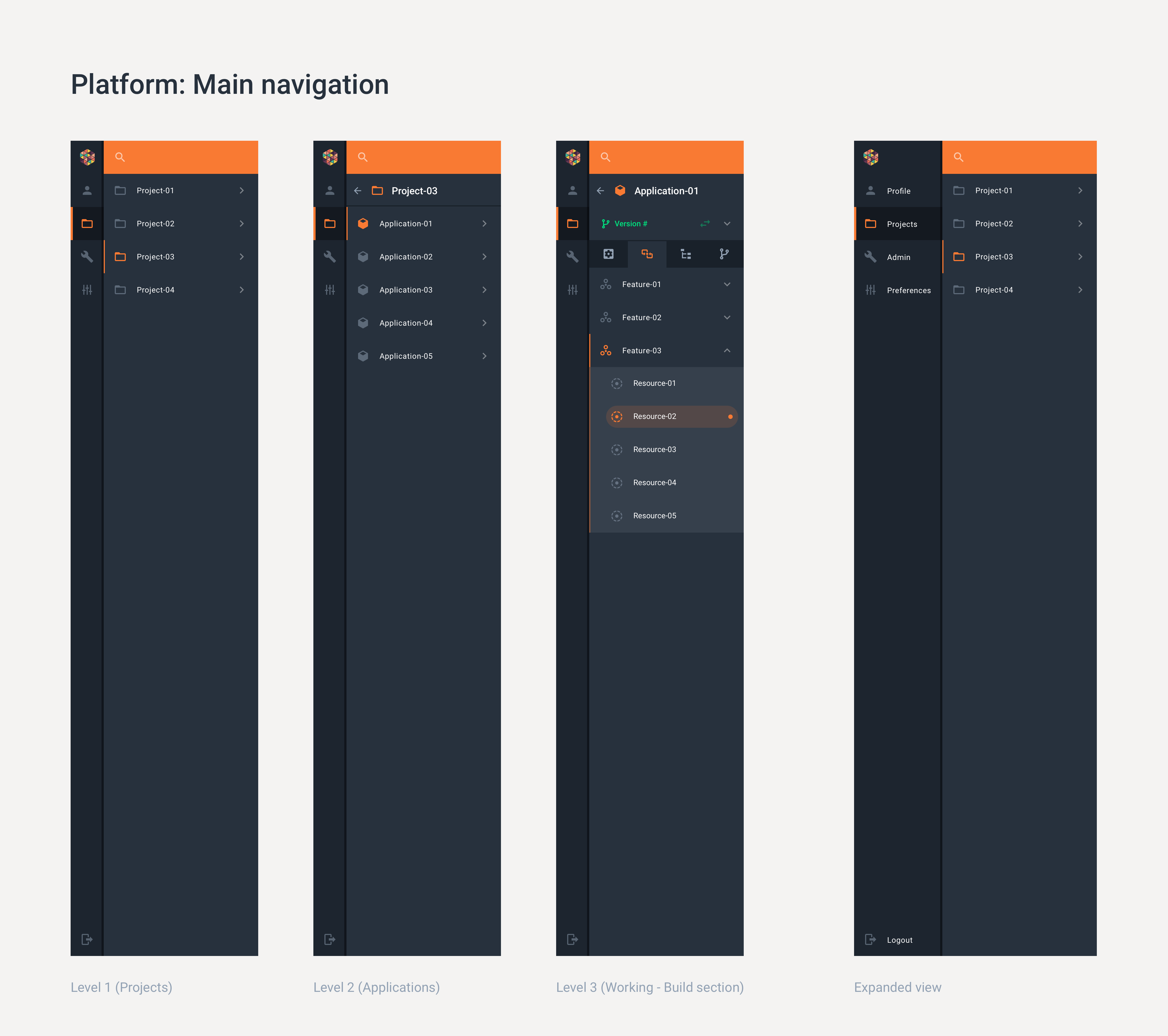
Mapping out the different page layouts using simplistic skeleton wireframes.
In detail
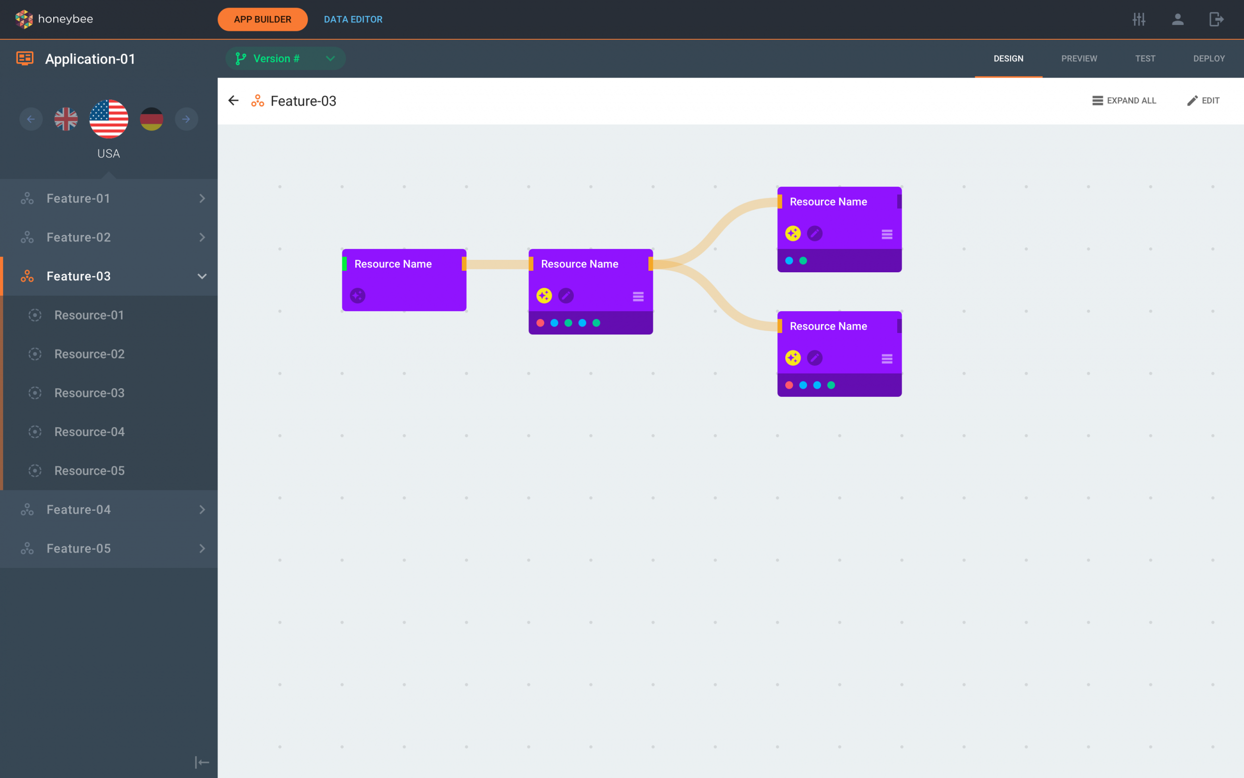
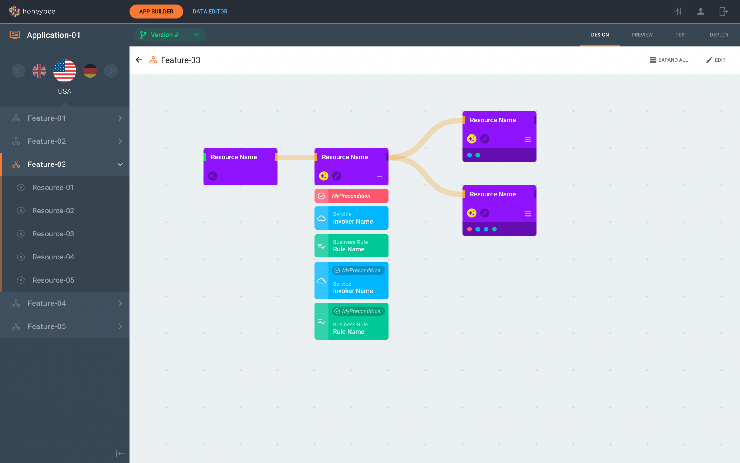
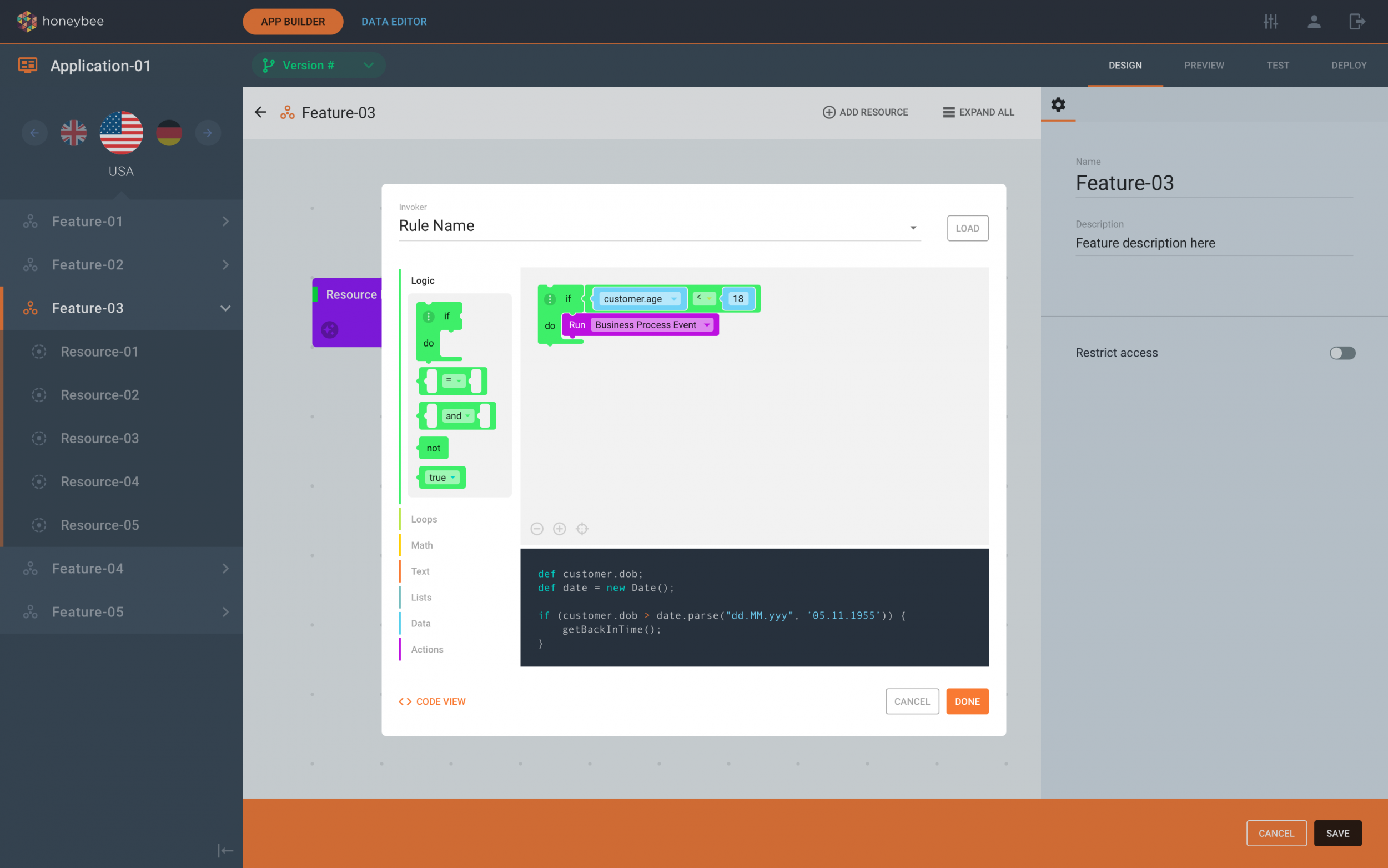
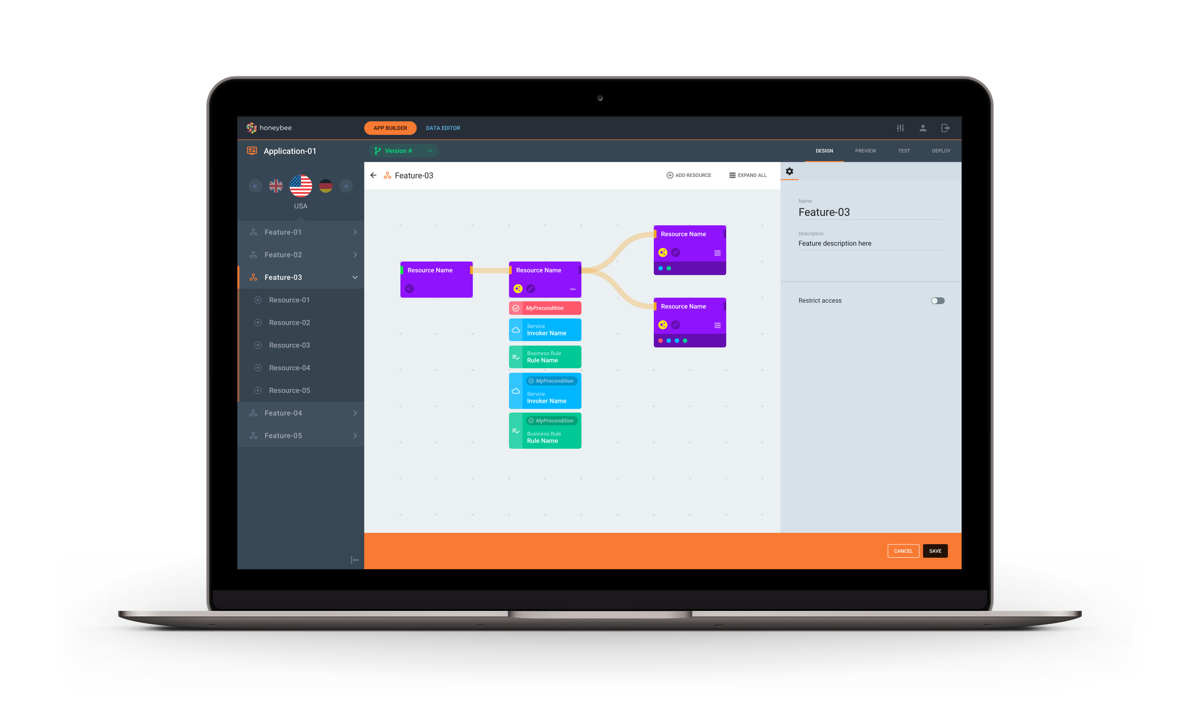
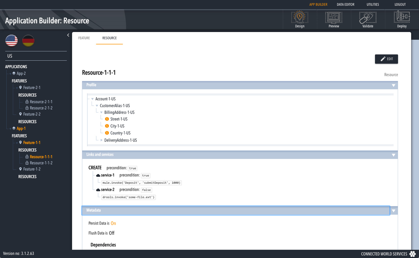
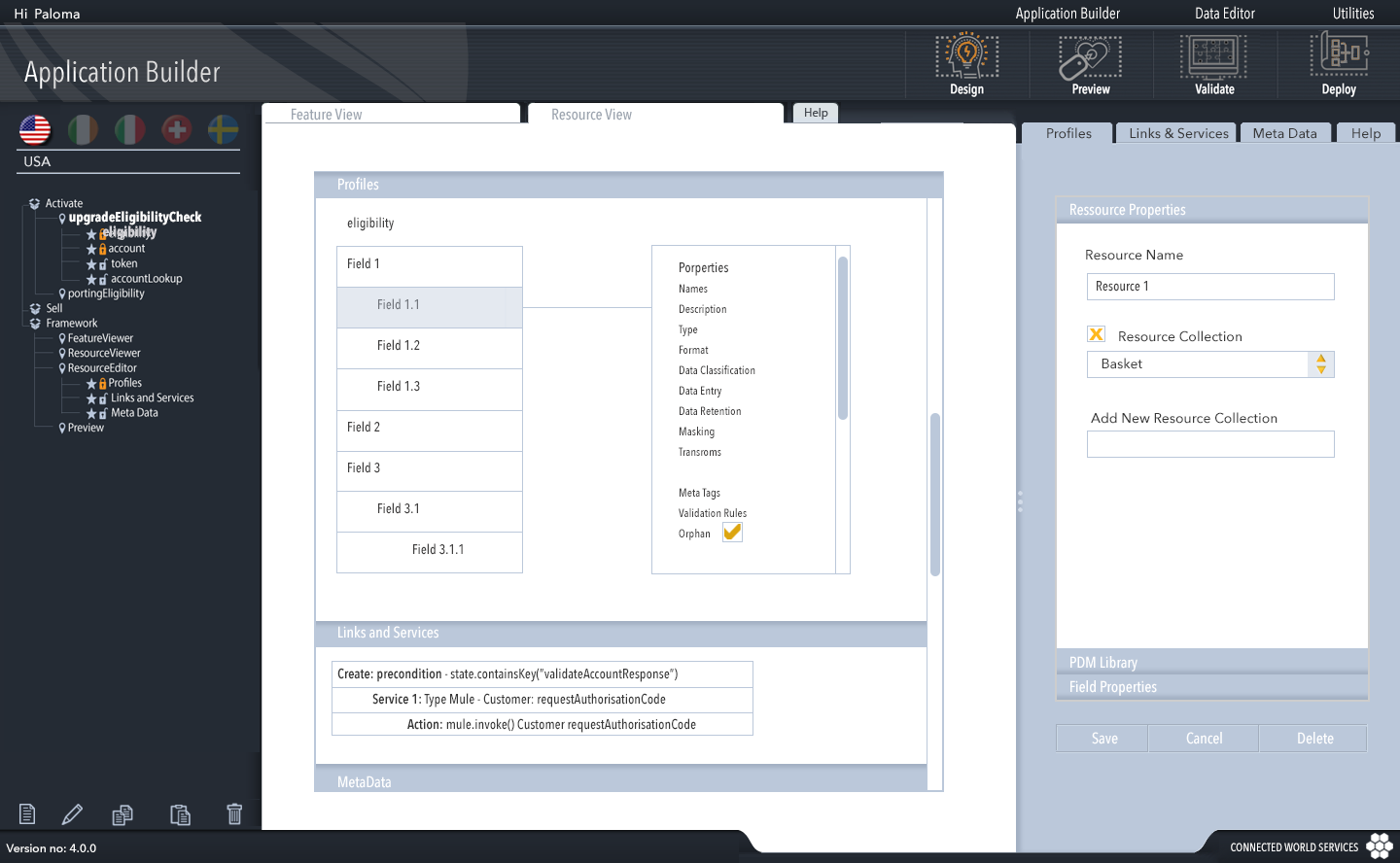
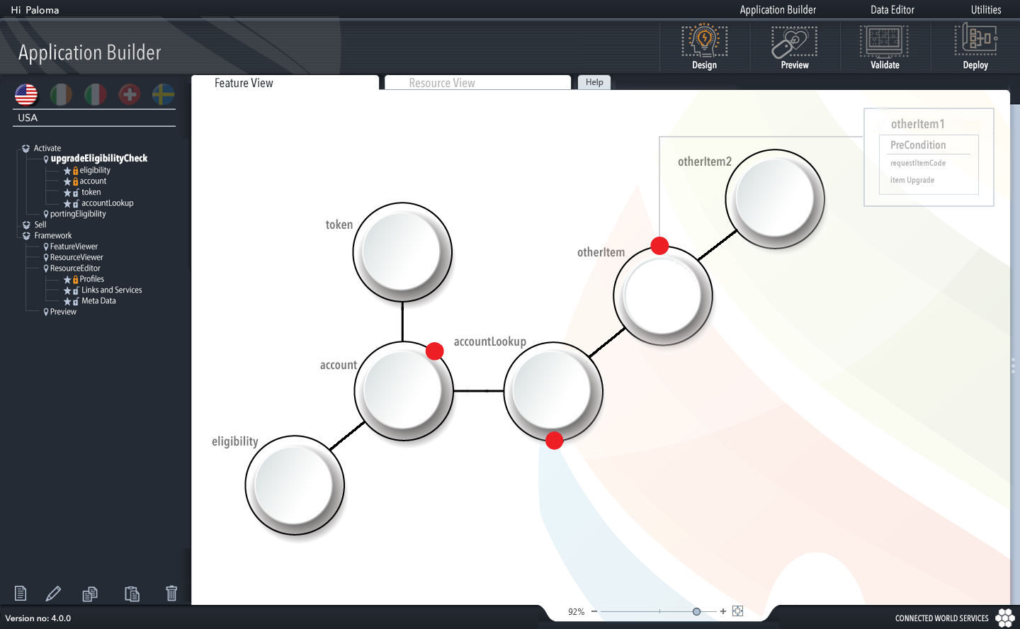
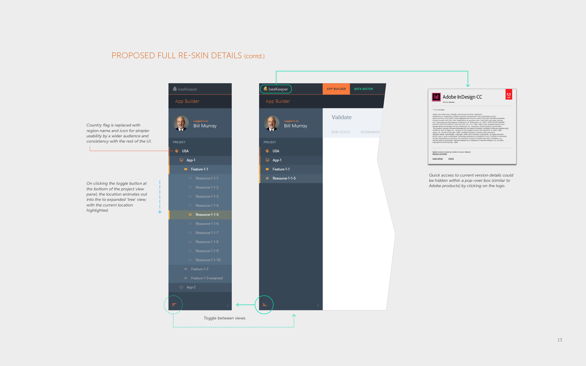
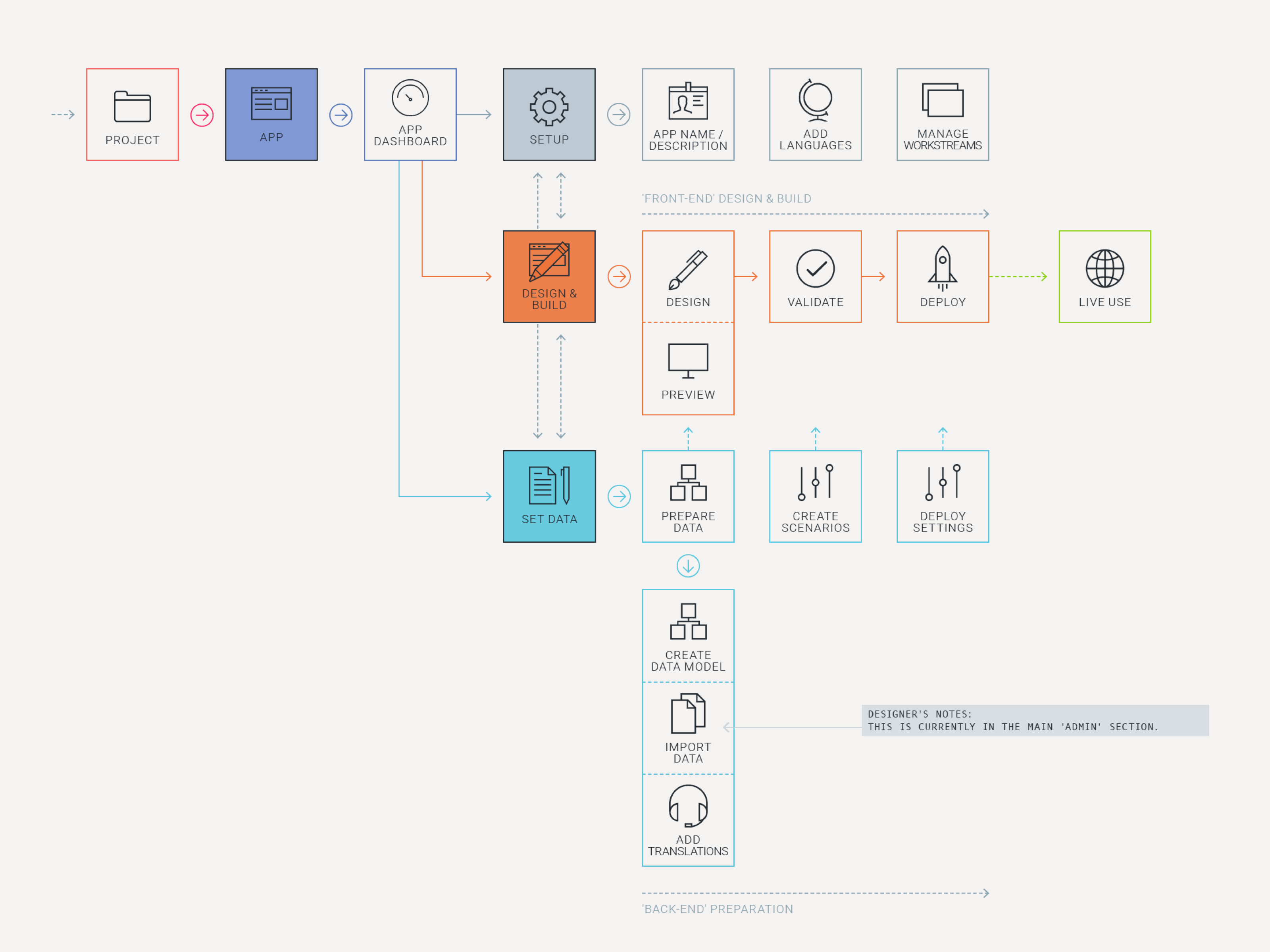
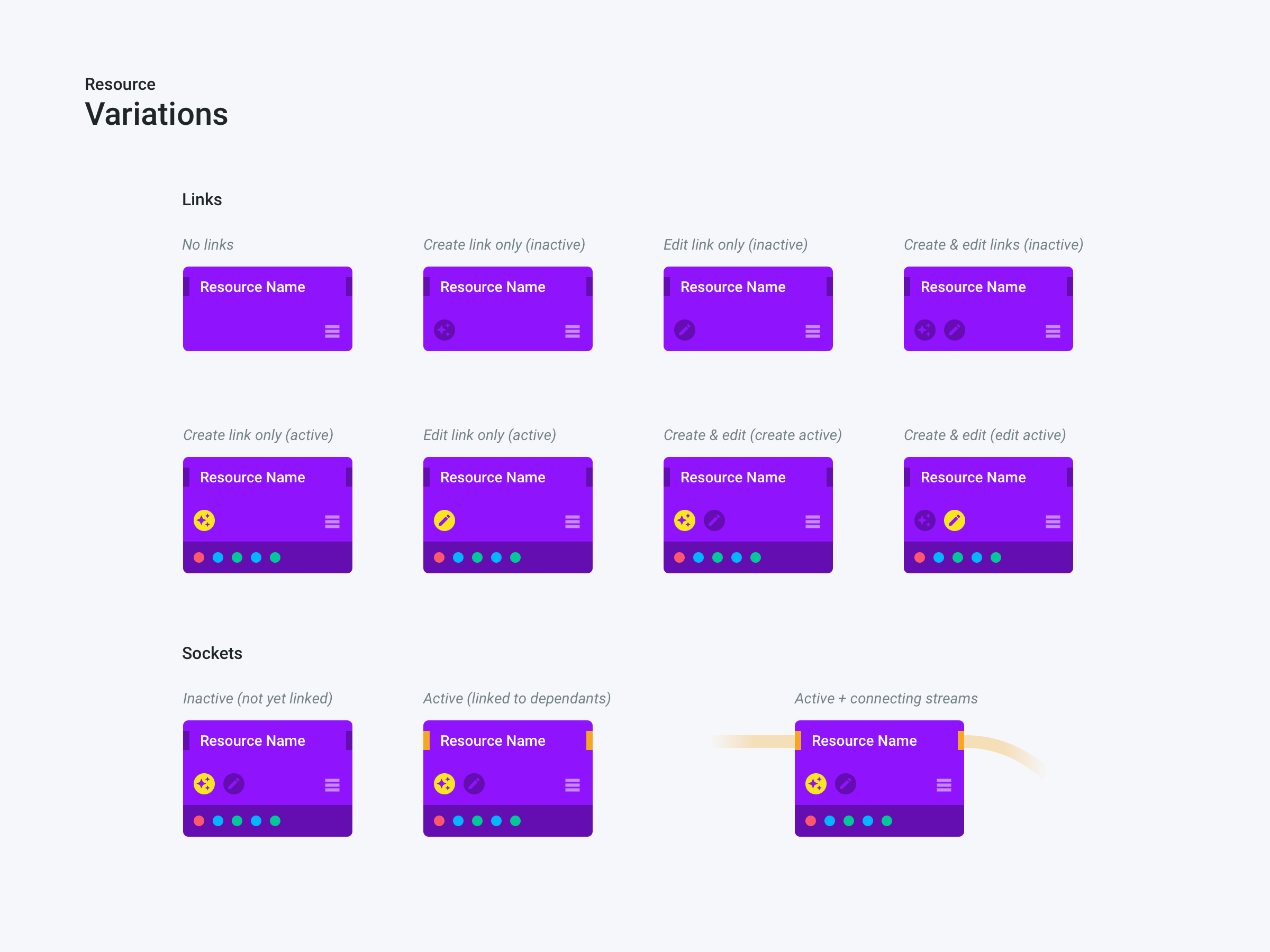
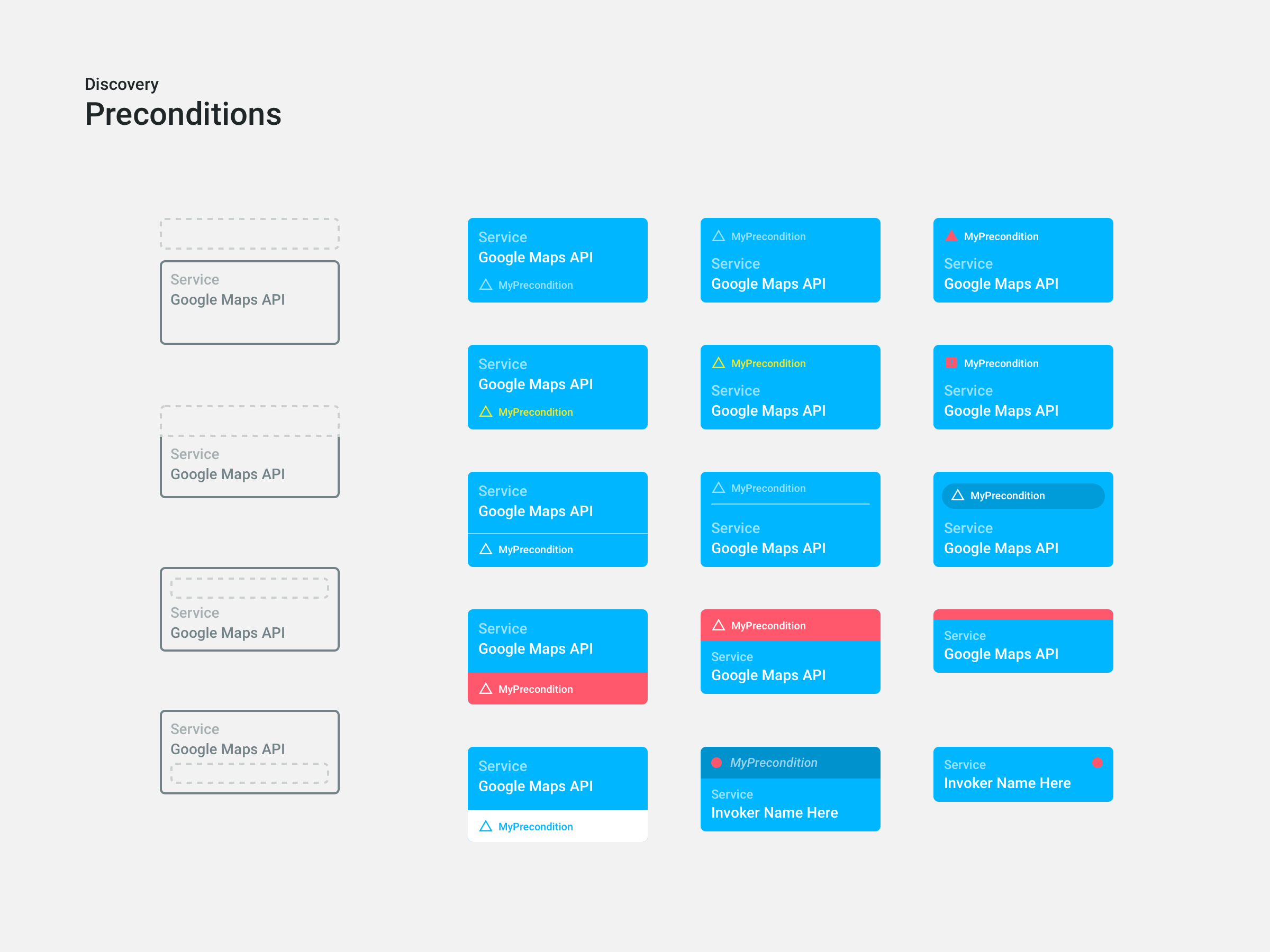
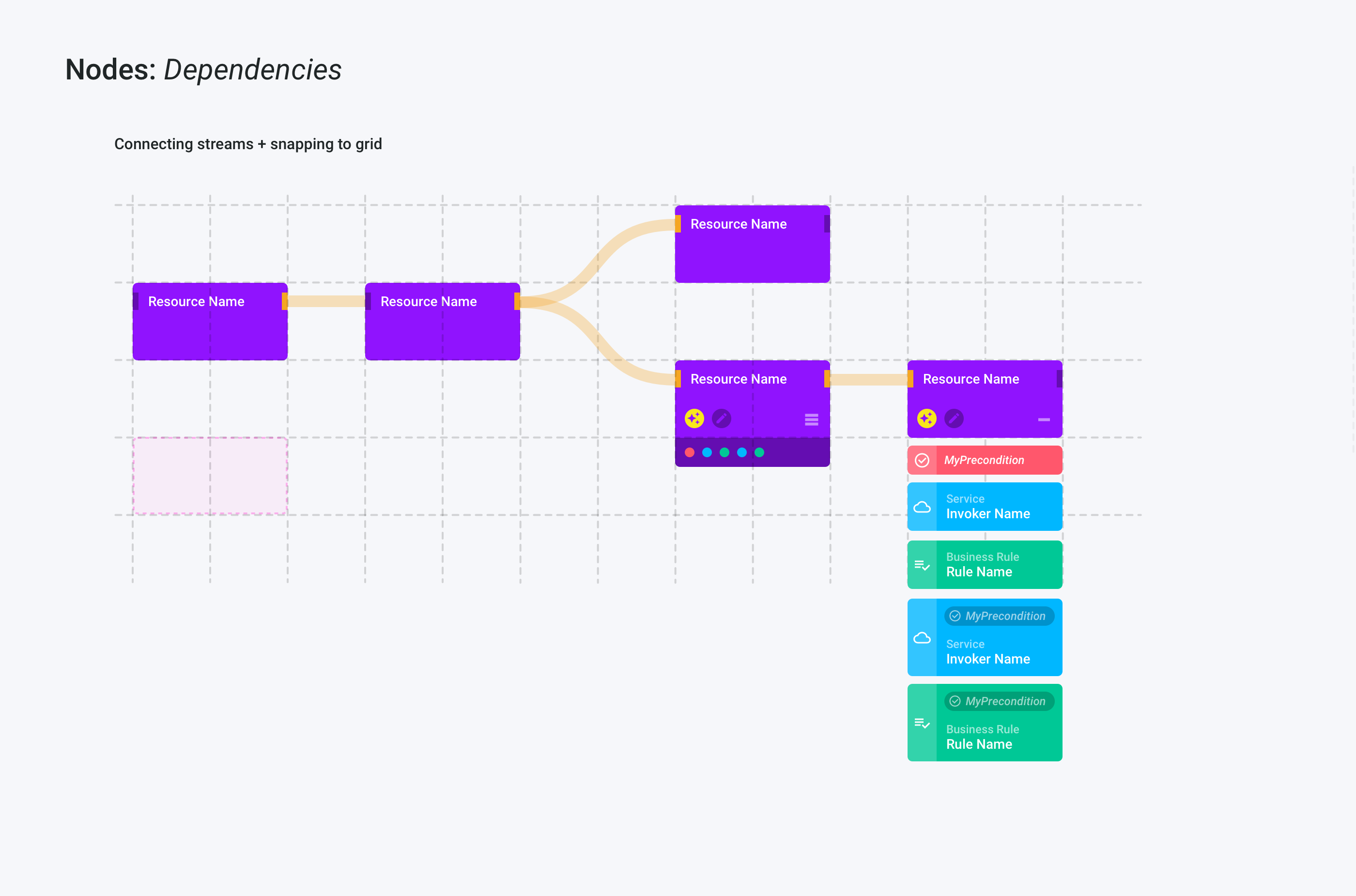
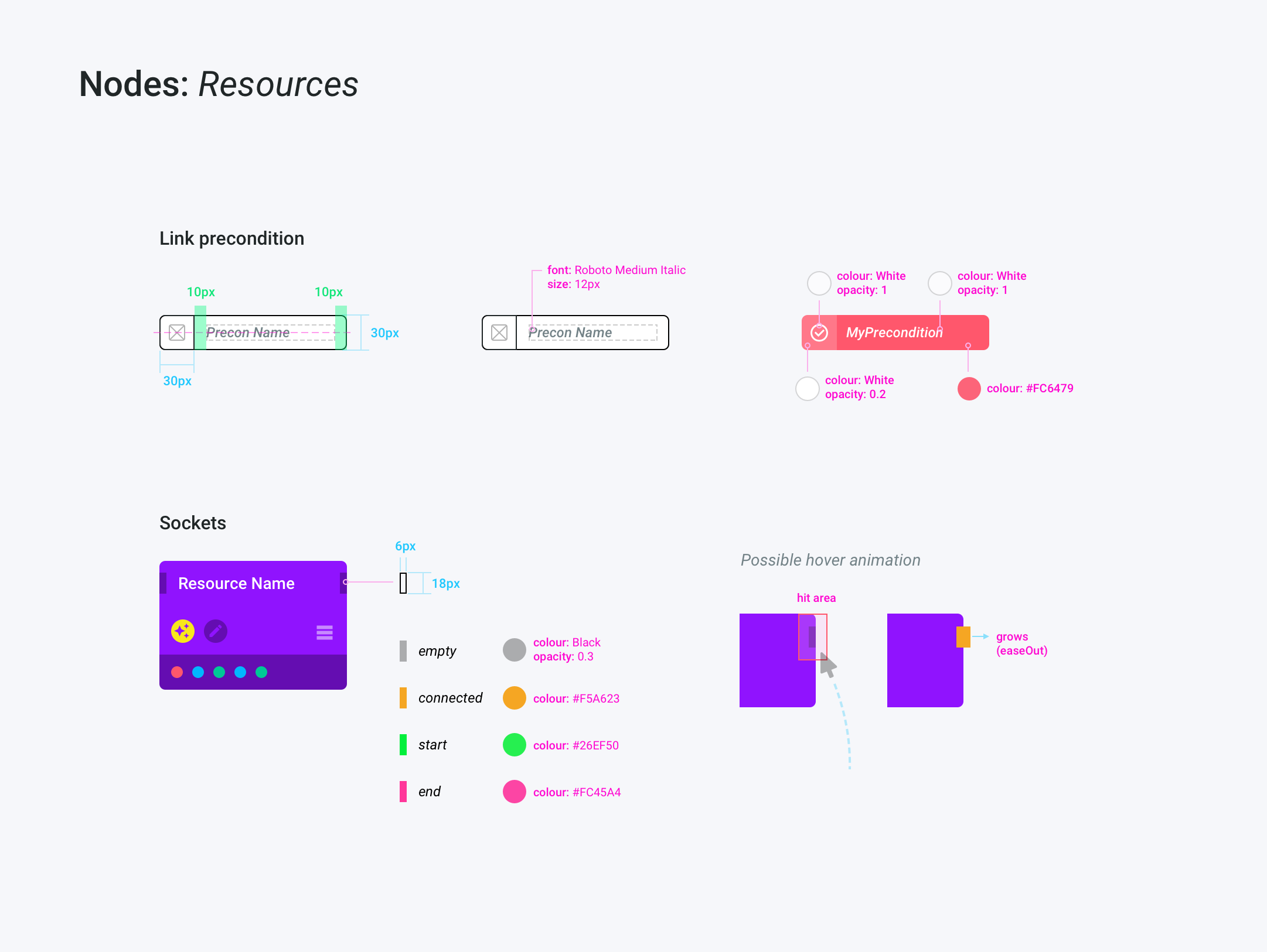
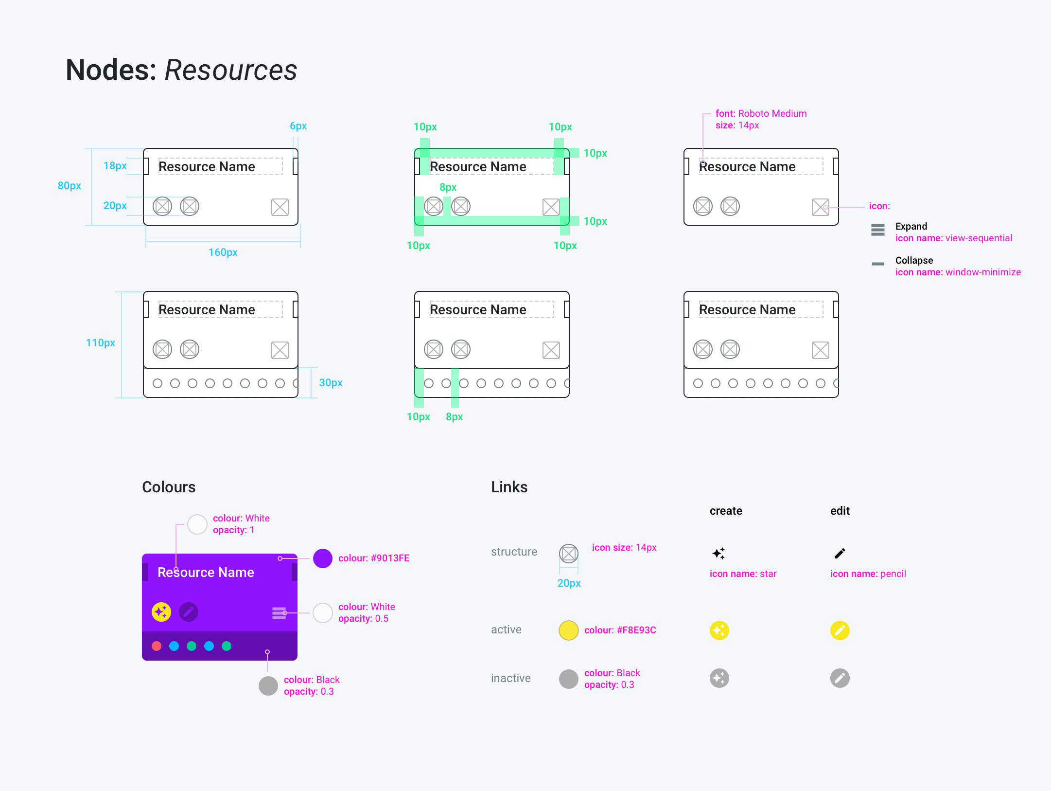
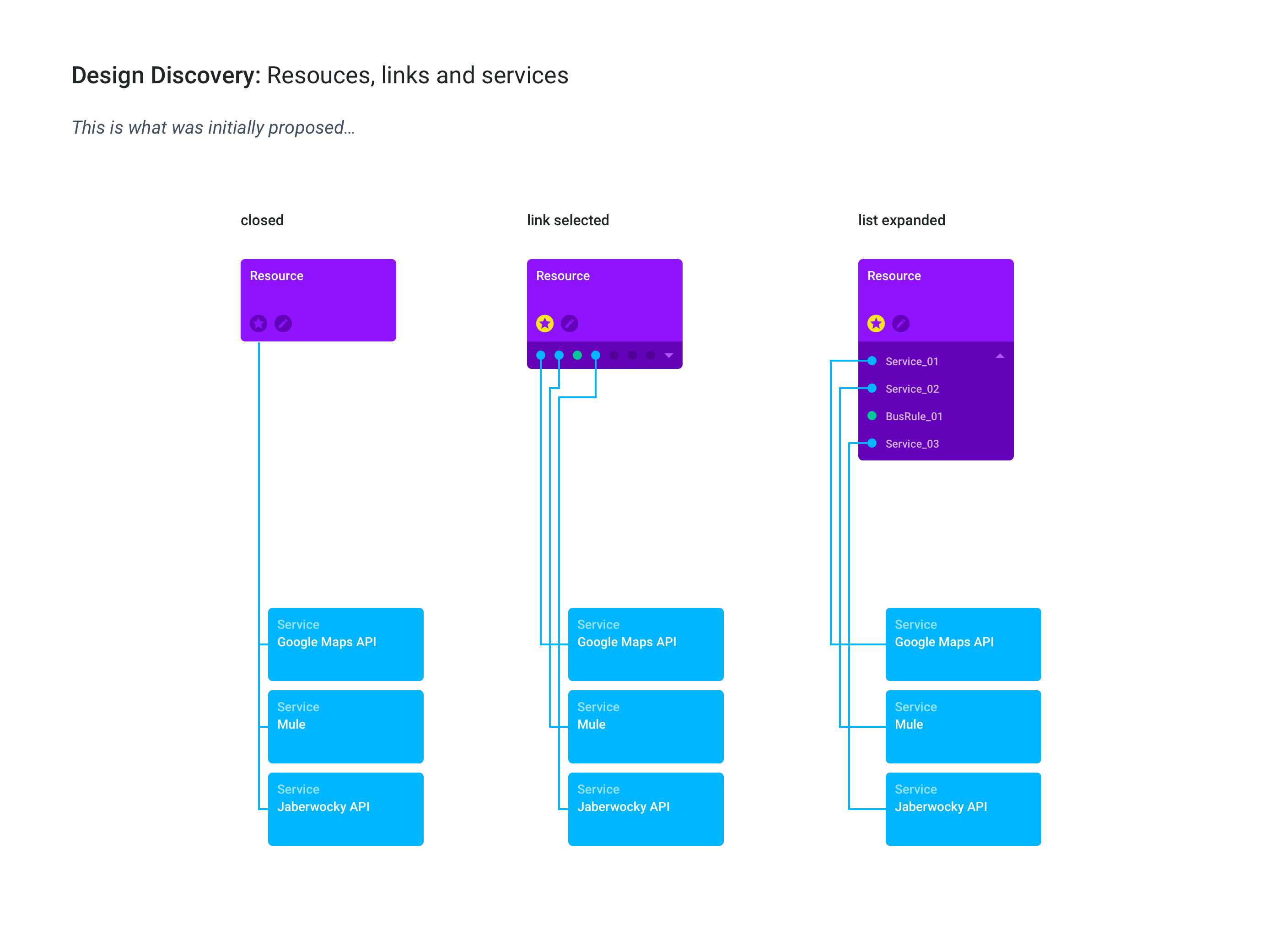
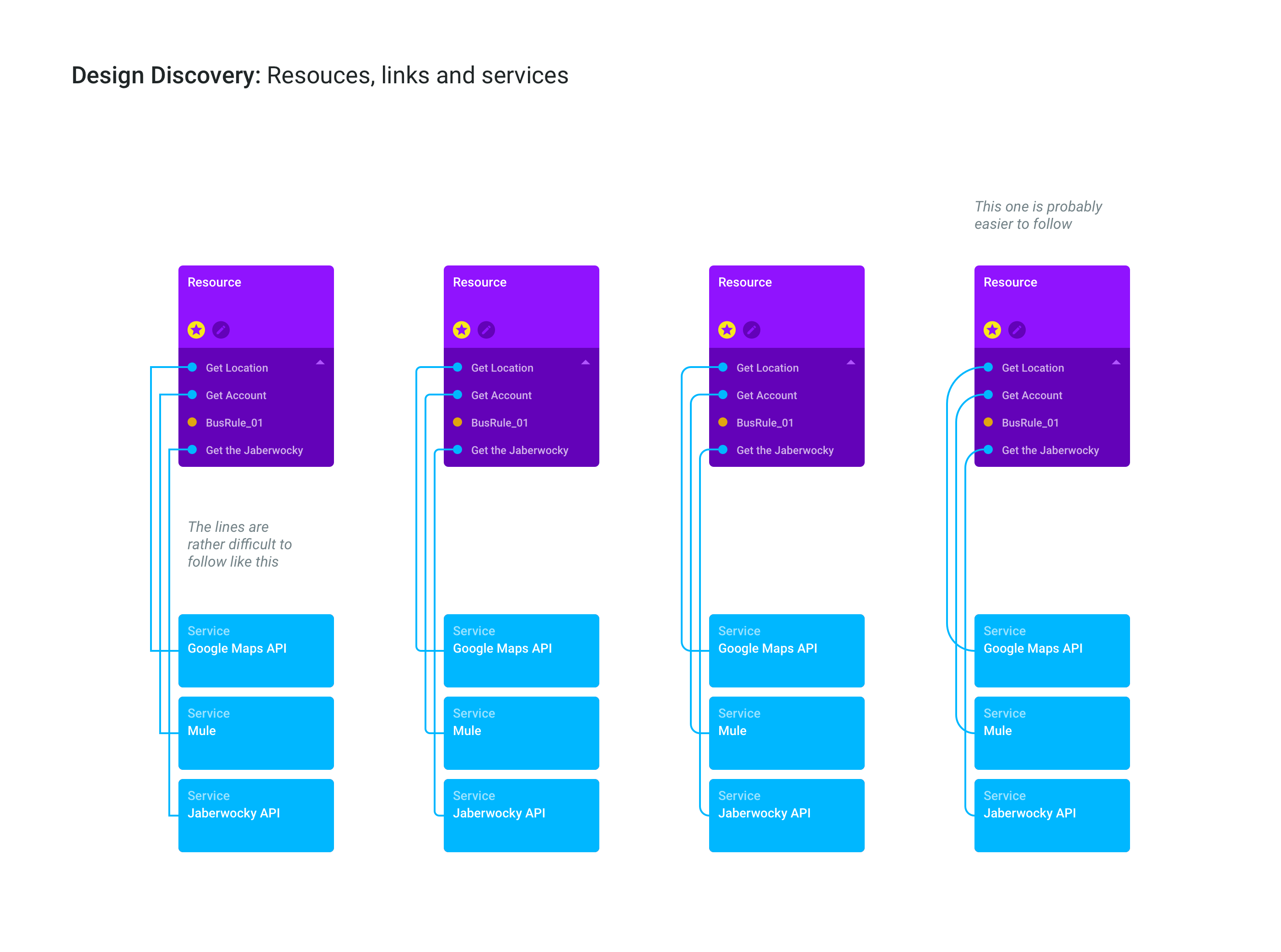
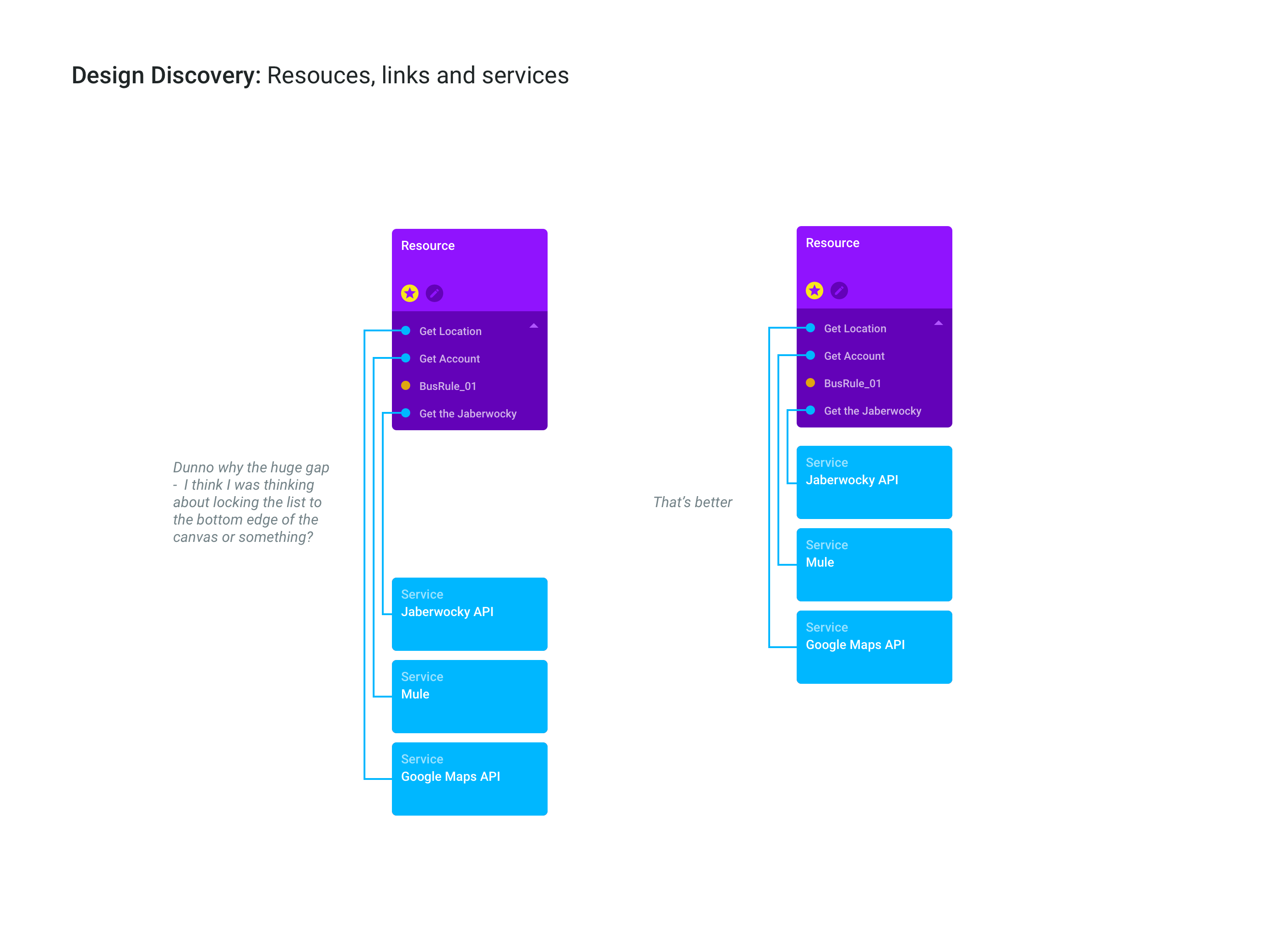
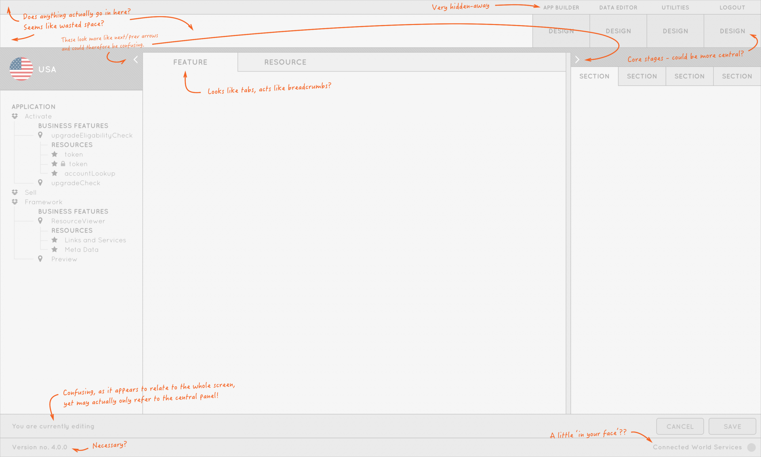
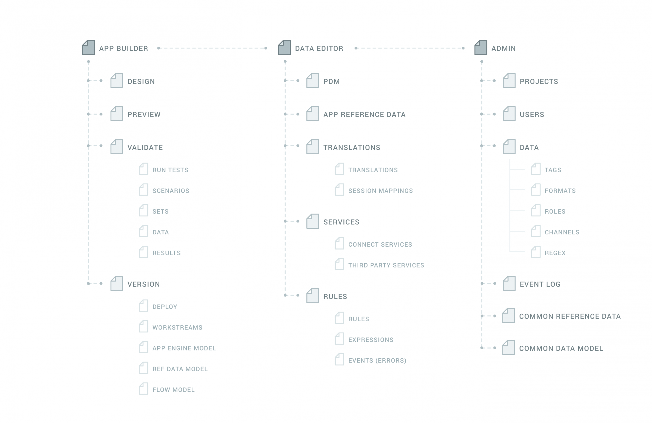
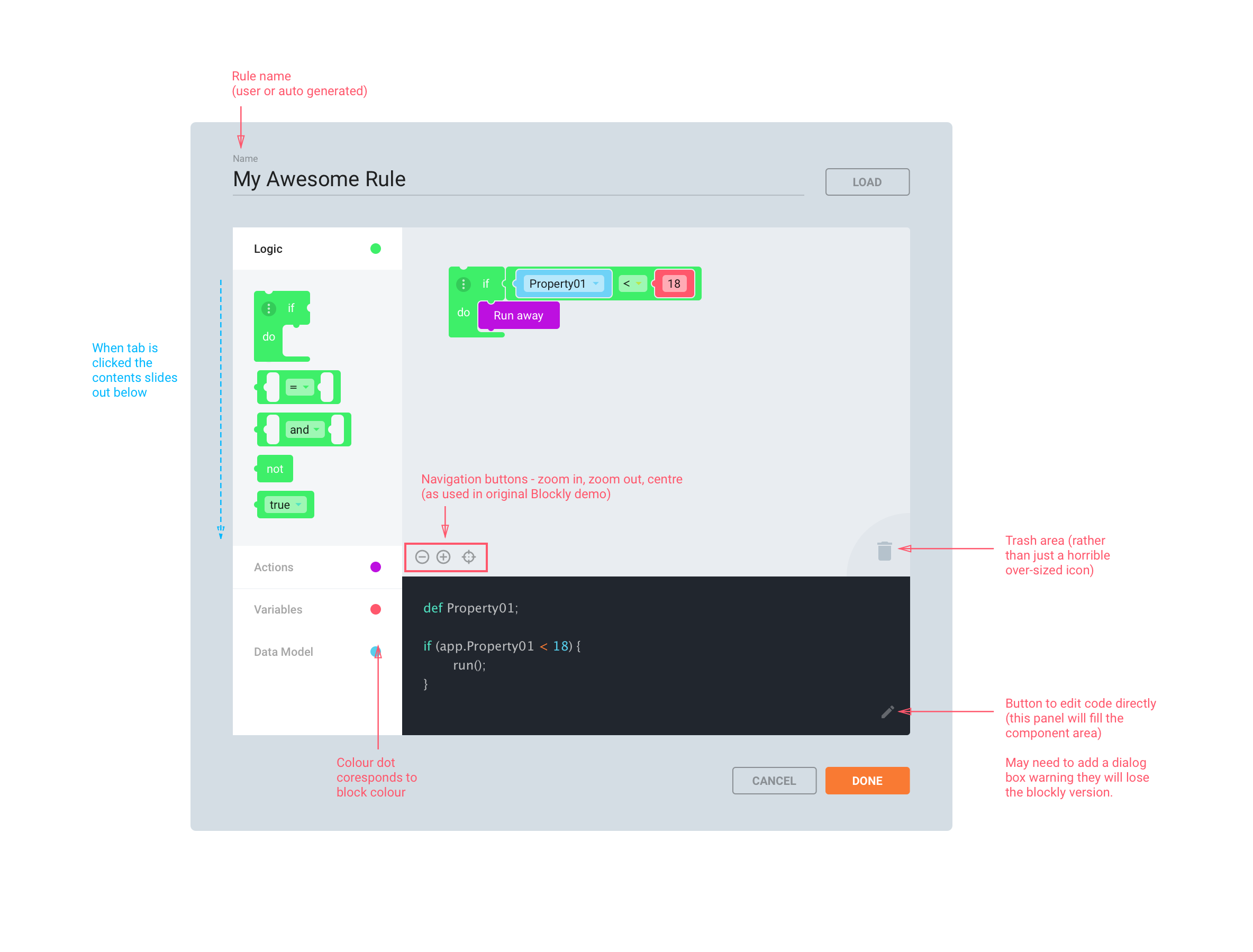
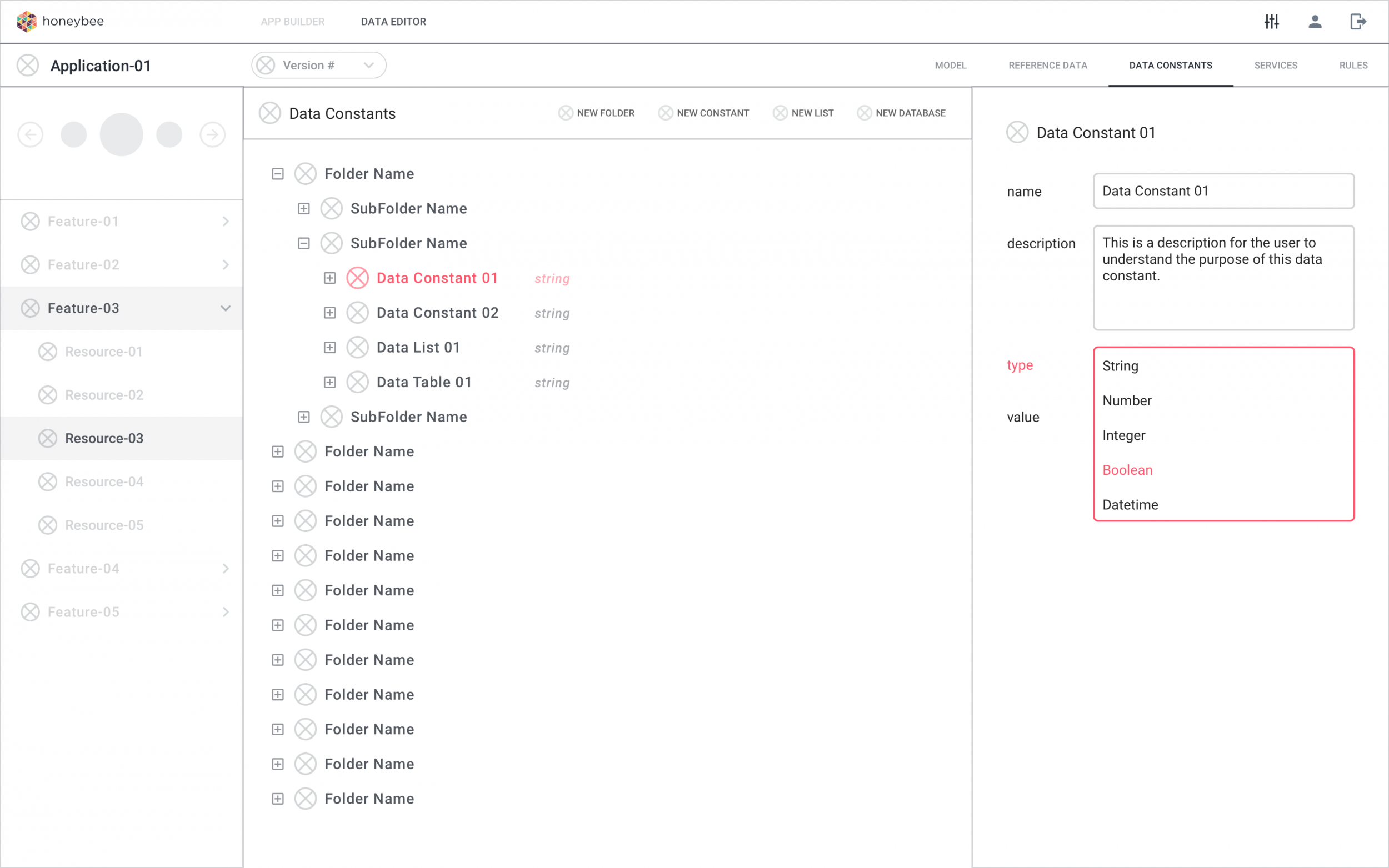
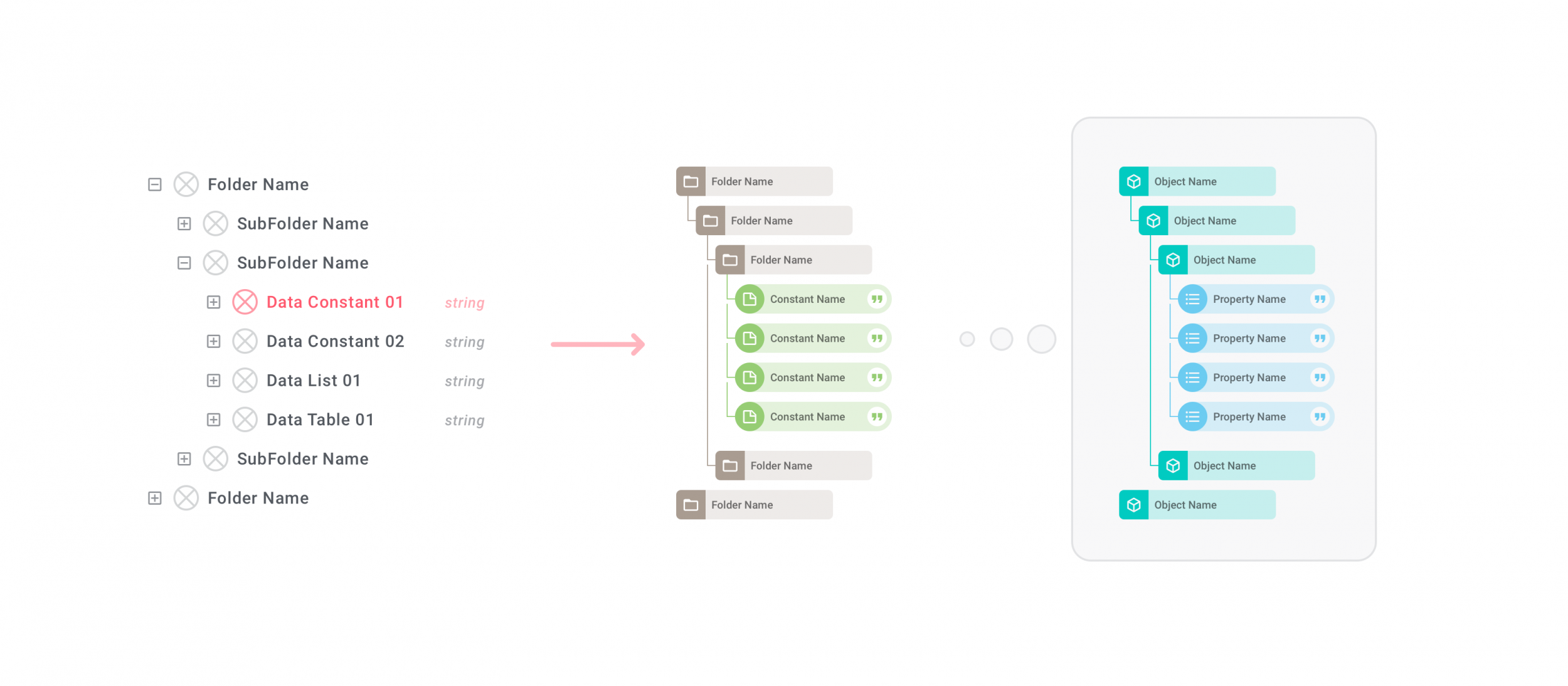
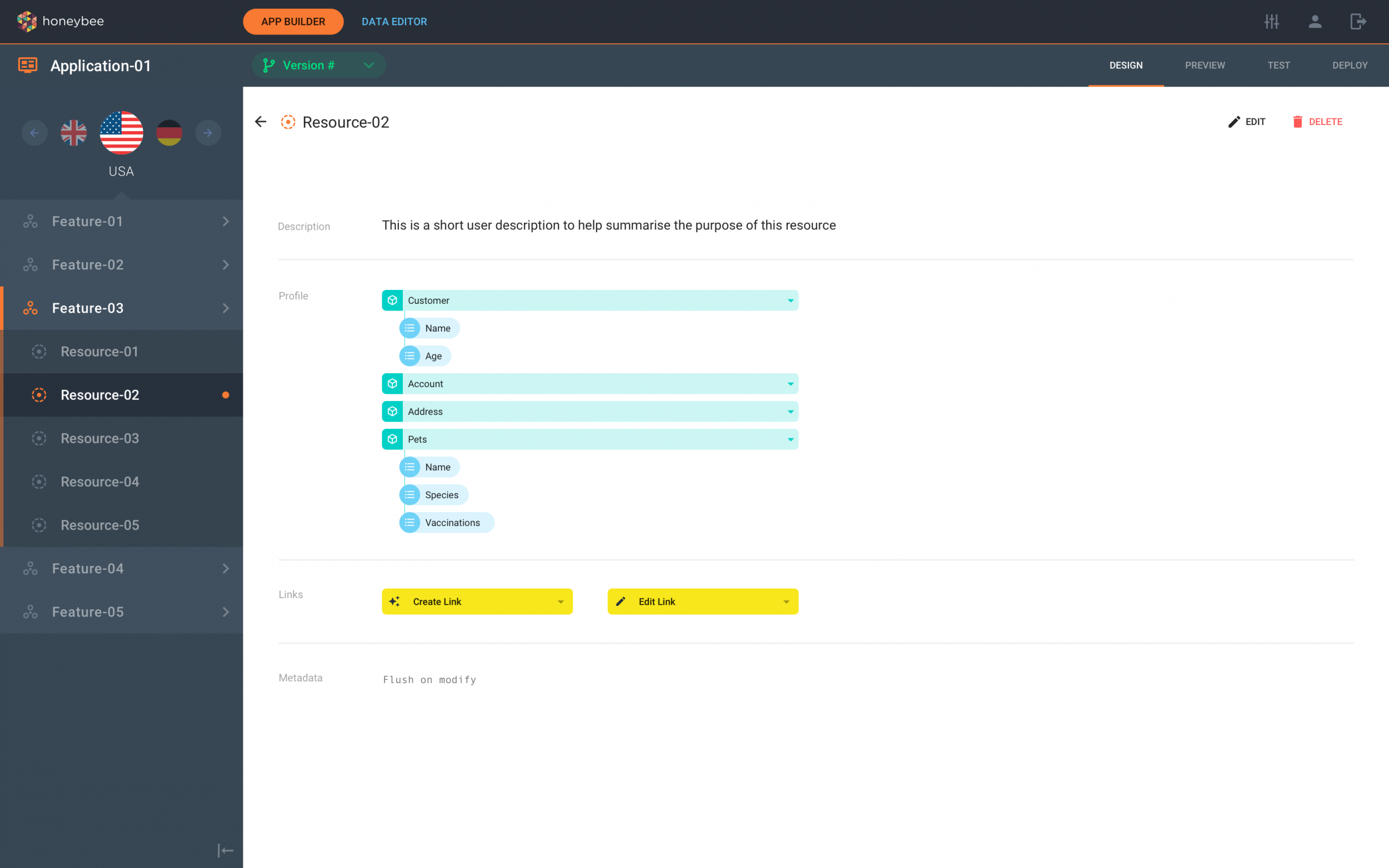
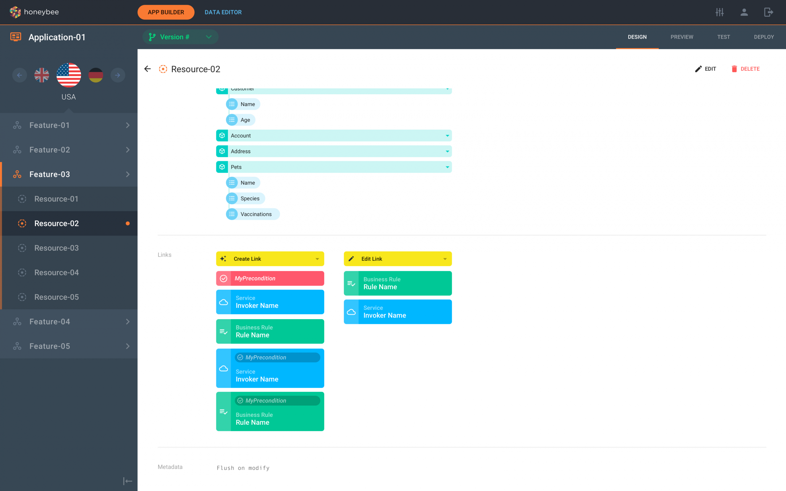
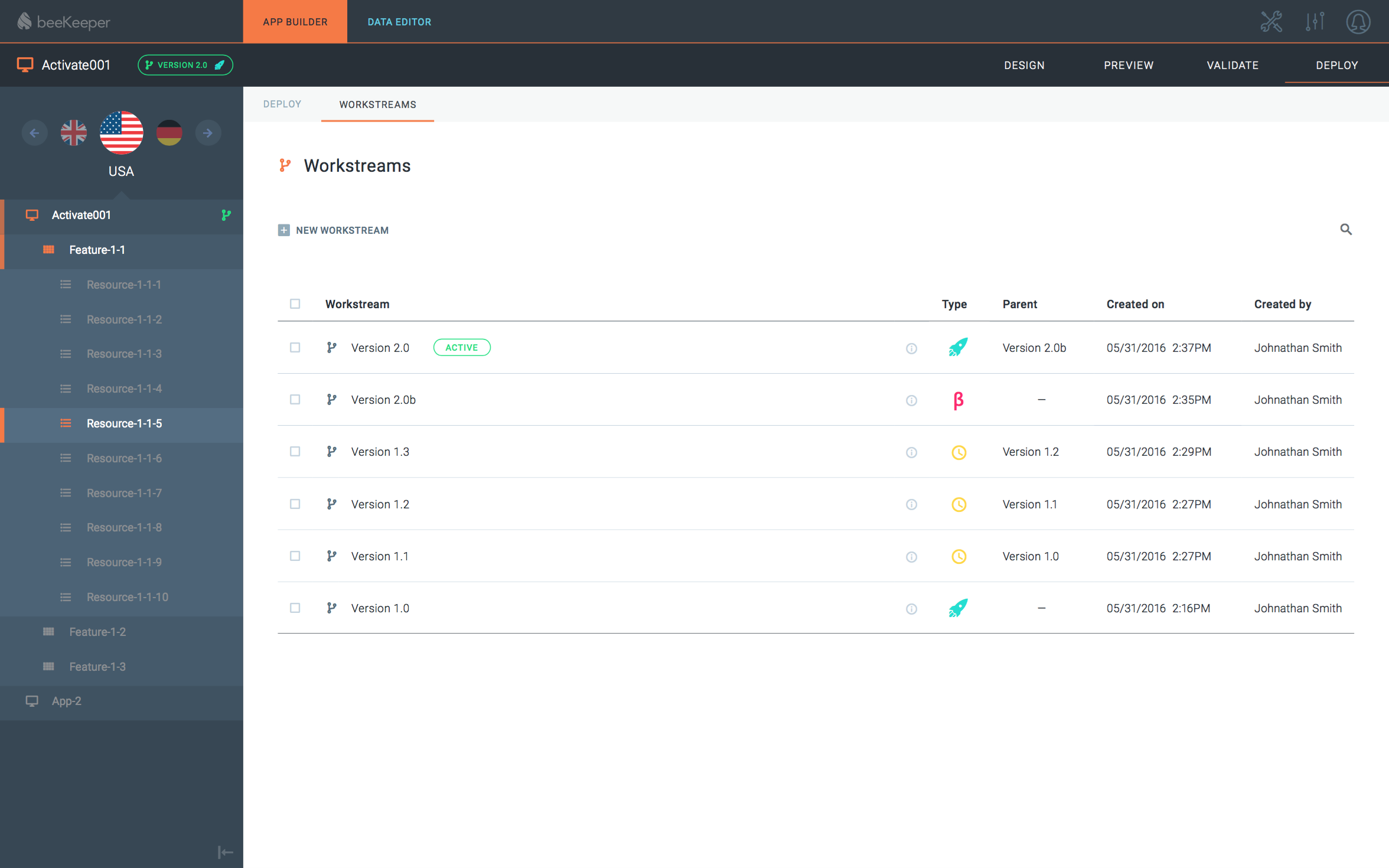
The application journey visual builder
The workflow visual builder was created to help the user to see the flow of events, the order in which things happen and how everything is connected, in a more intuitive and relatable way
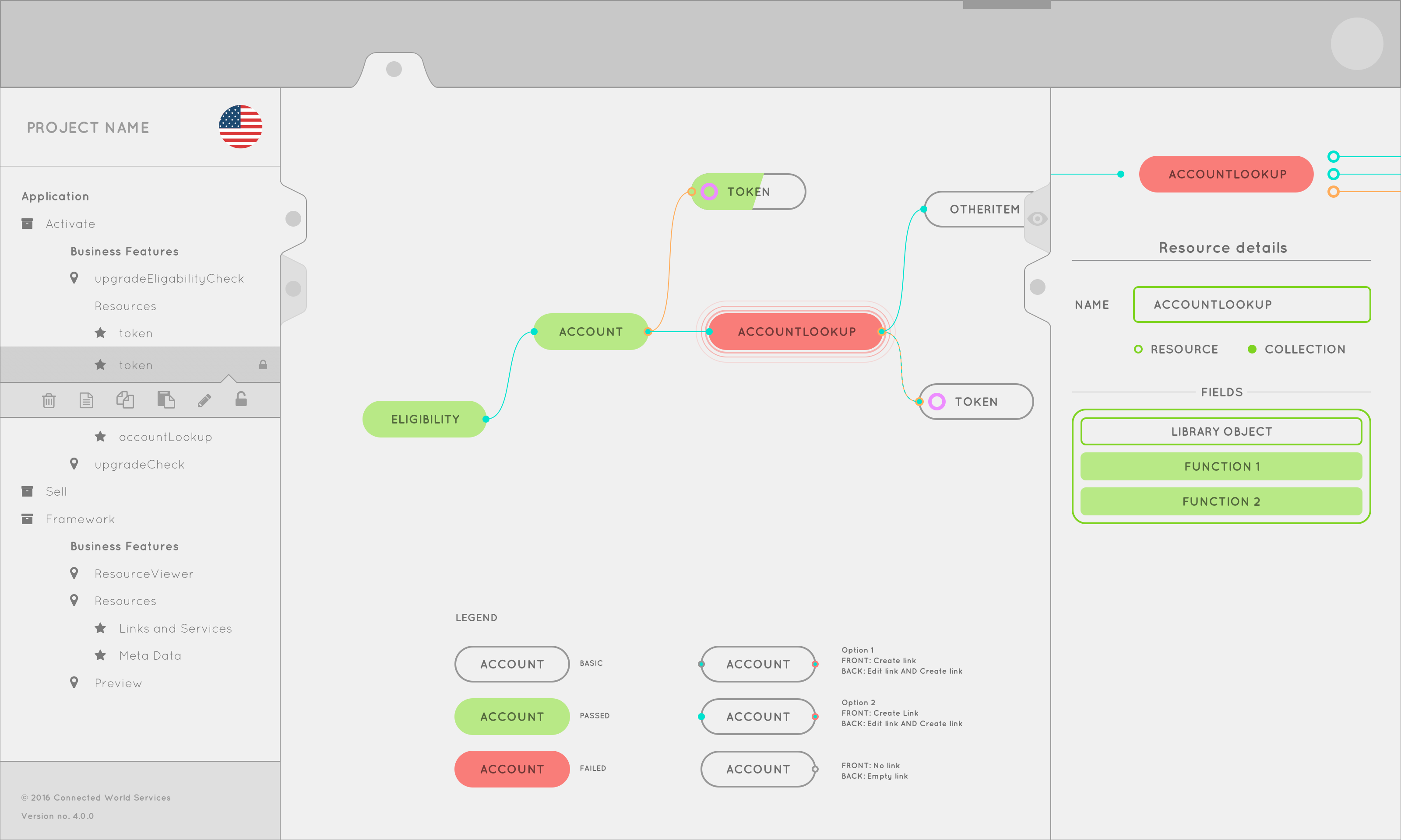
Early concept design for the visual builder.
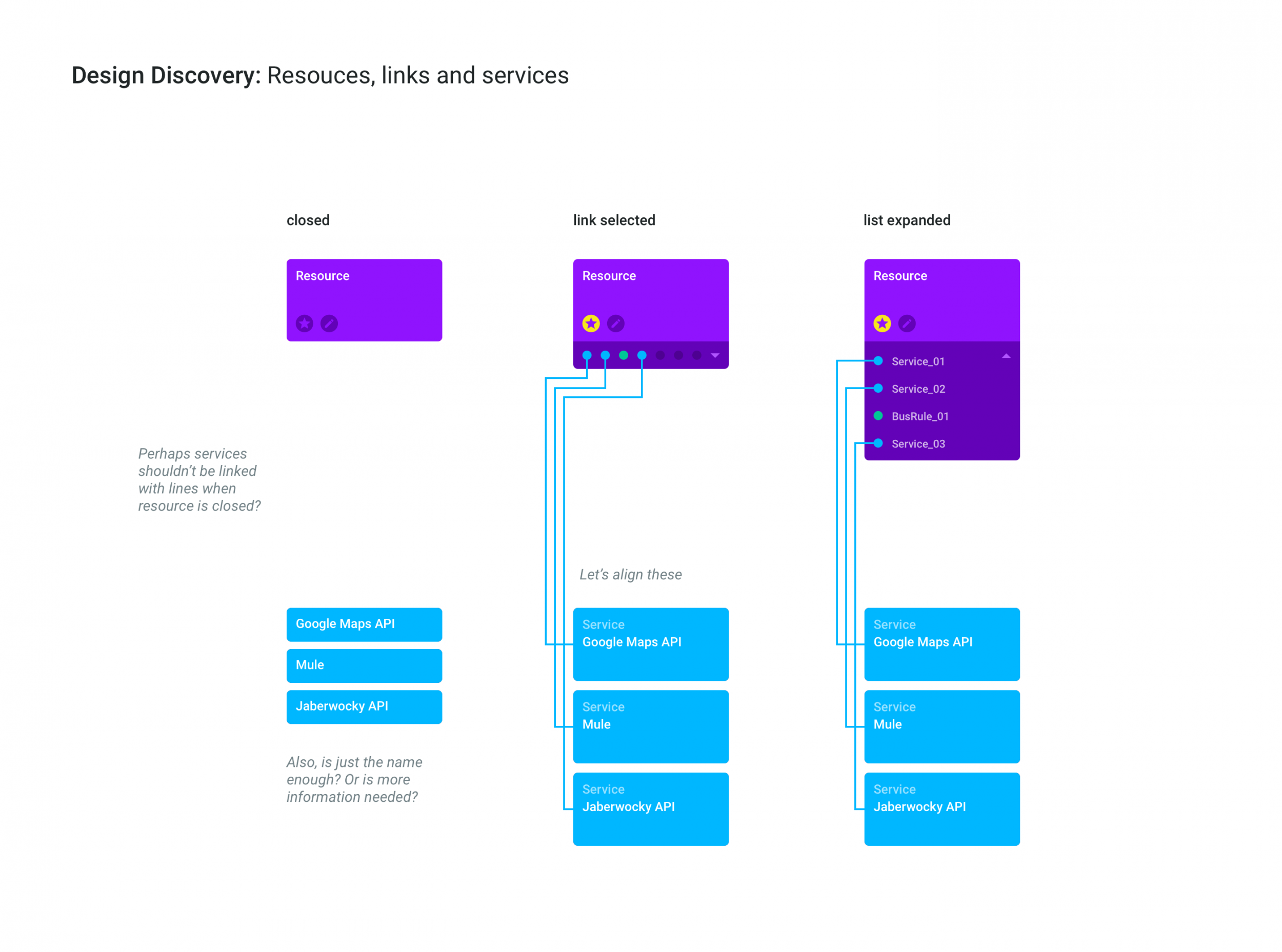
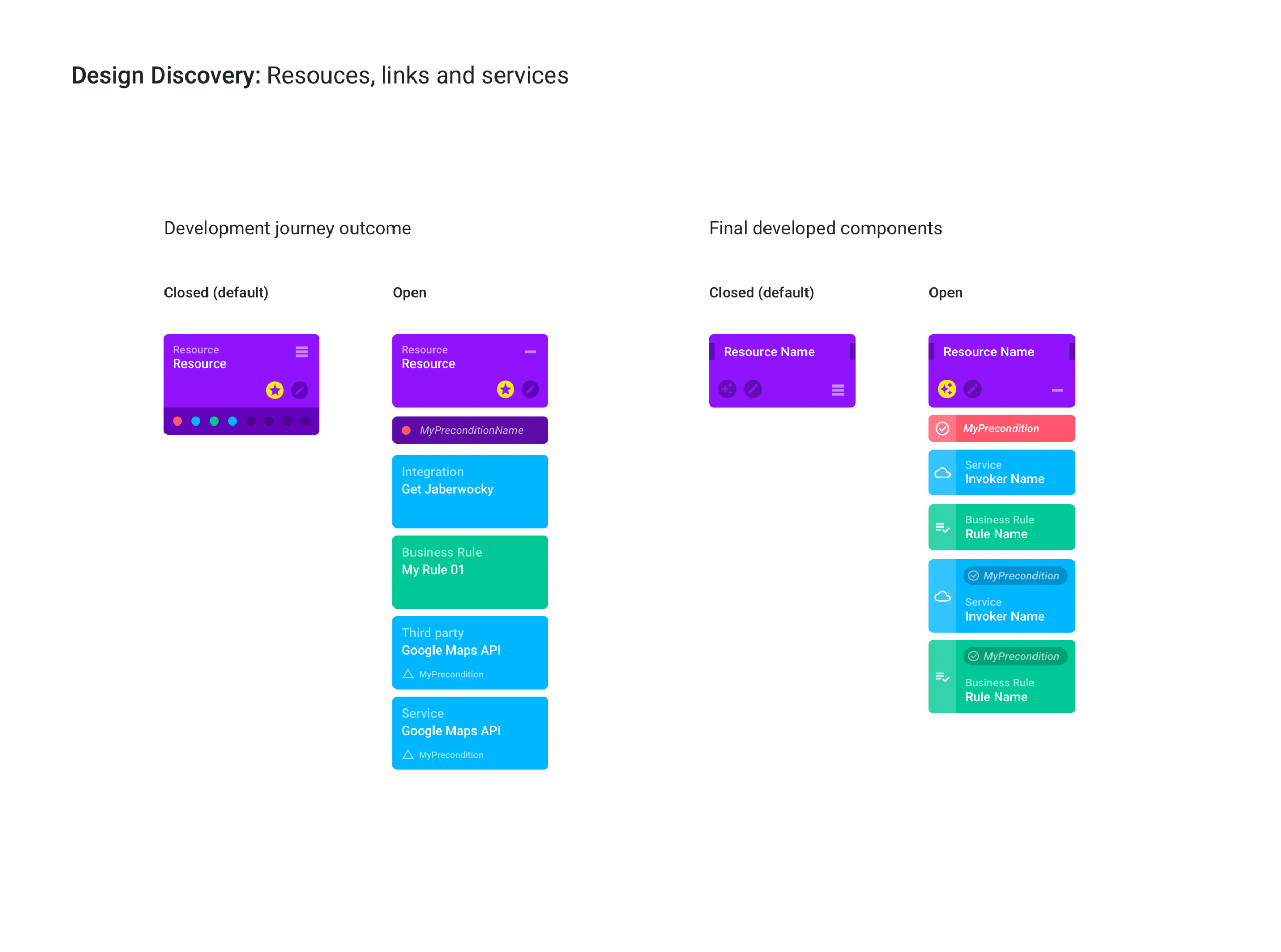
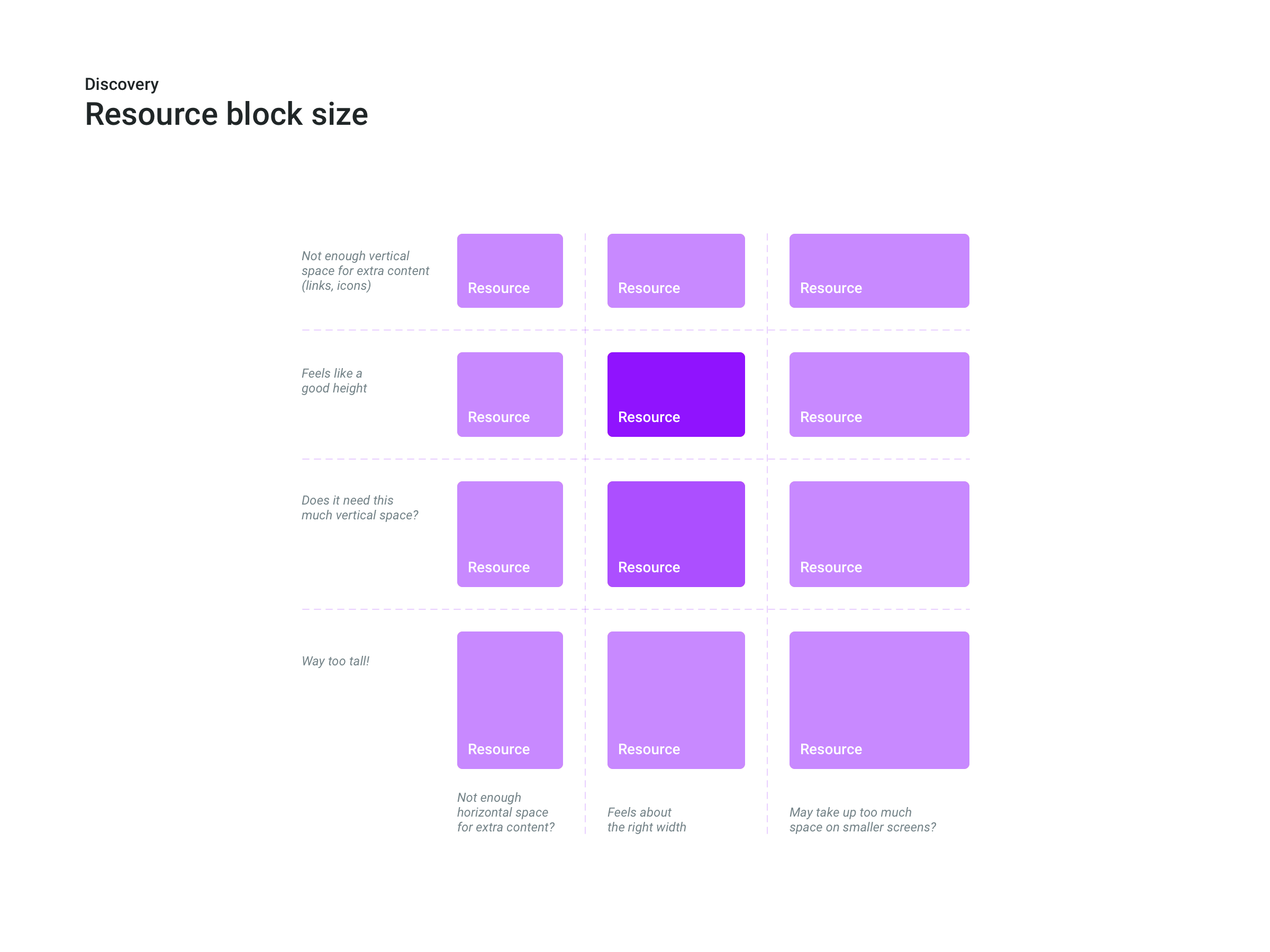
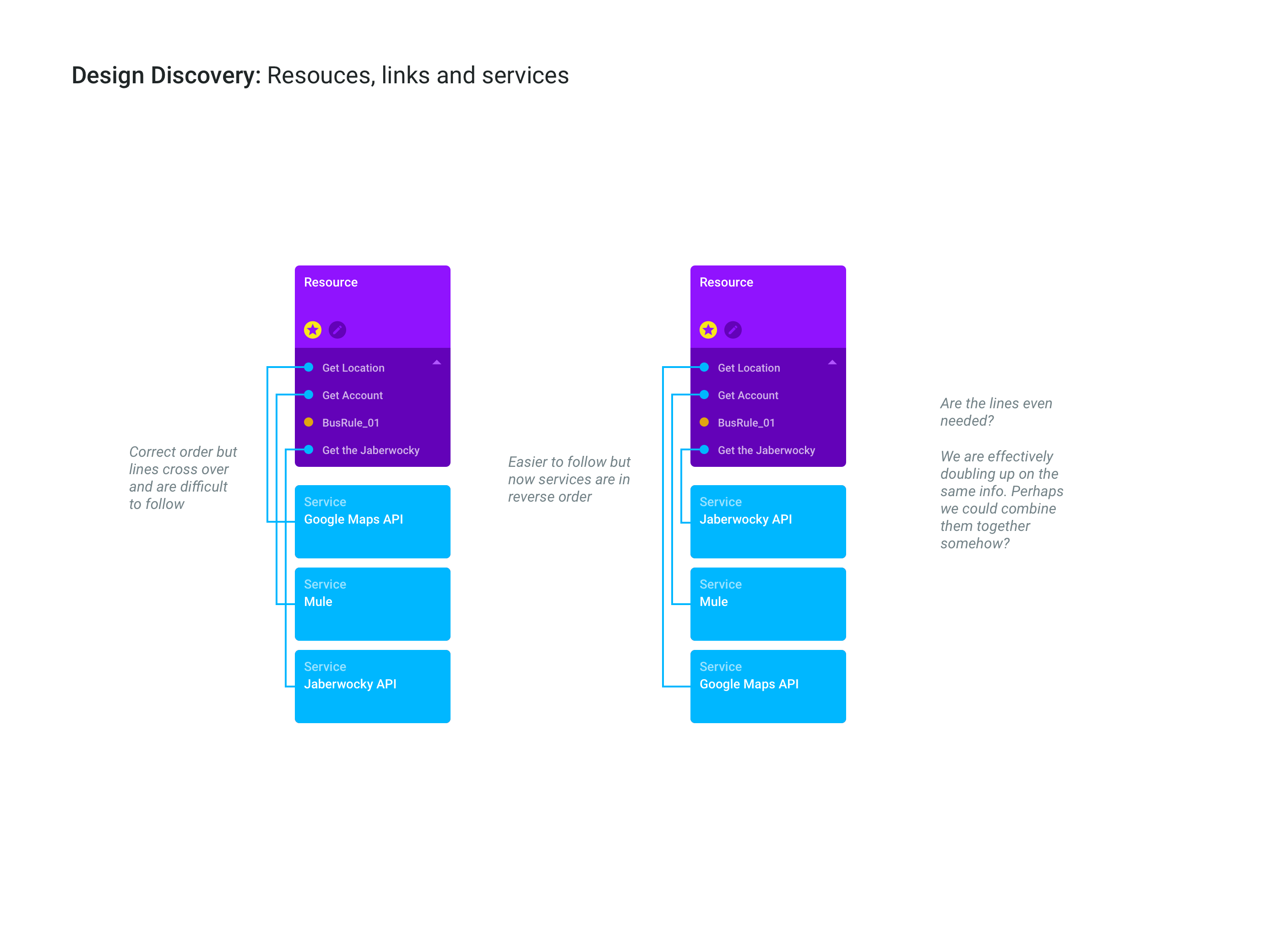
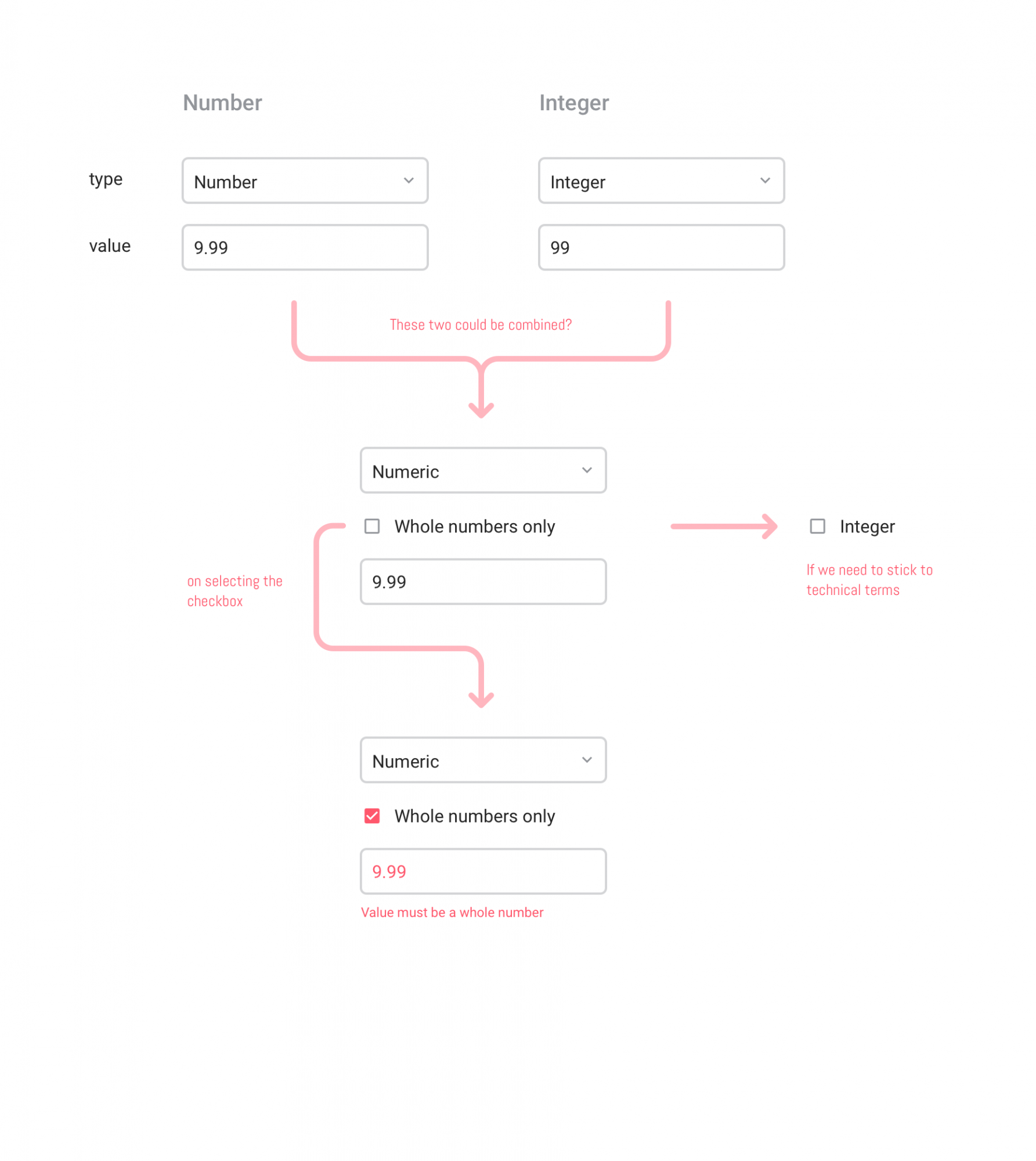
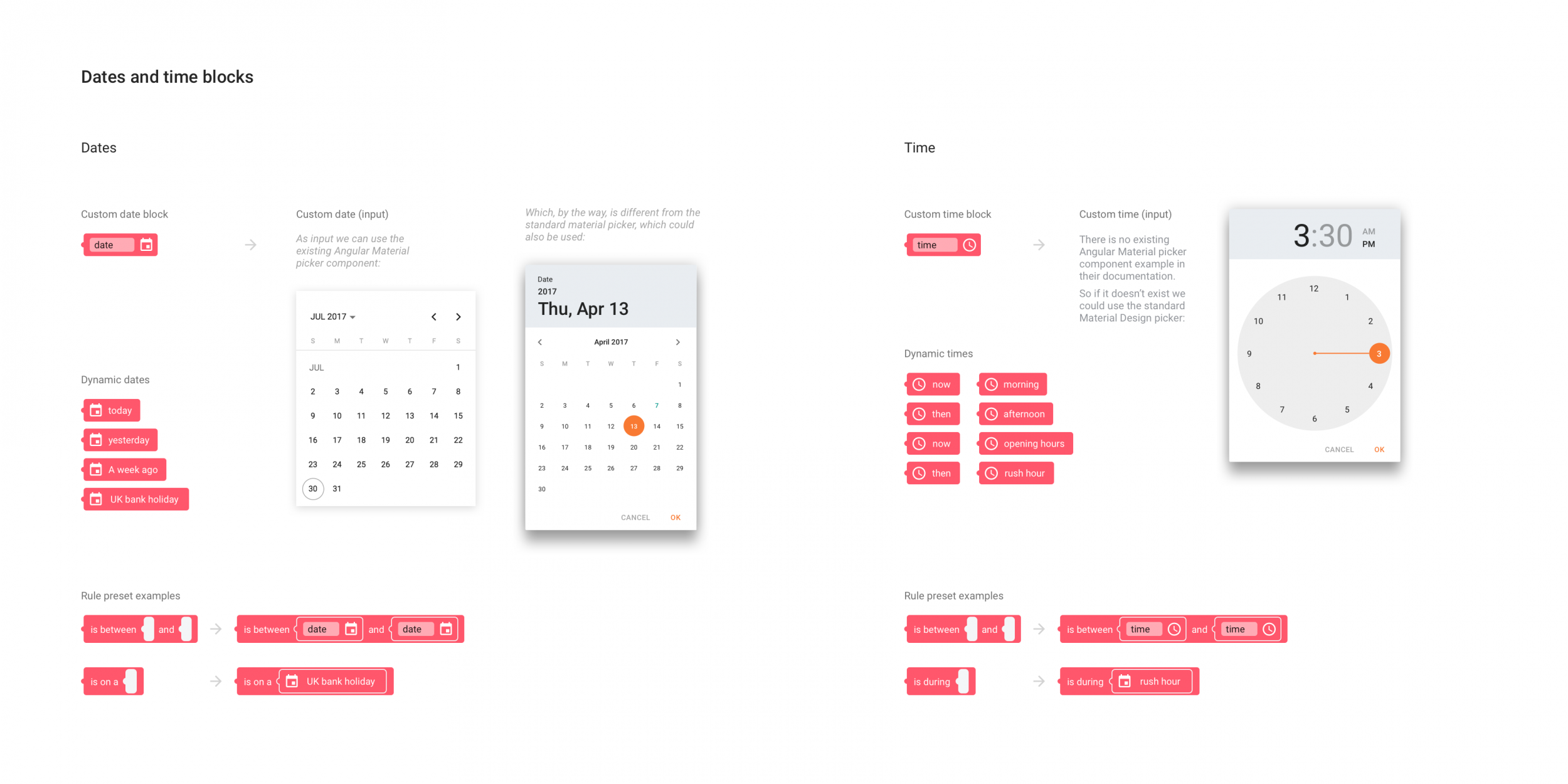
Design discovery
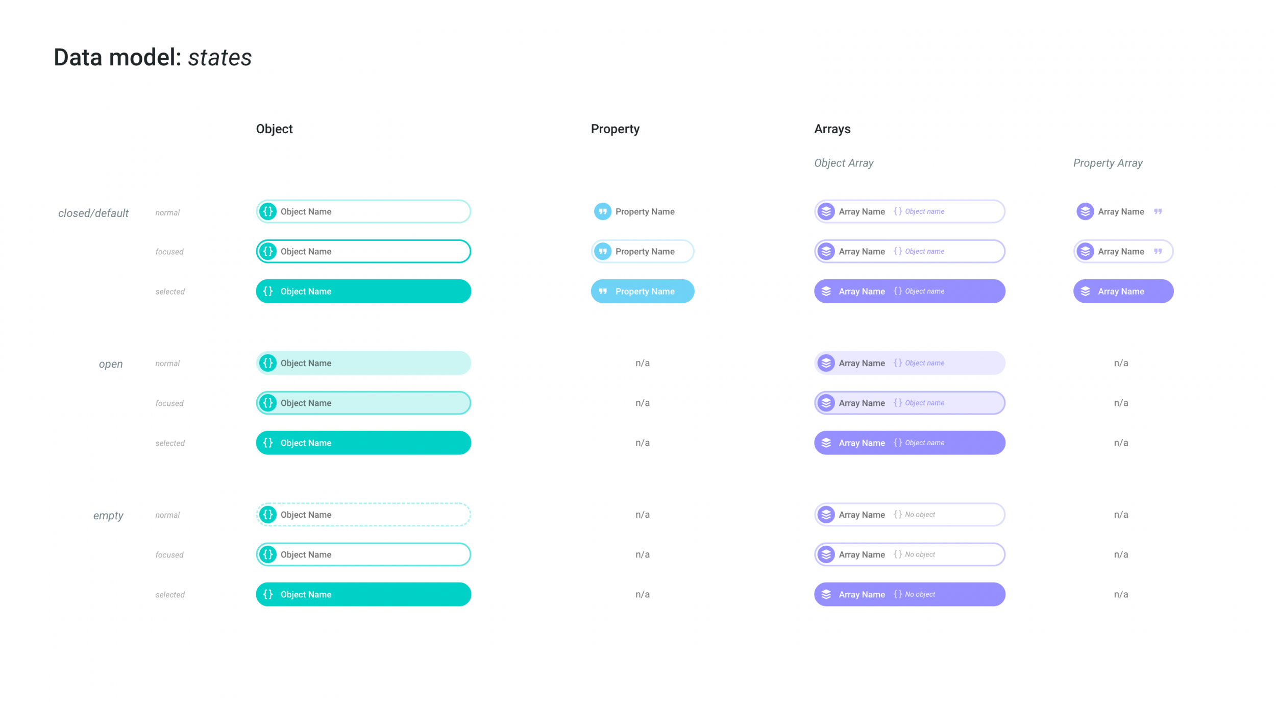
There were a lot of aspects to consider, not only with how to visualise each required element, but also the size of components, naming, spacing, colours, etc. And then a shed load of rules to ensure things worked consistently in every situation.


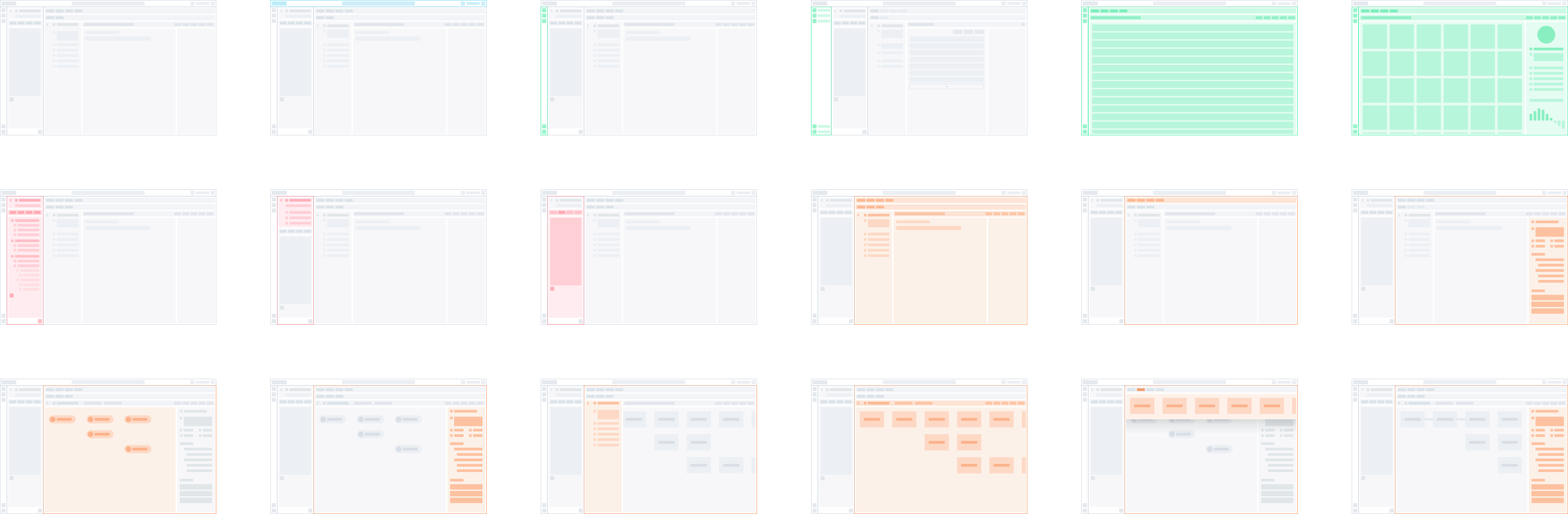
Snapshots
More examples
Below are some more work from various stages throughout the product’s development.
Conclusion
The end result